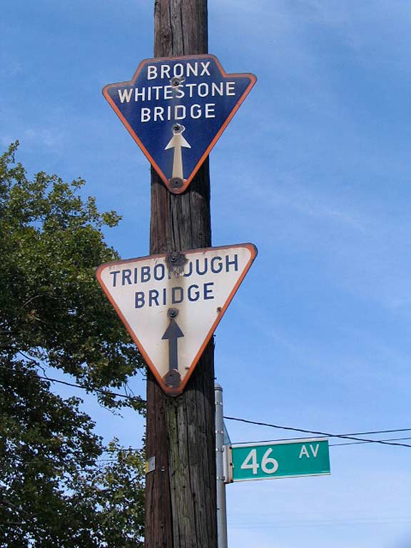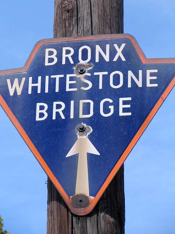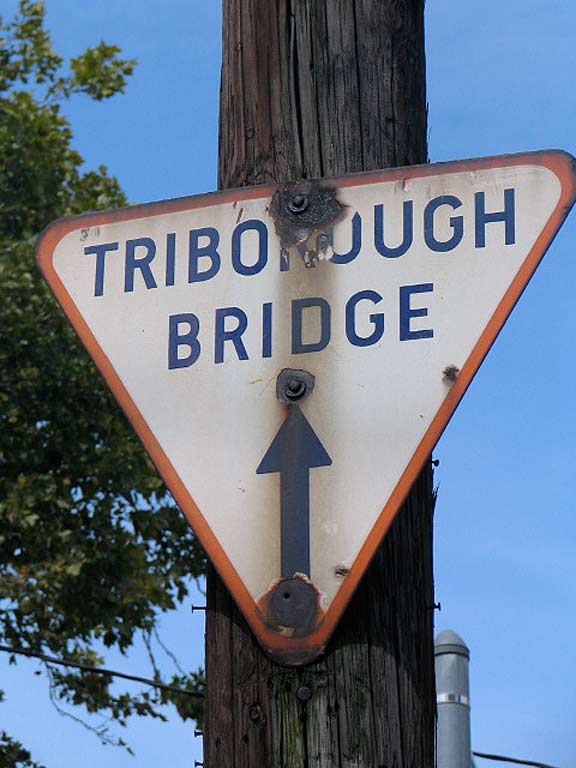
In the 1940s or 1950s, the Department of Traffic (now Transportation) installed hundreds of “arrowhead” signs all over town, pointing to bridges and tunnels. They took the shape of arrowheads, triangles and circles, with the bridge signs in combinations of red, white and blue. Tunnel signs were round, with combinations of yellow, white and black.

Small by current standards, they were installed at a time of lesser traffic and slower speeds…

…and stop signs dominated most intersections, or small “Olive” two-lamp stoplights. That era has passed and much larger signs are needed for heavy, pedal to the metal traffic, even on the northbound Junction Boulevard and Corona, where these two small signs held forth until the DOT carted them off in 2014.
ForgottenFan Jeff B:
I believe these particular “trailblazer” signs were put up by the Triborough Bridge and Tunnel Authority pointing the way to TBTA bridges and tunnels. I remember, and you have shown, that each facility’s sign had its own unique shape and color. I would love to see photos of all the different ones that existed. The Port Authority put up its own trailblazer signs to direct drivers to its facilities, e.g. G.W. Bridge, Lincoln Tunnel, LaGuardia Airport, et al. Those signs all looked similar, landscape white background, a black border, black sans serif lettering and a white arrow in a black circle to the left of the lettering.
It’s certainly the DOT removing them now, though.
Check out the ForgottenBook, take a look at the gift shop, and as always, “comment…as you see fit.”
6/21/17

8 comments
I believe these particular “trailblazer” signs were put up by the Triborough Bridge and Tunnel Authority pointing the way to TBTA bridges and tunnels. I remember, and you have shown, that each facility’s sign had its own unique shape and color. I would love to see photos of all the different ones that existed. The Port Authority put up its own trailblazer signs to direct drivers to its facilities, e.g. G.W. Bridge, Lincoln Tunnel, LaGuardia Airport, et al. Those signs all looked similar, landscape white background, a black border, black sans serif lettering and a white arrow in a black circle to the left of the lettering.
The sign for the Henry Hudson Bridge had, as I recall, a crescent moon. If that is the case, perhaps because the image of a half moon (after his ship) didn’t make for a good visual.
I wonder what happened to them ?
Trashed ?
They do not meet new sign standards published by the FHWA. They are not reflective and designs conflict with FHWA standards (such as circular shape reserved for railroad crossing warning signs. See https://www.google.com/maps/@40.7868111,-73.8069045,3a,15y,288.01h,90.63t/data=!3m6!1e1!3m4!1sy4a8L9JCTMbP5NaoGhV_aQ!2e0!7i16384!8i8192 for an example of a FHWA complaint trailblazer sign… the trailblazer image is placed on a green rectangular sign panel.
The new ones are MTA/TBTA installs are shown on the bottom border of the signs.
https://www.google.com/maps/@40.7698308,-73.9183265,3a,37.5y,63.97h,101.03t/data=!3m6!1e1!3m4!1smDIlhjLk3_ASqRBUrKWI_A!2e0!7i16384!8i8192
I remember a sign for the Whitestone Bridge not too far from the Verrazano. That was pretty far from the destination. The problem was that if one falls off and it is not replaced, the directionals become useless.
Occasionally the triangular signs had a R or L instead of an arrow (or I am hallucinating). Don’t have photos, just a memory.
I know where one of these can be found somewhere on the 2 and 5 in the Bronx. I won’t say where though.