
The City Island Historical Nautical Museum at 190 Fordham Street, in City Island’s old PS17, with artwork and exhibits chronicling the island’s near-250-year old history of shipbuilders, fishermen and America’s Cup yachtsmen. The Museum owns one of the world’s largest collections of maritime-themed books as well as watercolors of Orchard Beach, City Island, Hunter Island and other local sites by Prof. Harold V. Walsh, painted in the 1930s. The Nautical Room is devoted to City Island’s rich history as a boatbuilding, oystering and yachting mecca, the School Room depicts a typical classroom in 1830s City Island, while the Community Room contains items donated by City Island residents. Its densely packed shelves and walls, filled with newspapers, books, advertisements, scrapbooks and memorabilia are testimony to City Island’s colorful history. I never fail to visit if I am in City Island on a weekend in spring and summer. One of the Museum’s trustees, Barbara Dolensek, owns a historic City Island house and two Forgotten NY tours have been admitted to the property, which faces Eastchester Bay and has exquisite views.
City Island typically does not get a lot of tourism during the cold months and so, it is closed until spring. When it is open again, weekend hours are 1 to 5 PM.
Today I’m concentrating on the Museum’s street sign collection, which spans the approximate years between 1915 and 1985. The above image shows the dominant street sign design shared by Manhattan and the Bronx from 1915 to about 1965. Street signs were navy blue with serifed white lettering (by coincidence?, NY Yankee colors), each containing a “hump” showing the cross street. I always thought the type font used on these signs was nonpareil and which it could be digitized into a print font. The name of the font designer has been lost to history, as far as I can discern, as has the name of the font. Notice that the font uses the old typographer’s trick of raising the bowl of the C and the apex of the A slightly above the other flatter letters. This causes the eye to render the heights of all letters at the exact same height. In effect you have to trick the eye to see an even line of type.

This street sign is obviously from the same sign shop, and uses a version of the same lettering. However, it’s just a bit different. The serifs are shorter, and the letters are drawn at slightly different angles. Note the C: the other version has two serifs while this has just one.
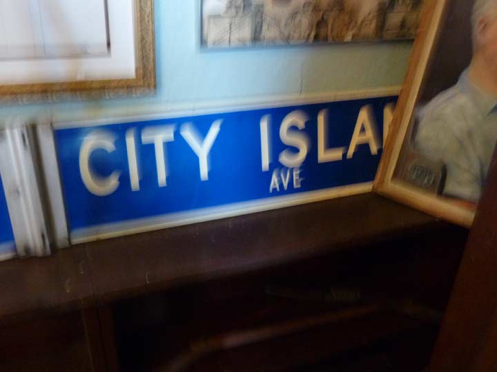
Forgive the blur, as I have not mastered indoor shooting with my Panasonic Lumix, or the camera is incapable of it. Blue and white signs were used to identify bronx streets between about 1964 and 1984, when they were replaced by green signs. In those years, signs were color-coded by borough: Manhattan and Staten Island, gold with black letters; Brooklyn, black with white letters; Queens, off-white with blue letters; and Bronx, the reverse of Queens.
This was a system that made perfect sense if you were traveling between boroughs and were unsure which one you were in, but the government decided that ease on the eye was the most important criterion, and decreed that most street signs unless in cases such as the Downtown Alliance signs in Manhattan, or maroon Landmarked District signs, should be white on green. Thus, NYC street signs, as well as those in other municipalities, were largely standardized.
Check out the ForgottenBook, take a look at the gift shop, and as always, “comment…as you see fit.”
12/26/17
4 comments
I am not so sure that green and white is the de-facto standard. Up “here”, in South Burlington VT, the street signs are white on blue, with many being new. The link below has an example, and additionally, a misspelled sign.
http://cheezburger.com/6327351040
It was the standard for decades, and was even the requirement until 2011 when it was relaxed to allow for what wasn’t considered at the time: differentiation, historical locations, aesthetics. So long as they are visible and retroreflective they are allowed to differ.
Up here in Massachusetts, we got around the regulations for signs by including city and town seals on them to show where you were, they were still green and white, but the seals were different than neighboring municipalities. Now they also include different colors but chose to go with larger fonts and signs to comply with visibility requirements
I think NYC made that rule up so they could spend a few million dollars on make-work signage. Here in LA, all the signs are blue with white lettering, and many other cities in SoCal have white with black letters, green with brown letters, even burnt orange and black lettering. Rarely do I see a green with white, except on freeways.
The reason NYC switched to green and white is that the Feds decreed that if you want them to pay for the signs (or a portion of the cost) the signs must be white on green. The previous signs coded by borough that you refer to as “black and white” the city officially called “black and silver”, although they never appeared to be silver looking.