In the 1950s, despite the considerable charms of Marilyn Monroe, Bettie Page, Jane Russell and so many other voluptuous stars in film and magazines, it was decided in the architectural community that curves were definitely out.
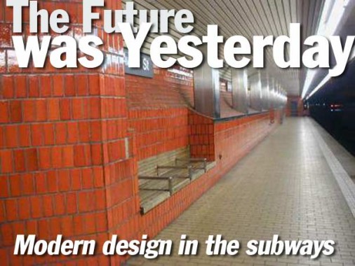
The United Nations Headquarters on 1st Avenue was built from 1947-1953 by an international team of architects that included Le Corbusier of France; at the same time, the Lever House (built for the soap company) was rising on Park Avenue. Clean, unobstructed lines were in; terra cotta, ornamentation and most of all, any curves, circles or ovals were out. It took the subways about 20 years to catch up to this architectural trend, and from the late 1960s on through the early 1980s, the TA (later the MTA) experimented with modern, sleek-looking subway stations that, in some cases, bordered on sterility. We’ll look at just a few of them on this Forgotten page.


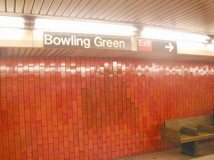
Bowling Green, opened on July 10, 1905, boasted an unusual configuration: an island platform and two side platforms. As originally constructed, the island platform served the main line to Brooklyn in both directions, as well as trains heading down a short loop to South Ferry. The loop to South Ferry was soon discontinued, but survived as a shuttle until 1977…the same year its original mosaic name panels and mosaic tapestries created by George Heins and Christopher LaFarge were covered over by oceans of orange.
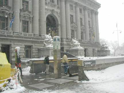
Heins and LaFarge also designed Bowling Green’s two ‘control houses’ in which fares were taken. The first was in front of the old Customs House Building (now the National Museum of the American Indian) when Bowling Green was a through street; it was closed to traffic during the 1977 renovation.
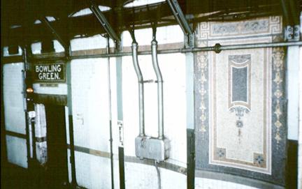
Bowling Green’s original name tablet and tapestries are shown in this photo courtesy David Pirrmann of nycsubway.org in the early 1970s. Though this variety of mosaic tapestry was covered at Bowling Green, there are two other examples in the system at the IRT 72nd Street station at Broadway and at 110th Street and Lenox Avenue; the ones at 72nd Street were being renovated in 2003.
South of Bowling Green in Battery Park, one of Heins & LaFarge’s original station houses is still extant.
Inside the foyer at the entrance on Bowling Green. The passageway has been lined with old-time photos of the Staten Island Ferry from the 1930s (note that the ferry is about six blocks from Bowling Green station; ferry passengers have a much shorter walk from the BMT Whitehall Street station, which is inaccessible from here).
As part of the renovations at Bowling Green and other subway stations, new flooring, railings and fare control areas were built.
Probably the only element remaining from the original H&L Bowling Green station design are the fluted columns, which have survived modernization in the NYC subway station as well as stations on the PATH lines.
It should be noted that the 1977-1978 reconstruction of Bowling Green took twice as long and cost half as much (in 1905 $$$) as the construction of the original subway line!
Bowling Green itself is New York’s oldest public park, going back to the era of British occupation. The wrought iron fence surrounding the park is the original one and goes back to the mid-1700s. Broadway begins here and continues, as Route 9, all the way to the Canadian border where it joins that country’s network of provincial roads.
At intervals, the side walls of Bowling Green feature sepia-toned renderings of historical scenes, including this one depicting a scene from about 1840. (Each artwork is accompanied by a plaque explaining what’s in the picture.) Is that Bill “The Butcher” Poole with the top hat?
In the early Seventies, 49th Street was indeed a change from the original mosaic tiling installed in 1919 (right). Architect Johnson was quoted about the renovation in a 1970 New York Times article: “Cheer is the word, like a big shopping center.” 49th was the first NYC subway station to have sound baffling installed in the ceiling. It’s questionable whether it did much good.
The Grand Street station is a product of new routings instituted by the then-TA following the new Chrystie Street connection, built in 1967, that allowed IND Sixth Avenue (B, D) trains to run across the Manhattan Bridge. Previously, those tracks on the north side of the bridge went up Broadway, but the renovations gave the IND a Manhattan Bridge passage to Brooklyn via the north side. BMT tracks on the south side of the bridge were then rerouted to Broadway, and their connection to Chambers Street was terminated.
A new system of tiling was used when the station opened in 1968, based somewhat on the spare IND-type mosaics, but pared down to basic white tiles with a blue color band containing the station name. This type of tiling had been used in the 1960s and would continue in the 1970s in all three branches of the subway system.
The walls of the Grand Street station are designed to be removed, in case a Second Avenue Subway connection were to be made here.
In the early 1980s, the monotonous Grand Street station was spiffed up with playful bas-relief sculptures.
In the early 2000s, most the BMT Broadway stations had this tilework stripped off, revealing the original late 1910s mosaic work, which is presently being restored. However, the 1960s work remains on the BMT 4th Avenue, so there’s a good opportunity to contrast the styles.
Original 1910s tile work still remains on the center column.
A major theme where we have modern tilework in the subways constructed from the late 60s to the early 80s is its frequent juxtaposition with original tilework; this is demonstrated starkly at the IRT Hoyt Street station in Brooklyn, with a truly ugly red-and-beige concoction placed cheek by jowl with its original 1908 mosaics which have a tulip theme similar to that at Atlantic Avenue.
There were terra cotta cartouches with the initial “H” at Hoyt Street; only one has been preserved, and is currently at the Transit Museum. Today a red and white nameplate makes do.
Yesterday meets tomorrow. The east end of Hoyt Street has been preserved while the rest of Hoyt Street was retiled about 1979-1980.
Fluted columns bear witness to Hoyt Street’s over 90-year-old pedigree; constant leakage is taking a toll and it seems like the 1980 renovation may be ready for an overhaul.
The red tiling on the columns at Hoyt Street is rather reminiscent of that on the MBTA Red Line tilework.
Hoyt Street once had a direct connection to the A&S (now Macy’s) department store; that connection has been eliminated for years.
Some of this reno, now almost a quarter century old, has begun to show its age or lack of maintenance.
53rd Street/5th Avenue is constructed unusually, with two tunnels atop one another (Wilson Avenue on the Canarsie BMT is built similarly as are some stations on the Concourse IND on Central Park West). The Manhattan-bound side features a ceiling vault tile treatment that the Queens bound side lacks.
53rd Street/5th Avenue is a simple, clean design that works well; however, it is in a desperate need for rehabilitation.
Here again is another handsome early example of the Akzidenz Grotesk typefont at work in the subways.
A visit topside at 53rd Street allows a view of the new awning over the entrance, as well as a view of two Citicorp buildings, the one on Lexington Avenue and the other in Jackson Heights in Queens, directly visible looking east on 53rd Street.
What is likely an original 1968 track indicator.
Just the facts, Ma’am: the name of the station is the only embellishment on the stark white tile at 57th Street.
57th Street originally served as the terminus of the 6th Avenue IND trunk line after the Chrystie Street connection was built in 1967. B trains would end their run here while D trains turned off to continue their run up Central Park West into the Bronx. In 1989 57th Street lost its terminal status when the 63rd Street “Tunnel to Nowhere”, or more specifically, Long Island City, was opened. In 2002 the Tunnel to Nowhere was connected to the IND Queens Boulevard line.
With the addition of the V local running in the 53rd Street tunnel, the F was rerouted to the 63rd Street tunnel and is now the only train stopping here. 57th has been home to the B and Q in the past.
86th Street, though, has been enlivened by mosaic “photograph paintings” by local students and some poetry over most of the platforms.
In a strange coincidence, 86th Street is prominent in both Manhattan and Brooklyn and each have a couple of subway stations along their lengths.
Interestingly, a nod to the IRT (and BMT’s old habit of fluting columns was done in the 137/City College reno.
Two station ID tablets, and two three-headed bas reliefs, have been preserved in the station. In addition, a “137” terra cotta plaque produced by Atlantic Terra Cotta in 1904 is owned by the NYC Transit museum and will be on view when the museum reopens, hopefully in 2003 or 2004.
You won’t find a sand dollar and a starfish anywhere else in the subway.
At first, two stations, 51st Street and Wall Street, both on the IRT Lexington Avenue line, had their walls heavily bricked over, 51st Street in an off-beige and Wall Street in a royal blue. However, station name plate mosaics as well as several original 1905 treatments like the terra cotta rendering of the wall that protected Nieuw Amsterdam from rampaging Injuns and Brits in the mid-1600s were preserved. In addition, on the southbound platform is a wooden token booth and a ticket chopper, wooden restroom doors on each side and an entrance to the Equitable Building.
2007: Wall Street has undergone yet another renovation, with the blue glazed tiles removed.
Your webmaster has always been partial to the original Wall Street reno…the glazed brick is in my favorite shade of blue. Note there’s no period in St–there was no set style at the time, and sometimes you got periods in abbreviations, and sometimes you didn’t.
As with 53rd Street/5th Avenue (above) this reno is now over 20 years old, and is definitely showing signs of wear with peeling plaster on the ceiling.
Fulton Street, the very next stop on the Lex, was redone at about the same time as Wall Street, and was a fullblooded renovation, a restoration of the original tilework, mosaics and friezes..a template for what the MTA would subsequently do on all the station renovations that followed, including masterful renovations at Astor Place and the Broadway BMT stations.
ARCHER AVENUE and the TUNNEL TO NOWHERE
In 1988, the MTA unveiled three new subway stations, at Kew Gardens, Sutphin Boulevard and Parsons Boulevard/Archer Avenue. These stations served to connect the IND Eighth Avenue (E) with the BMT Nassau Street line (J) at Parsons Boulevard, but at the cost of much of the Jamaica Avenue El; the section between the 121st Street station and the original 168th Street terminal was razed, and new tunnels and tracks were built for both lines. The plan was originally much more ambitious, extending out to southeast Queens, possibly utilizing some underused Long Island Rail Road tracks, but one of New York City’s periodic budget crunches scotched that plan. As it is, it took ten years between cessation of service on the to-be-razed Jamaica Avenue section (1978) and service to begin on the new Parsons-Archer Avenue connection in 1988. This is not as severe as the duration between demolition of the Third Avenue El and any new service on a Second Avenue Subway; with a renewed NYC budget crunch, this one the severest in recent history (as of 2003), straphangers will undoubtedly be waiting for a Second Avenue Subway for a long time to come.
The stations on the Parsons-Archer connection are leftover from the 1967-1982 method of building: modern, sleek and utterly characterless; indeed the Parsons-Archer terminal has now endured 15 years of use and it appears to have been there for decades.
Three new stations were also unveiled when the MTA opened up a branch to Queens that dead-ended at the Queensboro Houses at 21st Street, using the new 63rd Street Tunnel, leading some to dub the line the “Tunnel to Nowhere.” In 2001, the MTA finally completed a connection to the IND Queens Boulevard line. The three stations were the last ones that were done in a completely new style (any Second Avenue line, if it does come, will probably incorporate a streamlined design with traditional touches, such as tiled station nameplates.)
Included in the Lex Ave./63rd Street and Roosevelt Island stations are additional tracks for a proposed Long Island Rail Road connection to Grand Central Terminal. If this link is made, it will open no sooner than the early 2010s.
The new 63rd Street Tunnel stations are probably about as “modern”-looking as the subways will ever get, if the 60s-70s template is no longer followed in the future.
A distinctive feature of Lex Ave./63rd Street is its curved walls which echo the cylindrical subway tunnel.
The ‘fare control’ area is more suburban in feel than most other exterior station houses in NYC. Many other exterior stations in the MTA date back to the days when the lines were actual railroad lines later converted to subways. The Queensboro Bridge can be seen from outside the station.
The exterior of the Roosevelt Island station is quite subdued and sober. An IND-type stanchion with a green light, signifying the station is open at all hours, enlivens things just a bit.
SOURCES:
Subway Ceramics, Lee Stookey, self-published 1994
BUY this book at Amazon.COM


