

The Swingin’ 60s were a fun time to grow up in Brooklyn, especially for kids like me, with a perplexing penchant for noticing changes in lampposts as well as subway signage. One day in 1962, the whole neighborhood’s 1920s-era Corvingtons had been hauled away and slot-shafted, curved neck Donald Deskey posts appeared.
Likewise, in 1969 or 1970 (the mind is hazy on that point) all of the BMT 4th Avenue and Broadway Line’s intricate mosaic signs and shiny tile bricks were buried underneath unending walls of white blocks, interspersed with Mondrian-esque rectangles of color accompanied by metal signs. Less than thirty years later, the MTA went to great expense to knock down the white blocks and expose the mosaics once again — with one exception, as we will see — but in Brooklyn, no such expense was warranted, and streamlined 1970 design still holds forth.
When you ride the subways, you’re riding in the world’s longest museum. From the Beaux Arts Heins and Lafarge stations of the early 1900s…to the Squire Vickers mosaic tiling that was in control from 1915 to 1928 … to the Machine Age IND stations of 1932-1948 — to the bland modern stuff seen at the end of the Jamaica Line extension from the 1980s — when you ride the trains you’re getting an American design primer, all for the ever-rising price of a MetroCard swipe.
You dig what you grow up with. I like the pop rock and soul music that sounds like what I heard from the Good Guys on WMCA and Daaaaaan Ingram on WABC. So, it’s no great stretch to think that I have a soft spot for these made-over BMT stations. More specifically I also like designs with bold colors. You get them with the 4th Avenue BMT.


The color blocks on the BMT makeover were tomato red (or burnt orange, a favored color for subway station redesign in the 1960s — Bowling Green, 49th Street and Lexington Avenue on the F train Queens extension are awash in it); bright blue; golden yellow; and gray. What’s more, the Transit Authority redid the stations in rigid order of color.
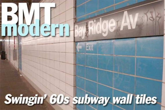
Originally, the metal signs indicating what stop it was were white with black lettering in the Standard font. In the 1980s, all stations changed the signs to black with a thin white stripe and lettering in Helvetica. However, the directional signs in Standard that were stenciled directly on the color tile were retained in the Standard font.
As you can see concrete peeks out from between the tiles. This was a design flaw because the concrete has become covered in soot over the decades.


The stations on the BMT 4th Avenue were opened in 1915 and 1916, with the exception of 95th Street (1925). There are a few clues to the stations’ 1910s legacy still intact, such as the fluted filigree on the top and bottom of the columns …


…and the terra cotta “News Stand” sign in the station mezzanine. It was bricked up long ago and I don’t remember ever seeing it open.


Some Bay Ridge Avenue bright blue.


“Extra” signage is few and far between on the tiled signs but at 53rd Street is an indicator for nearby Lutheran Medical Center in the Standard font.


Some dull 45th Street gray. The Transit Authority should have chosen a cheerier color. Note the font difference between Standard (53rd) and Helvetica (45th)


Sometimes, the TA left tantalizing reminders of the 1915-era design, especially oin the “token booth” areas, like the mosaic 25 and original light fixture.


Originally, the new tiling treatment was done all the way north to at least the 28th Street station (49th Street was given a special makeover — in burnt orange — by a group headed by architect Philip Johnson, and I’m not sure if 5th Avenue, which has local platforms, ever got the white blocks arrangement). In the 1990s, all Manhattan stations, except Rector Street, were returned to mosaic splendor.
Rector is a bit different — it was vouchsafed to keep one mosaic tablet. Also, the new black signs were done with Standard, not Helvetica, as you can see here.
Most photos from nycsubway.org
1/6/12