

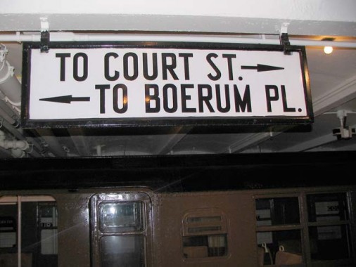
When the IND Subway was built beginning in the late 1920s, designer/architect Squire Vickers decided to move away from the Beaux Arts terra cotta and multicolored mosaics that had characterized the IRT and BMT, then run by private contractors, and streamline the whole design, with stations outfitted in one color with black and/or white trim. A new typeface, seen nowhere else before or since, was also devised for station signage and ID.
It was a no-nonsense type font, with easy to read letterforms that somehow lacked the sunniness that latter-day Helvetica, or even its contemporary, Futura, possessed. (I don’t even know its name — if it had one).
Of course beginning about 1970 the Transit Authority scuttled most of these free-standing enamel signs featuring this font — the only place to see the font now is in IND station wall mosaics. The Unimark system demanded the Standard font be used for all signage, which later was changed to Helvetica. The only place to see a good collection of them is at the Transit Museum in Brooklyn.
4/10/13