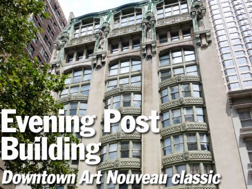
In July 2013 I was meandering around southern Manhattan, if only to take some fleeting solace in the madding crowd, and while in St. Paul’s Churchyard, I saw an unusual tall building on Vesey Street at #20 that I immediately realized required some research. At the ground floor, people were lined up at the headquarters of the 9/11 Memorial Visitors Preview Site. Pillory me if you wish, but I’ve alway been opposed to the construction of an elaborate 9/11 memorial, because it’d always be turned into a tourist attraction and continue to encourage the presence of hawkers selling photos, souvenirs and gewgaws depicting the events of that most horrible day in US history in my lifetime. That’s neither here nor there, as the memorial site is under construction, but I don’t plan on visiting.

At the ground floor, there’s an ancient tobacconist shop, and an old clock that’s been out of working order for some time.
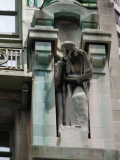
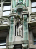
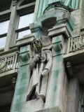
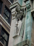
The 13-story building features four now-verdigris’ed monklike figures on the façade just below the roofline…
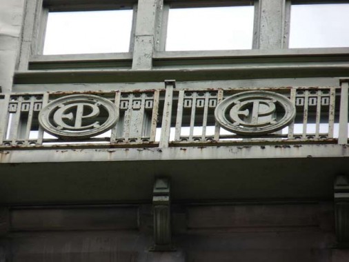
… and some railings emblazoned with the letters EP between the figures. What’s going on here? I had to find out.
It turns out this is the former headquarters of the New York Post, when it came out in late afternoons and was called The New York Evening Post (explaining the EP’s). The Post was still adhering to this schedule when I was a kid, and was coming out during the PM hours, and would sometimes publish partial baseball line scores if there was an afternoon game (this was before the days of espn.com, when you didn’t have the score at your fingertips at all times).
The building was commissioned by Post owner Oswald Garrison Villard (grandson of abolitionist William Lloyd Garrison) and is officially called the Garrison Building, not for the owner’s middle name, but because the broker was Garrison Realty. Architect Robert D. Kohn had the building finished in spring 1907 in the Art Nouveau style, rare in NYC but more popular in Paris. It is steel-framed and covered with limestone with what appears to be copper sheathing from the green verdigris.
The four monks, by the accounts I’ve seen, were meant to represent the “Four Periods of Publicity”; two were sculpted by Kohn’s wife, Estelle Rumbold Kohn, and the other two by Gutzon Borglum, the sculptor of the massive Presidential figures on Mt. Rushmore, South Dakota.
The building housed the Post’s printing presses and later, other publications like The Nation and The Crisis were printed here, and Yachting Publishing, Ronald Press, and the U.S. Nautical Gazette. Other firms included the manufacturer of school blackboards. By the 1940s, when the Post had moved out, the building was owned by Mutual Life Insurance.
Five stories of bay windows comprise the building’s middle section. Each set of windows is, in turn, punctuated by crests, each holding a symbol. The same symbol appears on each floor three times, totalling three sets of five symbols. So, what do the symbols represent? I’m not sure about all of them, but I’m sure of the theme.
The first depicts an old man standing under an elm tree entwined by grapevines, with a banner saying the Latin phrase “non solus” or “not alone.” This is the printer’s mark of the Dutch publishing firm Elzevir, which was founded in 1580, give or take a few years, by Louis Elzevir. His son Isaac introduced the mark in 1620, which subsequently appeared on all publications by the firm. The symbol is said to represent the mutually beneficial relationship between the publisher and the scholar. The modern firm Elsevier is not a descendant of the ancient publisher, but does use the mark.
Above the next set of windows is a symbol depicting a long-necked bird — a crane, goose or swan, with the initials I.F. I do not know what this symbol represents.
The third symbol is a stylized trident in a circle, with the initials N.F. Again, you got me here. Anyone know this one?
From Comments:
The third symbol belongs to Nicholas de Francfordia of Venice (15th century). It was common at the time for printers to have a variation of a cross with their initials for their mark and his was one of the more distinct. See page 25 of this document: http://www.gutenberg.org/files/25663/25663-h/25663-h.htm
Here’s some general information about the uses of the swan, olive branch, and serpents – but nothing on those specific marks or printers (paragraph about 2/3 down): http://www.library.illinois.edu/rex/about/windows/article.html
The fourth symbol shows two snakes entwined around a tree. It’ similar to the caduceus, the symbol of Roman messenger god Mercury, though not quite the same.
Italian pressman Aldus Manutius (1449-1515) who established one of Italy’s finest printing presses in Venice in 1493. It is thought he invented the slanted style we call italic type.
Aldus is the name of a former software company that made, you may recall, an early giant in the desktop printing biz, Aldus Pagemaker. It was purchased by Adobe, which updated it through 2001; Adobe has pretty much succeeded it with the more complex InDesign.
Flocks of NYC streets are named for the signers of the Declaration of Independence, NYC mayors, Trinity Church vestrymen, classical composers, even astronauts. But printers? Why not?
Aldus Street in Longwood, Bronx runs through the former estate of Colonel Robert Hoe, inventor of the rotary press. When the city developed the area and streets were cut through, three were named Hoe Avenue (which is still there) Guttenberg Street (now East 165th), and Aldus Street.
So, I think we can deduce that all five symbols have been printer’s marks, in a building housing printing presses for a great city newspaper. Can anyone tell me what the middle three are?
Comment below or tweet to Kevin Walsh @ForgottenNY
9/19/13
