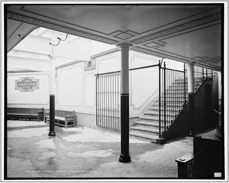
The 28th Street station on the Lexington Avenue IRT (e.g., the #6 train) is one of what I call the Original 28 — the original 28 stations built by the Interborough Rapid Transit subway company that opened in 1904, running from City Hall up Elm (since renamed Lafayette), 4th Avenue, Park Avenue, 42nd Street and Broadway north to 145th Street. The original line has been divided since the late 1910s into the Lexington, Times Square Shuttle, and Broadway lines, or the #4/5/6, S and #1/2/3 lines.

Courtesy nycsubway.org, I have a couple of views for you of the original platform layout in photos taken just before the line opened. You can tell from this picture that while the station did feature incandescent lighting, skylights allowed a generous amount of sunlight in. Of course this had to be augmented by artificial lighting on cloudy days and at night.
Several elements of the decor still remain. The large and small station ID plaques are still there. Many of the round columns with fluted tops and bottoms are still in place, and in the last decade or so, the paint scheme you see here has been restored, though it’s impossible to tell from a black and white photo if the same colors are employed. However the filigree on the ceiling has largely disappeared, as have the wood benches.

Here you get a greater sense of what part of the platform benefited the most from the skylighting. On the right is the ‘fare control’ area. In the days before tokens and turnstiles, collecting the fare was a two-man operation, one to sell a ticket from a booth, and the other to take the ticket at the entrance (between the two columns on the right, at the break in the fence) and drop it in a ticket chopper. Amazingly a couple of these survived in some stations into the 1970s. The approximate view today.
Original IRT stations built in 1904 featured entrance and exit kiosks (entrances had domed roofs, exits peaked roofs). As the century rolled on, motorists began to find these large structures an obstruction to viewing traffic signals and stoplights, so they were phased out, with the last ones surviving until the late 1960s. A new entrance kiosk was built for the uptown Astor Place platform in the traffic island formed at Astor Place and Cooper Square in the mid 1980s. THis pair could be found at the uptown 28th Street station.
I don’t know what formula Original 28 station designers George Lewis Heins and Christopher Grant LaFarge used to determine what stations got large, decorative identification plaques, but 28th Street was selected to receive some of them. You can see that they were made of several pieces that were adhered together. There are two each on the uptown and downtown platforms. They are composed of ceramics made by the Grueby Faience Company of Boston, which closed its doors in 1920.
A new mosaic plaque, (poorly) imitative of the originals, was installed a couple of decades ago on the uptown platform. Accept no substitutes.
In addition to the large plaques, these terra cotta shields were installed at intervals at the ceiling line (see 1904 photo above). They were manufactured by the Atlantic Terra Cotta Company in Tottenville, Staten Island. These, too, are replicated by mosaics on the uptown platform.
When stations along the line were extended in the 1950s to accommodate longer trainsets, the new walls received IND-style mosaics that were the de facto signage standard until the 1960s. The blue and gold color scheme contrasts somewhat with the green and gold plaques.
One of the downtown 28th Street entrances/exits is located beneath New York Life’s “Cathedral of Insurance” building, occupying a full block between Madison and Park Avenue South and East 26th-27th Streets, which celebrated its 85th anniversary in 2013. It was designed by famed architect Cass Gilbert (who also designed the Woolworth Building on lower Broadway) and was inspired by Britain’s 13th Century Salisbury Cathedral.
New York Life is 40 stories high and contains 2180 windows and 72 gargoyles. It stands on the site of the first Hippodrome and the first and second Madison Square Gardens, which really did overlook Madison Square. The famed gold leaf pinnacle (barely visible from this angle on Park Avenue South) was added in 1967 and was lit at night for the first time in 1985. New York Life Insurance has been the building’s sole tenant and has been made familiar across the country by a company ad campaign beginning in 1999.
But one aspect of the insurance palace I’d not suspected was its subway entrance at 27th and Park Avenue South.
Yeah, I had noticed these huge, ornate iron signs out in front, backlit with the words “Interborough Subway.” This is a hark back to the name of the original subway, Interborough Rapid Transit, the IRT. These signs very likely go back to 1928, when the building opened. Of course, whenever I need to photograph a building, the Walsh Rules state that the outside sidewalk must be covered in scaffolding, because FNY.
I had thought that the signs pointed out a run of the mill staircase leading down. That’s not the case.
The wood and brass front doors of NY Life have a stenciled window sign indicating a subway entrance/exit, but only from 7AM to 7PM. Open the door and walk in…
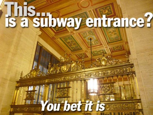
.. and you’re not in Planet Subway anymore. It’s a sea of polished brass everywhere in the anteroom to one of NYC’s great feats of architecture.
There’s a door leading into the restaurant on the ground floor of the building at East 27th.
I think the big discovery for me was the presence of two “SUBWAY” stanchions that appear at both staircases leading down to the station. Note the detail on the sign of what appear to be two barking dogs on either side of a flaming brazier. I tried without success to find out if this has anything to do with a former New York Life Insurance logo or symbol.
NYLI symbol or not, these are among the handsomest station indicators in the entire system, even though they’re outside the purview of the MTA.
Polished brass railing overlooking the staircase.
The ceiling treatment is nothing short of breathtaking, with nine colored reliefs in red, gold and green. A chandelier hangs from the central tile. This treatment appears in front of each down staircase. Cass Gilbert, you done good.
Another original element, the ‘push’ sign on the door leading out.
Google Street View from 2009. Without the scaffolding this is how this subway entrance appears from Park Avenue South.
Once underground you are in a maze of corridors, one of which leads to the subway entrance. Note the brass “SUBWAY” sign on the ceiling. From Jeremiah Cox’ Subway Nut site.
“Hat tip” to David Pirmann of nycsubway.org.
1/19/13
