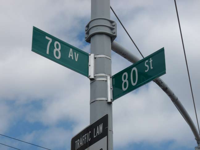
For the past five years, the Department of Transportation has slowly been replacing street signs with new ones that feature the Clearview typefont in upper and lower case, following a federal ukase that is not immediately mandatorily applicable, according to the NYTimes. The DOT has made a number of errors with the new signs, as some of the new ones are all caps instead of upper and lower.
My problem with the replacement is not that it’s being done — many signs were installed thirty years ago and are in need of a refresh. It’s that the ones that are worn out are being left in place.
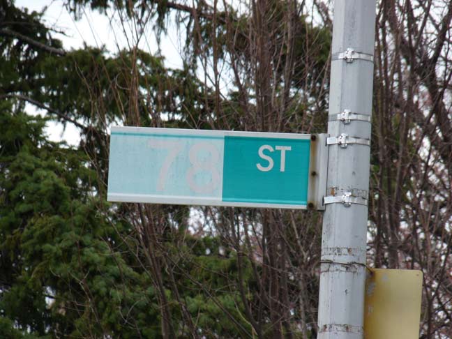
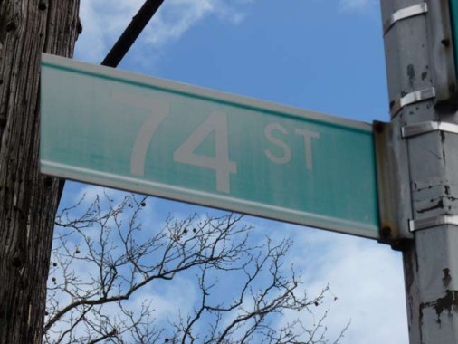
As a look at the title card photo shows, sun bleaching is the signs’ worst enemy. Any sign that gets full sun for a good part of the day will eventually wind up looking like this. Since 1964, all newly installed NYC street signs have been made of colored vinyl; a color code system by borough was followed until the early 1980s. Since then, new signs have been green and white, except in certain designated areas such as midtown (blue and white) and neighborhoods designated by the Landmarks Preservation Commission, which are reddish-brown and white.

In many, many cases, the new signs seen above featuring Clearview in place of Highway Gothic have replaced perfectly legible old signs. Meanwhile, sun-bleached signs that are barely legible are allowed to remain in place! The implementation of the new signs makes no sense whatsoever.
I’d also question the replacement of the numbered signs at all except the illegible sun-bleached ones. After all numbers are not in uppercase or lowercase.

Now, this condition of sun bleaching is unexplainable, unless the right sign originally said “AVE” and “ST” was pasted over it. I see no sign of that, though; it’s ingeniously done, at least. The DOT should make it a priority to replace all sun bleached signs instead of the helter skelter replacement system in use right now.
4/9/14
