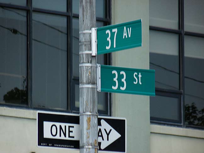
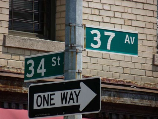
There’s a right way and a wrong way to do everything, and the recent installation of Clearview street signs in Long Island City illustrates the point perfectly.
The signs at 37th Avenue and 34th Street use the boldface version with the normal width, with white racing stripes at the top and bottom of the sign to contrast the green background of the sign. This style has been in place since about 1985, and there’s no reason to change it now.

Or is there? The pair at 33rd Street use the condensed version of the font in regular weight, with no racing stripes. The overall impression is indifferent, if not just a bit nonassertive and wimpy. Nevertheless, this seems to be the version that is appearing on most streets, not the boldface, take-charge vision.
This has probably come up because the signs are likely being produced in more than one shop. If I were involved, I’d try to cajole the foreman/forewoman into producing the correct version, which, of course, is the one on 34th Street.
7/30/14
