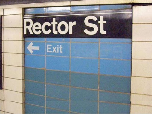
Rector Street is the one remaining station in Manhattan on the BMT Broadway line still sporting the 1969 makeover all local stations received on the subway section of the BMT Broadway, which opened in 1915 and runs up 4th Avenue, Montague Street, Trinity Place, and Broadway and has terminated at Ditmars Boulevard or Continental Avenue at different times.
The main local is the R train, once known as the RR and before that, the #2. When lettering was introduced, the line received the RR designation, probably for “railroad,” and its signs originally featured a circled RR in a green field. After the Transit Authority switched the colors of its BMT and IND lines in the 1980s, R trains featured a black R on a gold field … except when the R used the Montague Street tunnel to Chambers Street, in which case it got a white R on a brown diamond.
When designed in the 1910s, the Broadway line employed the same style mosaic trim and ID tablets as IRT stations were featuring at the same time. In the Swinging Sixties, subway station designers went on a modernist kick and hired the Unimark firm to redesign the stations. Probably the use of the Standard typefont and later, Helvetica, on station signage is the main legacy of this era.
Plenty of stations were extended and received streamlined signage that was esthetically at odds with the stations that retained their 1910s mosaics, but on the Broadway, the Transit Authority went the full Monty and placed new off-white tiled walls, with simplified signs on fields that wore four colors in order: blue, tomato orange, grey, and gold. The signs were originally white with black letters in Standard, then were switched to black signs with white letters in Helvetica.
In the 1990s, as classic stylings were back in vogue, these new fronts were simply torn down, revealing the old mosaics behind them, which were spiffed up with new artwork.
Since the Broadway BMT was my subway line as a kid, I have a soft spot for this style. All Brooklyn stations on the line still feature it.
8/9/14
