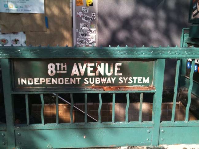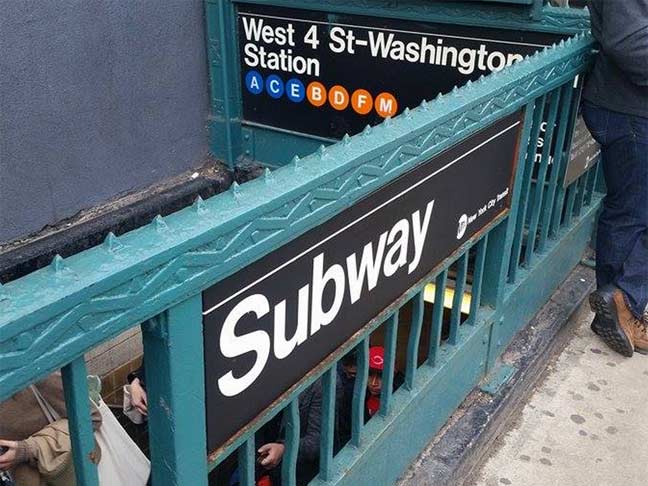
A couple of years ago, a classic enamel sign dating to the origins of the Independent (IND) Subway, built by New York City beginning in the 1920s to compete with Brooklyn-Manhattan Transit (BMT) and Interborough (IRT) subways, was uncovered when a newsstand was dismantled at an entrance to the West 4th Street station on the west side of 6th Avenue at the Waverly Theatre just north of Carmine Street.
In Manhattan the IND built two main lines, up 6th (which turned east under the East River onto Queens Boulevard) and 8th Avenue (which wound up traveling under the Grand Concourse in the Bronx). The 8th Avenue Line today carries the A, C and E trains at some point.
There the city was content to leave the sign, for a time. Eventually this sign was taken down to reveal an even older IND sign beneath it.
But now, the inevitable has happened…

photo: David Silver
When the subways were all unified in 1940 and then run by several successive city agencies, it was eventually decided to unify the signage style, as well. Unimark, headed by Massimo Vignelli, was hired for this task and quickly selected Helvetica as the font of choice. In the 1960s, Helvetica was unavailable and Standard, which greatly resembles it, was used for a time, but the city eventally switched to Helvetica. Since the Easy 80s, white type on black signs has been the constant, and the city has been absolutely ruthless in rooting out nonstandard or outdated signage…
… as they considered this relic to be.
3/11/15