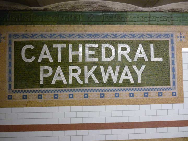
When the Cathedral of St. John the Divine began construction in 1892 at Amsterdam avenue and West 110th Street, the city believed that the occasion required a grand, wide boulevard to approach it from the east and west in addition to Amsterdam Avenue, which received its own name just two years before when the numbered avenues west of Central Park and north of West 59th Street received historic names in a burst of civic pride (9th became Columbus, 10th received Amsterdam and 11th settled for West End). And thus, 110th Street west of Central Park became a much wider street and gained another name: Cathedral Parkway.
Cathedral Parkway, it seems, was destined to a fate matching Avenue of the Americas, a grand name ignored by New Yorkers, who went merrily along and continued to call the streets 6th Avenue and 110th Street, respectively. However, when the IRT subway, the city’s first, reached 110th Street as one of the Original 28 stations opened on October 27th, 1904, it was still hoped that Cathedral Parkway would be the accepted moniker and so, huge name panels were designed by Heins & LaFarge to reflect this desire.

The custom of the Beaux Arts era was, add more decoration after it seems you’ve added enough, and so the station panels from 1904 are incredibly intricate works, with thousands of mosaic pieces, here rendered in brown, yellow, green, blue and beige, which my pal Phil Copp describes as viridian, ochre, rose and other fanciful color names in his indispensable guide to subway decor, Silver Connections.
This is one of the few 2-line station ID tablets in the Original 28 and is impressively massive. Note that the green mosaic tiles in the main background are not all the same shade; some are lighter. That scattering of lighter tiles gives an even greater sheen to the panel in addition to what the fluorescent lamps give it (remember the stations were originally lit by incandescent bulbs, which weren’t that old an invention in 1904).
Copp adds an insight: when the station was first being designed, there was a saloon, ah, music venue called Philip Dietrich’s Lion Palace of Music upstairs on Broadway, and a subcontractor named John Shields floated the idea of the station decoration to include murals of beer steins. This would have been an intriguing key to the area’s past had they been included, but perhaps owning up to a sense of propriety H & F went with the Cathedral Parkway panels instead.

Note that the panel I showed above had the Period of Importance at the end of the word PARKWAY. In the 1800s, a period was often used to connote a sense of definition or importance, in addition to its other uses identifying an abbreviation or the end of a sentence. This practice died out soon after the yearly calendar changed the digit from 8 to 9, but stubbornly held on in some quarters (The New York Times kept its Period of Importance until the Swinging Sixties!)
However, there’s at least one panel that doesn’t have the Period of Importance. (The white lettering is a bit thicker, too.) This either indicates that it was installed some time after the originals were, or perhaps a different contractor was used. Or, perhaps the Period of Importance was removed during a renovation.
The street’s original number isn’t forgotten. It’s emblazoned in terra cotta cartouche panels along the platform rooves, once again in the station color scheme of green, buff and blue. Two tulips flank the number in honor of NYC’s Dutch heritage, a practice also carried out at other of the Original 28. The swastikas in the panels surrounding the cartouche were innocent symbols of good luck in 1904, as they still are in many worldwide cultures in the 21st Century.
12/3/15