


A couple of weeks ago, I wrote about the tile directional sign at the East 149th Street station in the Bronx pointing to a nonexistent stop on the NY Central (now Metro-North) line. In Comments, some readers speculated that since there was a large trainyard a couple of blocks away at the tracks, the sign was meant to direct railroad workers. While scanning the internet today, I found another seemingly out-of-time mosaic sign in the same station, which has been something of a treasure trove of subway artifacts.

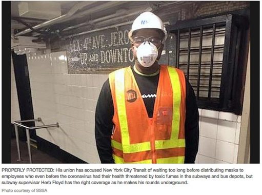
I found it in this article in The Chief (which serves civil service workers) about how subway workers have inadequate Covid-19 protections. The MTA worker is standing in a corridor at the East 149th Street station that transfers riders between the #2 and 5 trains with the #4. Here, the #5 diverges from the #4 (i.e., the Lexington Avenue line) and buddies up with the #2 up to the East 238th Street station. At 149th, riders can transfer to the #4, which goes on the Jerome Avenue line to Woodlawn Cemetery.

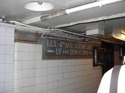
It’s that marvelous mosaic sign that directs riders to what is now just the #4 train. Before the MTA settled on its present nomenclature of numbered and lettered trains beginning in the 1930s with the advent of the IND (the IRT and BMT had their own individual sets of numbered trains, until the BMT got its own set of letters in the 1960s) lines were known by the streets they ran under, like the Broadway Line, the 7th Avenue Line, the Lexington Avenue line etc.
The Lexington Avenue Line is today’s #4, 5, and 6 in Manhattan. Trains ran beneath Lexington Avenue and switched to 4th Avenue (now Park Avenue; it’s complicated) south of Grand Central Terminal on East 42nd. Of course, trains ran on an elevated line above Jerome Avenue in the Bronx.
The sign is notable because the MTA is fairly “Nazi” about replacing older signage with modern signage, i.e., the black metal signs with white Helvetica type. This sign should be covered with a black sign with arrows and a green 4 bullet, but thankfully at the moment it’s not.


I recently acquired a font replica that was designed for the subway mosaic signs of the early 20th Century. This particular font was used in the BMT stations and isn’t an exact match for the IRT, but it’s pretty close. I don’t have the expertise to match the actual mosaic plaques, and the font doesn’t have arrows as far as I know, but it’s a fairly good match, no?
Check out the ForgottenBook, take a look at the gift shop, and as always, “comment…as you see fit.”
4/21/20