


GLAD to get out of the house for the first time in a couple of weeks (I’m “chained to the computer” at home during the week, and the weekends have been rainy) I found a subway transfer I had never attempted before. (Andy Sparberg, fill me in on how old this transfer is) See Comments below
Headed for Battery Park, the #1 wasn’t going there and the friendly announcement informed us to transfer to the R at Park Place. Park Place? Yes indeed. From the IRT, you go through a secret passageway to the IND E train terminal station at World Trade Center and then walk the length of the platform, which gets you to the south end of the BMT Cortlandt Street platform.
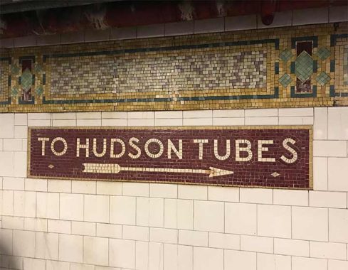
It’s there you find mosaic signs pointing to the “Hudson Tubes” which is a euphemism for the PATH train (which stands for Port Authority Trans-Hudson). The IND, constructed some years after the BMT, calls the PATH trains its original name as conceived in 1908, the Hudson-Manhattan Railroad. The Cortlandt Street station was opened in 1918, renovated in 1998, closed for some months after the 9/11/01 terrorist attack, and then closed again for a few years so a corridor could be built to the Fulton Transit Center. Through all of it the “Hudson Tubes” mosaics have been retained, and people know what they mean.


I have mentioned the Rector Street BMT station (R, W) before but I’m fascinated with it since it’s a holdout of sorts. In 1970. local stations on the 4th Avenue/Broadway BMT got a makeover which made them look like nothing else in the subways at the time. The mosaics and original tiling were covered over with white blocks interspersed with unicolored blocks on which were affixed station signage. Originally the signs were white with black letters in the Standard font the MTA was using, but when black signs, white letters and Helvetica became the MTA standard the signs were changed. The color blocks were in 4 different colors, red, blue, gold and gray and were installed in that sequence. One exception was 49th Street Manhattan, which was designed by Philip Johnson and employed burnt orange, which was a hot color for the MTA in the 1970s.
In the 1990s, Manhattan stations… except for Rector Street… had their 1970 tiles and signs unceremoniously removed and the mosaics beneath were cleaned and restored where necessary.
As always, “comment…as you see fit.” I earn a small payment when you click on any ad on the site.
1/22/22