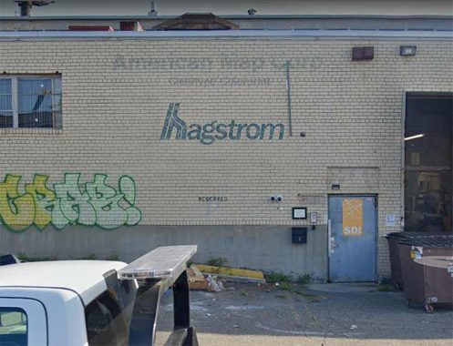
WEST Maspeth, also known as Laurel Hill, was world headquarters of Hagstrom Maps, whose plant is shown here on 46-35 54th Road near 48th Street. Though the company moved out long ago, its old painted sign was covered for awhile but is now visible again.
My former webhost Paul Matus was employed at the company in 1967 and remembers:
“Every now and then, when [founder Andrew Hagstrom, still there after 50 years] encountered me in one of the hallways of the building, he would talk me and he loved to take me over to one of the documents on the wall which featured the Hagstrom logo, a Viking ship on the high seas. He told me that the ship represented him, who came to the U.S. without two Kronas to rub together, and through hard work built up this great business. But his special satisfaction was in telling me that he didn’t have a college degree and didn’t much care for people who did. ‘I never went to college but now I hire and fire college graduates everyday,’ he said with great satisfaction. He must have told me the story a half-a-dozen times, as though he had never told it to me before.

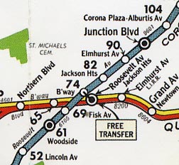
“Of all his maps, his New York City subway map appeared to be his pride and joy. It was the official map during the 40s and 50s and was in the New York Telephone yellow pages until the TA hired someone else to produce its more diagrammatric London Transport-style map about 1958 which the old mapmaker disliked. He thought maps should be graceful looking and reasonably geographically correct. Even after the TA abandoned the traditional BMT, IRT and IND divisions on its map, Hagstrom retained them and their traditional map colors: BMT yellow or green, the IRT blue, the IND red, and elevated lines as thin black lines.”
All these years later, that original Hagstrom subway map remains the gold standard, in my opinion.
Here, map historian Peter Lloyd discusses the great Hagstrom subway map in a NY Transit Museum chat.
|
|
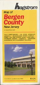
I am a near obsessive NYC street map collector and I own close to five hundred street maps from around the country, not just NYC. I got hooked by Hagstrom in the early 1970s when I made most of my early purchases with allowance money. I’ve followed Hagstrom’s distinctive cover designs for decades the way record aficionados follow 45 RPM sleeves and labels. (Click on each image for a complete view.)
When I was beginning to collect Hagstrom in the early 1970s they were beginning to modernize their cover design with Helvetica type and streamlined art. New York map covers in the 70s were black with red trim, while New Jersey maps were blue. Occasionally though, Hagstrom would toss in a wild card, like their 1971 Queens edition with a green duotone of LaGuardia Airport on the cover. Their Philadelphia edition was blue, but with Optima type. The back covers of most of these maps were bright red with black type. Atlases usually followed suit with similar color and designs. As you can see, I added the date of purchase with Dymo labeling tape.

Throughout the 1980s and 1990s Hagstrom used a distinctive yellow color scheme with either red or green type and a new logo. The tyepefont was a variant of Franklin Gothic with a modified x-height. By the early 2000s, as digitally drawn maps began to make a move, the typefont was changed.
Hagstrom had always published specialty maps in addition to street maps, including subway and bus maps. This one from about 1960 (if you go by the GM ‘fishbowl’ bus drawing on the cover) features the Viking ship logo, which was getting rare by that time.
After becoming part of the Langenscheidt Publishing Group, Hagstrom found itself part of a stable of companies producing 4000 US and international street maps. The company left West Maspeth in 2005.
My history with Hagstrom runs thusly: My mom brought me to Hagstrom HQ on 33rd St in September 1971. I was looking for their Philly edition, which of course was unavailable for the most part in NYC (in those days, out of town maps were available only in dedicated map stores). The receptionist was friendly and helpful. Their Philly map is the best of that town I have ever seen; it was discontinued in the early 90s.
After I sent in several corrections in 1981, Greg Christiano of Hagstrom asked me in to interview for map researcher. I was not chosen (the job required a car to get around) but I enjoyed the tour around the plant in the days before computers and CAD.
I was between jobs again in ’92 and for the heck of it, interviewed again at their Laurel Hill plant. Each time, the pay stated was lower than I would have liked to make, but still, I would have enjoyed working for them part time at least.
Here we are over 50 years after I got my first Hagstrom. Former employee Paul Matus was my webhost for several years, and his friend Greg Christiano, who interviewed me in ’81, has posted his own Hagstrom recollections.
As always, “comment…as you see fit.” I earn a small payment when you click on any ad on the site.
6/27/23


