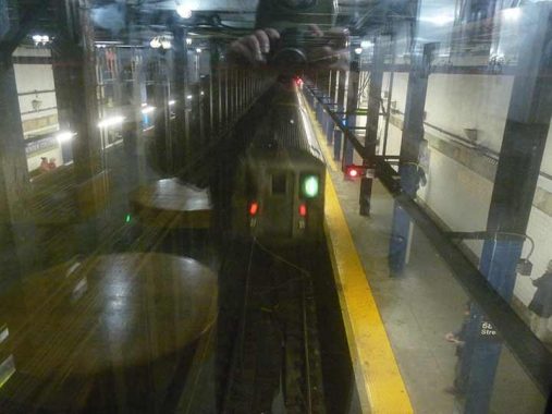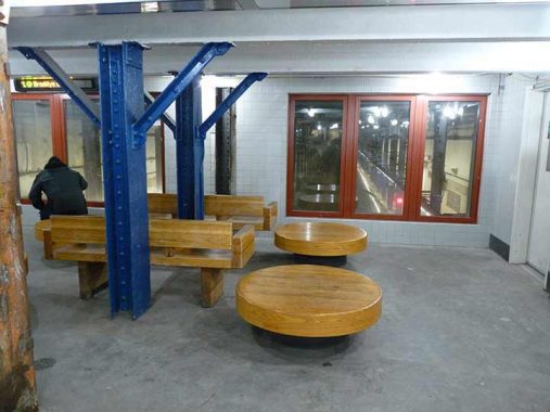

UNUSUALLY for a NYC subway station that opened in July 1918, the 68th Street-Hunter College station has a mezzanine section built over the tracks. When it’s not too busy, you can have a seat and watch as #6 trains pull in and out. The pillars that support the station roof extend right through the mezzanine. Of course, this wasn’t an original feature of the station but was part of renovations that occurred in the 1990s.


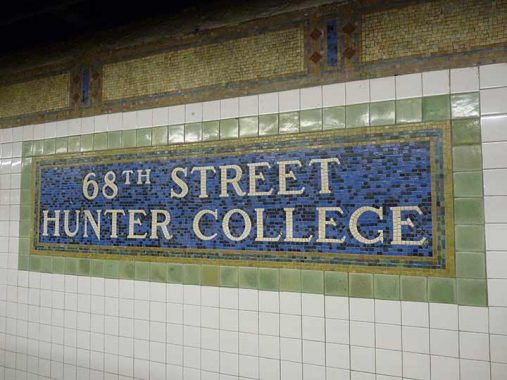
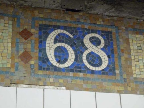
By 1918, mosaic subway signage designed by Squire Vickers were hitting their stride, design-wise. Part of an art discipline called Arts and Crafts, subway signage used “earth tones” of the color palette such as green and brown, with bright blue added for accent. Note hwo different shades of green and blue in the individual mosaic pieces are perceived as a whole. When I was a kid my parents bought me mosaic art sets and I would have a ball putting artworks together. I wonder if those kind of sets are still sold.
In a few years, Vickers would get a little more adventurous with color in the mosaic signs on BMT stations built for the Canarise and Flushing Lines, and then go a different direction with the Machine Age uncolored IND stations of the 1930s.
As always, “comment…as you see fit.” I earn a small payment when you click on any ad on the site. Take a look at the new JOBS link in the red toolbar at the top of the page on the desktop version, as I also get a small payment when you view a job via that link.
3/13/24
