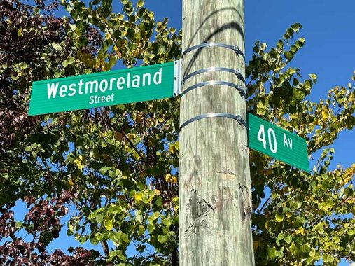
WHEN I stepped outdoors for a bit of fresh air in this October of perpetual sunshine and 75 degrees, I didn’t expect to get the pleasant surprise that I got. For years I have complained about the state of street signage in Little Neck, one of NYC’s easternmost redoubts and an area the Department of Transportation seemingly forgot. Signs were missing or sun bleached into unreadability. Seemingly overnight…I found they had finally been replaced.
This is the current state of the art in NYC street signage. The DOT began a complete street sign replacement program in 2011, changing signs formerly in capitals to upper and lower case, even the “Av,” “St” and “Rd” designations, even on the numbered streets. For about five years, the font was switched from Highway Gothic to Clearview, a much inferior font in my opinion. The DOT later relented and went back to Highway Gothic, but retained upper and lower case.
I must say, I wandered over to Little Neck Parkway and 43rd Avenue, to shoot a pair of sun bleached signs from the 1980s and put them on this page for contrast. But they had finally been replaced!

The DOT didn’t get everything, and this pair of 1980s signs is still there. You can see a wider variety of Highway Gothic on the number, which isn’t used anymore (I prefer this width) and everything’s in all caps. Another difference is two white stripes at the top and bottom that are not in the newer signs.
If you go back further, between 1964 and 1983 vinyl and metal signs that were in off white with blue letters were deployed in Queens, but very few of those are left; the only ones I’m aware of now are on 65th Crescent in Fresh Meadows.
As always, “comment…as you see fit.” I earn a small payment when you click on any ad on the site. Take a look at the new JOBS link in the red toolbar at the top of the page on the desktop version, as I also get a small payment when you view a job via that link.
10/22/24
