


I love the trains just the same. The MTA and the NYPD don’t really return the affection, with photo bans, official or otherwise. Unlike most railfans, however, the trains themselves for me are only a sidebar to the main attraction: station signage and design. Though more recently built stations are old enough to be recognized as historical artifacts in their own right, subway design reached its apotheosis in the original 28 subway stations, designed by architects George Heins and Christopher LaFarge, engineered and built by William Barclay Parsons and opened to the public on October 27, 1904. The original line ran from City Hall to 145th Street and is now a part of today’s #6 line, Times Square-Grand Central Shuttle, and #1 line.
City Hall station is tiny compared with other NYC subway stations, has only one platform, and has been devilishly difficult to enter since December 31st, 1945. New, lengthier subway cars then entering the system fleet made the station a liability: its sharply curved platform made for lengthy gaps when the new cars’ doors were opened.
City Hall station is the most beautiful of NYC’s unknown rail relics.


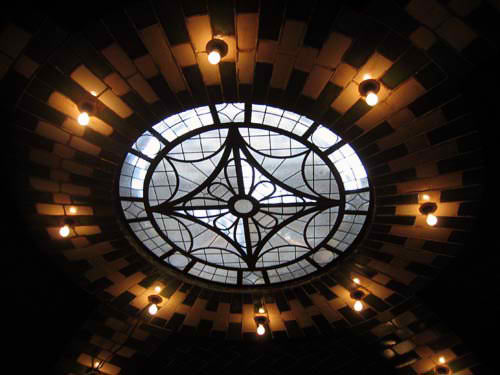

If passengers happened to look toward the lobby roof they would have seen a beautiful circular skylight surrounded by eight lights. In 1904, commercial electric illumination was just about a decade old. The City Hall station skylights are made of cut amethyst glass. A renovation for the subway centennial in 2004 erased decades of grime (the skylights were blackened during WWII) and allowed sunlight to once again shine in the station. photo left: Peter Dougherty; photo right: Mike Epstein


The station name plaques use techniques and colors seen nowhere else in the system, like the gold tiles and aqua borders and type seen here.
RIGHT: a second view of the vault, Guastavino tiling and skylight. photo: Jake Dobkin

Brass plaques, commemorating the station’s opening, are located on the walls opposite the station platform.
nycsubway.org at City Hall
Joe Brennan in Abandoned Stations
Forgotten NY’s 1998 visit
Brooklyn Bridge
Brooklyn Bridge is now the southern terminal for the Lexington Avenue local (City Hall was until 1945, and locals still loop around the trackways past the station to begin the northbound run). As we’ll see, a northern extension was built that made the next station to the north unnecessary.


NYCsubway.org at Brooklyn Bridge
Joe Brennan makes discoveries behind the wall


Early IRT express stations were built with both island (express) platforms and side (local) platforms. It was thought that because of heavy passenger traffic, local and express “customers” should be kept apart from each other. Eventually this notion was dropped — except at both the IND and 7th Avenue IRT 34th Street stations, both constructed after Penn Station had been built. The architects predicted huge crowds at these stations, and so side platforms were built — making it quite inconvenient to change from express to local service at each to this day.


There are no less than six NYC Canal Street subway stations: IRT 7th Avenue (#1) at Varick, IND 8th Avenue (A, C, E) at 6th Avenue, BMT Broadway express and local (J, M, Z), BMT Nassau Street line at Centre Street, and the very first, built here in 1904 at Canal and Centre Streets, served by the #6.


Though Canal Street has a couple of layers of renovations from various decades, a few original elements remain. The station sports a green scheme overall. As this picture shows, the original subway was built just below the street, allowing sun to pour in from skylights that were part of the station design. They were blocked up long ago, though at certain stations the sun streams in from breaks in the sidewalk.
The Canal Street station cartouche (right) like others in neighboring stations, was originally fired by the Atlantic Terra Cotta Company in Staten Island (in fact, a small stop on the Staten Island Railway is named Atlantic, since the factory was nearby). After 100 years the finish on these cartouches still shines. The “C” on the cartouche is accompanied by two poppy flowers.


The 1904 stations were quite short. At the beginning, trainsets were only a couple of cars long, so at present, original station artwork takes up only a small area in the modern-day station. Later subway architects who took up the mantle from Heins and LaFarge such asSquire Vickers applied an Arts and Crafts sensibility, with mosaic plaques depicting area histories, to subway stations he designed. The extension at Canal Street, though, finds him exploring a more streamlined side that he would fully employ in the IND, built in the Machine Age, ushered in by the 1925 Paris Exposition.


Spring Street station is built along a very gentle curve on Lafayette Street (so gentle in fact that it’s not seen on street maps). The original station tablet features the mosaic bellflower theme used on similar stations built about this time. In recent years, the MTA has repainted station columns in a solid color topped by a stripe, which was the original 1904 scheme, though we don’t know whether blue and gold were the actual colors then.


The station moldings are painted beige and feature flowering plants. The “S” cartouches differ very slightly from the ones at Canal Street. There are two poppies again, but the leaves are different and the whole plaque is a little deeper.


Bleecker, often misspelled without its “c”, was named for William Bleecker, a friend of Washington Irving and William Cullen Bryant, who was a writer himself: a renowned punster, his work appeared in several publications in the 1810s and 1820s. Bleecker Street runs through his former property. Along with Houston, it’s the only named street that extends from the West Village to the East Village.


The highlights of Bleecker Street station are unquestionably the brilliant blue Grueby Faience station ID plaques (and this was the case even in 1905, a year after the station opened, as we see a passenger regarding one in the postcard at right (courtesy of Ed Levine). Each plaque is built from 27 pieces of faience ceramic. While the plaques show poppies..


…the cartouches show tulips, apropos in a city with Dutch origins. Bleecker Street cartouches are in bad condition and await restoration.


When station names appear on columns, occasional unusual abbreviations have to be used.


The later Vickers station tablets, with even later ones from the IND era. Even these are complex in their own way, with 5 different colors employed.


From the start Astor Place station has been connected directly to buildings above it. The 1905 postcard shows the connection toWanamaker’s, now housing a K-Mart, while a bricked-up door leads to the former Clinton Hall.


The beavers whose pelts made Astor rich are depicted in the station by Grueby. This is the first station on the line in which a graphic element of this type was executed: there would be many more in the IRT and continuing on new BMT construction on into the 1920s. While later stations would use mosaics, though, here faience was used, and you can see what we meant by rich color. The beaver, resting on a tree stump and gnawing on a trunk, is surrounded by the bellflower motif and also by the precise geometric shapes, squares and diamonds, that are also a hallmark of original subway stations: the diamond surrounded by four squares is repeated at other stations further up the line. At 22.5×14 inches these plaques are the largest in the system (excluding station name plaques), and the ten-inch borders give them added size.


Astor Place utilizes two species of columns: the original cylindrical ones employing a restored original paint scheme, and also columns surrounded by load-bearing brick. Such columns are mostly used where a station passes under a building.

The font looks like the kind of thing master typographer Frederic Goudy was working on at about this time (such as Hadriano), though his involvement is unlikely.


Even subway grills and metalwork are carefully planned, and well into the IND years, distinctive grillwork is a subway highlight.
RIGHT: cartouches and signage echo the typefont we have seen on the faience plaque (above.) They are 1980s elements designed to echo original appointments.


The numbers seem to keep to no discernible pattern. They occur, in order, 9, 11, 8, 14, 15, and 14 blocks apart (excepted by 59th, which is the southern end of Central Park) until we reach 86th Street, when a 10-block separation begins (excepted by 110th, which is the northern end of Central Park). Beginning with 125th, main cross streets commence a more “logical” sequence, appearing every ten blocks.
I have been thinking that main cross streets occur where Broadway (which runs athwart Manhattan’s orderly grid) intersects a north-south avenue. Broadway, more or less, reaches 4th Avenue at 14th Street, but not quite exactly; Union Square was named for a group of colonial roads that met there in the early 19th Century. Broadway reaches 5th at about 23rd, but not quite; the junction actually happens at 24th, a block north. Broadway’s junction with 6th Avenue occurs at just about 34th, but not precisely. By the time Broadway reaches 7th Avenue the two roads are almost parallel; Broadway has to take up a few blocks crossing 7th, and it doesn’t do it at 42nd, but rather between 44th and 46th, Times Square. Broadway reaches 8th Avenue at about 59th, but has to make a rather sharp turn in the upper 50s since it still parallels 7th through much of the 50s. Broadway gets to 9th (Columbus) at 65th Street, which has never been a main street, and gets to 10th (Amsterdam) at 72nd. North of there, Broadway has a straight run, more or less, up to 103rd Street (which, not coincidentally, is where subway engineers decided to build a branch off the original route to the Bronx in 1905).
Originally, when it was the Bloomingdale Road, Broadway did a lot of twisting and turning to the west of where Central Park would be, but as the park was built and cross streets were laid out, it was thought best to straighten Broadway and so it was, beginning in the 1870s.
If any NYC historian can clear up this business about the numbers, let me know.
Where was I? Ah, the 14th Street subway station.


Fortunately, some of the artwork from the side platforms, including eagle plaques, has been preserved along with some of the station walls, as a 1998 art installation by Mary Miss (Miss Miss to you) entiled Framing Union Square.


Elsewhere in the station, new porcelain station plaques have been installed in the spirit of the old, and original mosaics poke through in some spots, though cleverly “framed.”


Looking out the window of the #6 local as it travels uptown or downtown you will see the remains of the 18th Street station, which went out of business in 1948 when the 14th Street station was extended north. The 7th Avenue IRT extension from the 1910s has retained its 18th Street station.
NYCSubway.org at 18th Street
Joe Brennan discusses 18th Street


Forgotten Fan William Hohauser has heard a different story:
“The term came from a time when 23rd street was a major party street with lots of theaters and drinking establishments, 1890’s maybe. Due to the “Blue” laws of the time, the bars and pubs had to close at a much earlier time then they do now. Naturally people were not quite ready to stop drinking and carousing when the law told them to. “23 Skiddoo” supposedly is the name given to the mass chaos that occurred as the bars closed and everyone rushed to find a ride to an illegal speakeasy or a private party. After the mass exodus the street would
turn dark and empty.”
23rd and the couple blocks north of it make up NYC’s Toy District in the region near Madison Square.


23rd Street has been nearly completely renovated, with the glazed vertical beige bricks seen at photo right, adjacent to some of the little original artwork left, a floor to ceiling tapestry with the usual mosaic bellflowers. Above we see a brown and beige name tablet from a later platform extension above IND-type directional arrows.


As Jim Naureckas reports in New York Songlines, Robert Shaw commanded NYC cops to deliver a $1 million ransom for a hijacked subway car in the 1974 thriller The Taking of Pelham 1-2-3 at the 28th Street station. The station also was home to the system’s first robbery on opening day. It would not be the last. 28th was home to New York’s Tin Pan Alley, where songwriters and song pluggers played and sold tunes to prospective customers; the street is now the epicenter of NYC’s Flower District between 6th and 7th Avenues, and also home to clothing wholesalers and further west, forms the northern boundary to a small neighborhood home to sewing machine wholesalers and showroom dummy manufacturers. Perhaps they come to life at night, like in the Twilight Zone.


Who knows why Heins and LaFarge decided to place a large Grueby Faience station name tablet in the 28th Street station…it’s a local stop, not a major stop by any means (Bleecker Street never was either). Note that the typefont is the same one used at Astor Place. When one of them was lost at some time in the past, it was decided to replace it with a truly hideous mosaic copy: dig the dated “computery” typefont they used for it. The tiled flowers were painstakingly done, and interesting enough.


28th Street also features some Atlantic Terra Cotta cartouches. The station extension mosiac adheres to the overall blue and gold station color scheme.


The wall bases are described as “buff Norman brick” in The New York Subway: Its Construction and Equipment, the first book published about the new subway by the Interborough Rapid Transit Company (the IRT) in 1904. It was reprinted by Fordham University Press in 2004, the subway’s centennial. At right we see a blocked up station crossunder.


33rd Street station was built at the former site of the 71st Regiment Armory, which was completed a year after the subway arrived. This was actually the second armory on the site: an earlier one built in 1892 burned down 10 years later. The site is now occupied by the 42-story 3 Park Avenue building.


For a building that’s been gone for several years, the Armory is remembered in several ways here. Its original plaque has been attached to 3 Park Avenue, and its old retaining wall makes up part of the Park Avenue subway entrance.


It’s also been said that faience and mosaic eagles in stations indicate that armories were located above the stations, but that’s only true here at 33rd Street. At Brooklyn Bridge and 14th Street, as we’ve sen, no such armories existed. Notice the swastika pattern on the faience plaque. It’s innocent in origin: the German national Socialist Party wouldn’t adopt it as a symbol until the 1920s, and before that, it was simply a symbol of good fortune. In fact it’s here likely as a conequence of the artowrk pattern and isn’t intentionally a swastika pattern at all. We will also see this further north on the Original 28.


James Garvey’s Lariat Seat Loops, brass fixtures installed at the columns, works perfectly well as station seating.


33rd Street’s fare control ironwork is much different from that found at other stations, and likely goes back a few decades earlier. A station renovation in the 1990s left 33rd’s name tablets and faience eagles looking better than ever.
NEXT: The original 28 from 42nd to 145th Streets
SOURCES:
The New York Subway, Its Structure and Equipment, 1904 Centennial Edition, Fordham University Press 2004
BUY this book at Amazon.COM
Subway Ceramics, Lee Stookey, self-published 1994
BUY this book at Amazon.COM
Subway Style, The New York Transit Museum, Stewart, Tabori and Chang 2004
BUY this book at Amazon.COM
RELATED:
Photographs, for the most part, shot in January 2005 by your webmaster unless otherwise indicated. Page completed 1/2/06.