In January 2015 before my team actually lost the annual Transit Museum Trivia Challenge we had won the previous year (our cleanup guy was out with appendicitis) I once again wandered around the venerable depository of NYC transit history, replete with ancient subway cars and station ornamentation, turnstiles, signs and exhibits, and was re-fascinated by the collected history of the 111-year old (as of 2015) system. I have been a member for many years and my card is the price of my admission.
The Museum is located in the best-maintained abandoned station in the system, the IND Court Street station. When it was in passenger service from 1936-1946 it was a shuttle terminal, with the tracks connected to the IND 8th Avenue Line (A, C) and IND Crosstown Line (G) at the Hoyt-Schermerhorn station. When in service the shuttle had the designation HH. The platform was in use again from 1959-1981 as the western terminal of the Aqueduct Special, and it has often been used by motion picture producers who wanted an authentic appearance of a NYC subway station.
After the shuttle platform was shuttered for little passenger use in 1946, it was revived again in 1959 to get Brooklyn racing fans to Aqueduct Raceway via an express service. The lower deck of the IND platform at 42nd Street, now destroyed because of excavations for the #7 Flushing Line westward extension, was also used as a terminal for Manhattan railbirds. The Court Street platform was used for Aqueduct Specials until 1981. On July 4th, 1976, Court Street began its career as the home of the NYC Transit Museum, originally slated to be a temporary exhibit, but it never closed, and has now been established as permanent, with upkeep largely done through member contributions, public funding, museum store sales, individual donations, and public admissions.
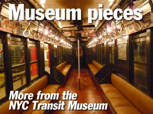
Car #6095C, one of three BMT D-Type Triplex cars in the Museum; built in 1927, these cars were mainly used in southern Brooklyn on the routes going to Coney Island such as the Brighton (today’s B and Q) and West End (today’s D), as well as 4th Avenue local (R). These cars were the first that were built to show a route designation in the front (in the 1920s up to the 1960s, BMT routes carried numbers) and twin lamps in the front (various combinations of red, green, yellow, white) that were used to signal route designations. This system lasted well into the 1980s and was handy in stations that supported several lines. for example, when waiting at DeKalb and saw a train approaching the station in the tunnel, I could identify and R train from two green lamps on the top of the car in addition to the headlamps. (Why modern traincars weren’t built with this feature is a headscratcher.) The trains are called “triplexes” because they consist of three articulated, or attached, body sections. Since 1940, no articulated cars have been purchased for the NYC subways, though bringing them back is an interesting idea, since it would make it easier to move through cars (think of the 2-section articulated buses in use on certain routes around town).
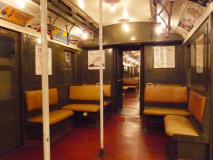
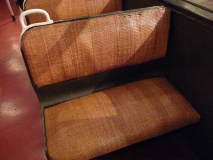
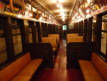
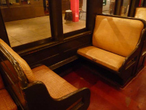
The Triplexes were in continuous service for 38 years, between 1927 and 1965. Think of standard subway car decor between then and now — these older cars are reminiscent of the golden era of railroading, with olive green riveted metallic surfaces, wicker seats and incandescent lighting. Compare the modern R143 and R180 cars — they look like dentists’ offices.
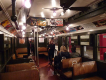
In many cases, period advertisements have been preserved. I can make out a few: My-T-Fine pudding, which is still around; the old Fu Manchu Restaurant, which was at 108 West 49th Street (now occupied by 1251 6th Avenue, a.k.a. the Exxon Building, though Exxon moved out long ago); Griffin Liquid Wax shoe shine liquid; the Duplex Cocktail Lounge, Beverly Hotel, Lexington Avenue at 50th Street (still there, now the Benjamin Hotel); and there’s the eternal Wrigley’s Spearmint Gum.
Can you imagine a modern-day seating arrangement like this on a subway car? Newer Long Island RR and Metro-North cars have facing seats like this; it’s a more anonymous age and except in the case of calamity, there’s not much interaction going on. This is the #1407 “BU” elevated gate car used on Brooklyn Rapid transit elevated lines beginning in 1903, making them the oldest in the Museum collection. The name “BU” comes from the Brooklyn Union Elevated, one of the last elevated train companies in business before the BRT was organized in 1912 and absorbed the other lines.
The cars have woodframe bodies and though they are stored on the Museum’s underground tracks they have to be pulled by steel cars and by law, passenger cannot ride in them while they are in the tunnels. They have been used for outdoor excursions in the modern era. Some of them were in use on the Myrtle Avenue El until 1969, but they had to be converted to closed cars to run there — they had been built with open platforms in which a trainman opened or closed gates when entering or leaving a station.
Orange Crush soda has been around for awhile. The company was founded by Clayton J. Howel and Neil C. Ward in California in 1911. These days the line is called simply Crush because over the years, other flavors have been produced such as grape, strawberry, cherry and pineapple. The name was also supplied to the Denver Broncos’ defensive side in the 1970s, as the Broncos wear orange, blue and white.
Sunkist, another venerable brand name, has been in use since 1908:
In its early years, the primary problem facing the California citrus industry was an oversupply of fruit. By 1907, California was producing five times the quantity of oranges it had been fifteen years earlier, and orange production was continuing to grow as newly planted orange groves began to bear fruit. In response, in 1907 the California Fruit Growers Exchange (now Sunkist Growers) approved the first-ever large-scale advertising campaign aimed at advertising a perishable commodity. The March 1907 campaign, which marketed oranges to Iowans as “healthy” and “summery,” resulted in a 50% increase of orange sales in that state. It also launched the Sunkist brand: the ad agency Lord & Thomas originally proposed using the adjective “sun-kissed” to describe the CFGE oranges; the word eventually used in the campaign was Sunkist, made up by the agency so it would be easier to defend afterwards as a trademark. wikipedia
In the earliest elevated and subway cars, handholds were canvas straps, which is where the word “straphanger” comes from. The newest buses have brought back soft straps, but those are made of vinyl or plastic.
1612C is a Q-type elevated car and is the same car as the “BU” elevated gate car built in 1903, but with the end gates enclosed to make it operable in tunnels, as it did when the Qs were produced beginning in 1938 to run on the Flushing Line to the World’s Fair of 1939-40. Later, the Qs were employed on the Myrtle Avenue El until service on that line came to an end in October 1969. It’s intriguing to think that while men reached the moon for the first time and the Mets were driving to their first pennant, the Myrtle Avenue el still was a stalwart. FNY acquired several photos of the Myrtle in action a few years ago.
Car 4902 is an IRT “Low-V” first produced in 1916. Low-V cars took power from 32V battery voltage units connected to 600V circuits beneath the car, while previous cars featured 600V units directly controlled from the motorman’s cab. The Low-Vs provided a much safer environment for the motormen as they no longer had to come so close to 600 volts of power. Like the Q-types, Low-Vs were in use on IRT lines until 1969.
The Low-Vs were pioneers in the longitudinal seating model that has been used for all new subway cars produced since the early 1980s. I much prefer seating that allows a look out the window, especially on elevated lines but also on subways — I have a hawkeye out for stations, seeking old features or irregularities. Longitudinal seating permits clear views only to your opposite seatmate and his chicken bones.
The ceiling ads next to the fan hawk Royal Baking Powder and Lifebuoy soap. Royal was produced as early as 1866 (in 1929 it merged with another company to form a huge food conglomerate, Standard Brands); Lifebuoy was introduced by the Lever Company in 1895, and ads for the soap produced a couple of the funnier moments in pop culture — ads popularized the abbreviation “BO” for body odor and employed a 2-note foghorn call on radio commercials, which was quickly picked up in Looney Tunes cartoons. Meanwhile, an ad campaign in Philadelphia proclaimed that “The Phillies Use Lifebuoy” but almost inevitably, a reprobate scrawled “and they still stink” under the headline. As heavily advertised as Lifebuoy was on TV till late in the 20th Century, the brand is no longer available in the USA.
Meanwhile, an ad on the far left advertises Burma Shave cream, which was popularized by a series of clever roadside ads in the early and mid-20th Century. Six signs in succession would show a clever jingle, the last lines of which would always be “Burma-Shave.”
The earliest subway maps were hand-drawn and hand-lettered and depicted only the subway division in whose cars they appeared. The Interborough Rapid Transit and Brooklyn-Manhattan Transit were competing companies separate from each other, even though in some cases they ran in different parts of town. It should also be mentioned that while the IRT controlled subways and els, the BMT ran subways, els, surface lines (trolleys) and buses. In 1925 the city began building its own Independent subway, and purchased the other two lines in 1940 to unify the subways.
The unification allowed comprehensive subway maps showing all three divisions to be produced. The handsomest was probably produced by the Hagstrom Map Co. beginning in 1948.
The unification was chronicled in subway posters by “Subway Sun” artist Amelia Opdyke “Oppy” Jones.
Examples of wonderfully simple black and white enamel IND signs still abound in the Court Street station and look as clean and new as they were when the station was briefly open to real subway traffic. With IND signs, simplicity was the rule in opposition to the “busier” Beaux Arts and Arts and crafts station art and signs installed between 1904 and 1928. The IND also had a font all its own that, as far as I know, has never been digitized. Some enterprising designer should get cracking on lowercase letters and punctuation. There’s already a condensed version! Somebody run with this.
Samples of station signage from previous eras are also exhibited. Both of these come from the IRT. The original 137th Street station (#1 train) cartouches, described thusly by Phil Copp in Silver Connections, Part 1:
…rectangular ceramic plates, complete with cornucopias and piles of fruit, adorn these old walls right below the cornice. Like the cornice, the numeral plates are cream, and the panel with the trapezoid handles to either end, upon which the cream-colored “137” numerals are displayed, is a thin olive green.
Unfortunately in the 1970s, when streamlining in design was still the rage, the MTA ripped out the “old-fashioned” stuff and made the station look like a McDonald’s men’s room. I actually support a nice modernist design for a new station, but what they did to 137th Street is ridiculous. However, as I’ve said, you can look back on the Streamlined 70s with some nostalgia.
The present Cortlandt Street station in which this blue/green mosaic directional sign was found was destroyed on 9/11/2001. The station is directly amid a construction zone and is not slated to reopen until several buildings on site have been finished.
When the IRT Cortlandt Street station opened on 7/1/1918 these Squire Vickers-commissioned mosaic plaques depicting the old Cortlandt Street ferry to Jersey City. They were removed in a station renovation several years before 9/11. When the station does reopen, perhaps a home for this Transit Museum piece could be found there.
This is an example of the sort of “cluttered” (I find it informative) station signage that Massimo Vignelli and Unimark eliminated when they simplified the signs and issued them in Standard (and later Helvetica). The Brooklyn-Queens Crosstown is now known as the easier to remember “G train.” I’d imagine this sign had been installed at the Hoyt-Schermerhorn station, where you can switch to the A train for service to Manhattan, Queens, and a connection to the Bronx at Columbus Circle. Exiting the A at Jay got you to Brooklyn Boro Hall, while switching to the F at Smith-9th got you to Church Avenue in Brooklyn’s Kensington section. (The G has now been extended to Church Avenue; the former G route was Smith-9th to Continental/71st in Queens).
4/26/15
