

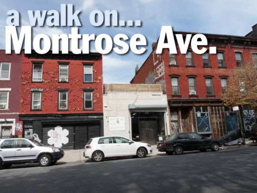
A few weeks ago I walked Meserole Street west, then Montrose Avenue (which is a block south of Meserole) east, then Bushwick Avenue as far south as the Aberdeen Street station — after a few years I thought it was time to update my Bushwick Avenue photos, which had been taken in 2000 or so when different technologies were in place and the photos were small and indistinct; I have a superior set now. I have already recorded Meserole Street in FNY, and am in need of a feature that’ll be relatively short and easy, so it’s Montrose Avenue’s turn in the spotlight.


I walked Montrose Avenue between Lorimer Street and Bushwick Avenue, which is the entire length of the street, less two blocks. For completeness’ sake, I’m including this screen capture of the beginnings of Montrose Avenue at Broadway. Just east of here, South 5th Street makes a “V” with Montrose as it ends its eastern run.
I do not know who Montrose Avenue is named for; Leonard Benardo and Jennifer Weiss’ otherwise excellent Brooklyn By Name, which is handy but not comprehensive, is silent on it. A prominent Brooklyn architect in the 19th Century was named Montrose Morris, but if a street was named for him it’d be Morris Avenue. I’d imagine Montrose owned land in these parts when the street grid was being drawn up by the governmental body in charge at the time in the mid-1850s. According to the Eastern District, which describes the streets of Williamsburg and Greenpoint in the mid-1800s, Montrose Avenue was first laid out in 1850 between Union and Bushwick, and was extended a bit west and east in succeeding years.


East of Lorimer, across from Sternberg Park, are a pair of brick buildings that appear to be the same style as the Joseph Fallert brewery offices on Lorimer Street around the corner. The brewery itself is still standing on Meserole Street. Both buildings are occupied by Cheung’s Meat Wholesale.

A bit further east are a trio of brick buildings, with the left one altered considerably, the center pretty much left alone except for the gates and window guards, necessary in these parts. The brick building on the right, #71, has some interesting fading painted signs: “Home of Korbro Salad Oil” and on the ground floor, “Montrose Smoked Fish Corp.” The writing above the 2nd floor is too faded for me to make out.
Korbro was involved in a misbranding case in 1934, so I imagine the sign is from the same general era.


I know this about NE corner building at Leonard and Montrose: It’s been here since the late 1800s, is painted blood red, and has a pair of chiseled cross street signs. Before the advent of lamppost-mounted signs, these were the main street identification.

Another pair of bright brick-red buildings are interrupted in the center by the Brooklyn Ball Factory, described by the NY Times as a “Japanese comfort-food joint and coffee shop” that opened in 2013. The building once hosted a can recycling plant. It has earned reviews of 4 and 5 stars in yelp.com. I had been under the impression that the place was once a “Spaldeen” factory, but the name refers to the meatball dishes available there.


Along the same row are a pair of classic Brooklyn building fronts. Looks like 1977 and we just had a blackout!


#101 Montrose, between Leonard St. and Manhattan Avenue, is a yellow-brick with brown-trim wonder, with what could be its original wrought-iron stoop railings. Like a couple more buildings along this row, it appears unchanged for decades.

The twin spires of Most Holy Trinity Church between Graham and Manhattan Avenues can be seen from all over East Williamsburg. More on this church anon.

This red brick building with the classic 1977 ground floor boasts some faded writing above the 2nd floor; it’s perhaps a palimpsest of two sets of writing. In any case, it’s too illegible to be read anymore.

Storefront church, NE corner of Montrose and Manhattan Avenues. Samaria was a city in ancient Israel in the 8th and 9th Centuries Before Christ.


Like a magnificent Gothic cathedral, Most Holy Trinity/St. Mary’s Church rises on Montrose between Manhattan and Graham Avenues. The parish was founded in 1841 (land for the church had been purchased from the Abraham Meserole farm), this church was constructed in 1882, and the parish merged with St. Mary’s, a few blocks away at Leonard and Maujer, in 2007. There are many secrets within, including the crypt-like resting place of the parish’s two founders. The church is affiliated with Most Holy Trinity Cemetery in the Brooklyn-Queens cemetery belt, accessed at Central Avenue and Pilling Street in Bushwick.
The church’s website is comprehensive — though you have to hunt and peck for awhile. For example, here’s a page explaining East Williamsburg’s street names: Maujer, Siegel, etc. The parish history can be found here.


For more exquisite neo-Gothic greatness there’s the Most Holy Trinity School next door, reconfigured as the Sts. Joseph and Dominic Catholic Academy of Williamsburg in 2005. Note the stained-glass sign over the front entrance and the intricately carved lettering on the cornerstone. Due to budgetary cuts, the academy closed in 2013


For now the Latin inscriptions in ecclesiastical blackletter will remain on tablets by the front entrance.

The parish convent is a sober, red-bricked, 5-story expanse on Graham and Montrose Avenues. I have always loved solid brick construction like this.

Olly Oxen Free, a vintage clothing shop, is directly across from Most Holy Trinity at #137 Montrose. The name comes from a phrase used in children’s games such as hide and seek, capture the flag or kick the can to indicate that players who are hiding can come out into the open without losing the game, that the position of the sides in a game has changed (as in which side is in the field or which side is at bat or “up” in baseball or kickball), or, alternatively, that the game is entirely over…
…the phrase may be derived from “All ye, all ye ‘outs’ in free,” “All the outs in free” or possibly “Calling all the ‘outs’ in free;” in other words: all who are “out” may come in without penalty…the phrase may [also] be a corruption of the German Alle, Alle, auch sind frei. wikipedia


Another very old corner walkup at Graham and Montrose, and again marked by the presence of chiseled street signs.

Once a bodega that offered hot food on the NW corner. Such shops are generally marked by awnings and signs featuring the colors red and yellow.

“Privilege sign” on Graham north of Montrose. The names of the original owners are at left. The paint manufacturer paid for the sign with the stipulation that their name went on the sign.

Passing Brooklyn Mac, 173 Montrose, I initially thought computer repair, but instead it’s a macaroni and cheese joint. “Comfort food” with just a hint of a hipster vibe has been catching on lately, as with Queens Comfort and Queens Kickshaw (grilled cheese sandwiches and vegetarian menu) in Astoria.


Passing Humboldt Street, on the right heading east are some more buildings that must appear much as they did when built in the late 19th Century, including #200 Montrose, a fragile-looking wood frame building that, though it’s been resided in aluminum, has been allowed to retain detail on the front porch and on the sloping roofline. A street tree must allow surcease from heat on that porch even in weather like we had in August and September 2015, e.g. a blast furnace.
You can skip over adjoining #202, since it’s modern 21st Century junk, but then you come to #204…


A five-story Italianate-style masterpiece in pristine white with black trim. Its owners have preserved what must be most of its original detailing especially around the windows. A pediment over the door is echoed by smaller ones over each window. I gather from the real-estate sites that it was converted to condos in 2006. A one-bedroom rental is $3600 or thereabouts (a condo here costs $600K), and I shake my head when confronted with these numbers. I took an apartment in Bay Ridge in 1982 in a railroad flat in a similar building for $300 a month.

Twitter® expressions like OMG (“oh my God”) are making their way onto restaurant and bar names, like this one, a taco joint at #213 Montrose.


A surviving curved-mast with bracket light post on Montrose between Humboldt St. and Bushwick Avenue. At the dawn of the octagonal-post age in 1950 nearly all such posts had these kind of masts, but they were soon supplanted by straight masts with no brackets. There are a couple of dozen masts like this remaining in NYC — they are secreted in out-of-the-way neighborhoods or under elevated trains.


A pair of yuppie-friendly buisnesses on Montrose near Bushwick: an Italian-themed bakery/cafe and a java joint called Cup.

Subway entrance for the L train at Montrose and Bushwick. The classic, albeit decrepit sign and the storefront gates make this look like a classic East Williamsburg scene circa 1977, but it’s actually 2015. More about the subway station a little later.


One more Italianate-style 4-story walkup with yellow brickwork and an enamel “Montrose Avenue” sign.


The BMT subway connecting 14th Street in Manhattan was built in stages from 1924-1931, with the westernmost terminal at 8th Avenue built in 1931 and the stations between 6th Avenue and Montrose Avenue opened on 9/21/24 and from Morgan Avenue to Broadway Junction on 12/14/28. The line between Broadway Junction and Rockaway Parkway runs on an elevated line that replaced an at-grade steam line in 1906; one at-grade station remained on East 105th Street until 1973.
When the Canarsie Line was built, the arts-and-crafts mosaic method of creating station ID plaques was beginning to look old hat, and the artist in charge of subway ID and signage, Squire Vickers, was already designing the uniform, regimented Machine Age look of the IND subway, whose stations opened between 1933 and 1950. Thus, perhaps, Vickers was going for a last splash with the Canarsie Line, as the mosaics in its stations were the boldest and most exquisitely rendered of any IRT and BMT stations that opened for business between 1912 and 1928.
Unusually, the ID plaques in this station feature two different heights of serifed lettering; I don’t know why it was done like this, because there was room to vary the heights of the boxes. But that’s not the real story; the box itself is mostly blue, with occasional darker blue and brown; the thin border is yellow and orange, but not with machine-like orderliness that Vickers would soon adopt, but there’s a random quality: occasionally two yellows in a row, or two oranges; and then there’s the earth-toned outer border, with khaki insterspersed with gold.

The bands that line the top of the station walls echo the plaques somewhat, with blue/dark blue/brown field supporting panels of mosaics cut to different shapes and sizes to form a complete whole, rectangles, squares and triangles. Light blue, pink, white, and gold are the dominant colors.

In most BMT stations a single letter or number was used as a secondary form of IND. Here at Montrose Avenue, a hexagon containing a mosaic M, flanked by columns of light blue, appears on the blue/dark blue/brown fields.

Long-closed bathrooms also got the deluxe mosaic ID treatment.
Masterful stuff. I wish Vickers hadn’t abandoned the style after this.
11/1/15