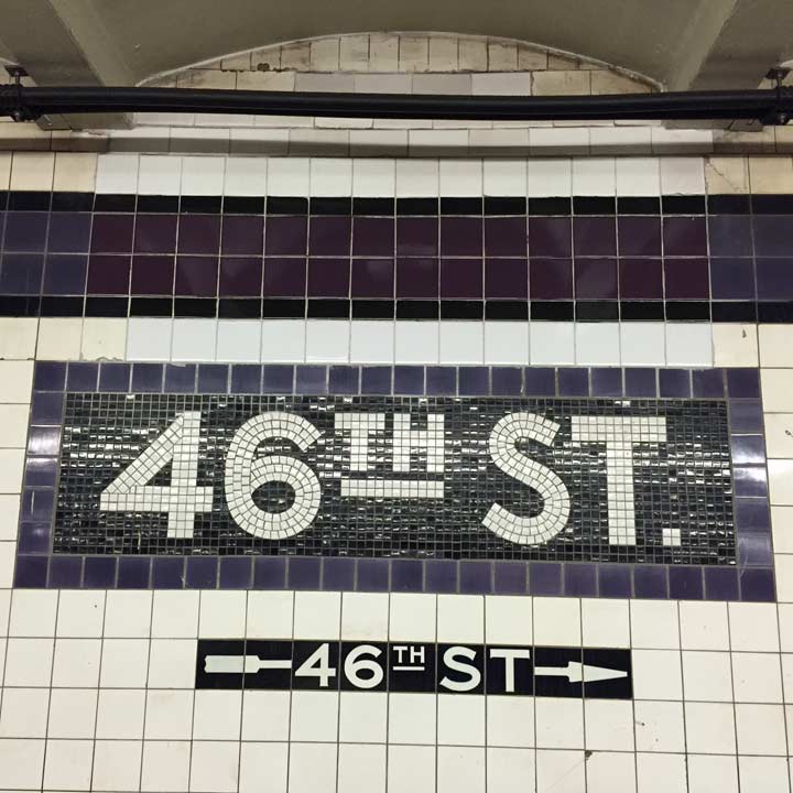
We’re fortunate to have a subway system old enough to have several different design schemes imprinted on it. The Earth is about five billion years old, old enough so that critters from several paleontological ages are still running or swimming around, like jellyfish, honey bears, Galapagos turtles and Vince McMahon. Similarly, when the subway first appeared in 1904, Beaux-Arts and its exquisitely crafted and ornamented architecture was current. A few years later, a more humble “Arts and Crafts” regime took over, with its mosaics and tiles. The regimented Machine Age followed, and most subway stations built in the 1930s and 40s looked the same, except for the colors. After that the streamlined International Style took over, a subway stations built during that time were all burnt orange, brushed steel and Helvetica.
I’m putting in a good word here for the Machine Age style used for most stations in the Independent Subway built between 1925 and 1950. The nameplates are big and bold and the colors eschew pastels and subtlety, announcing themselves like a rush hour express. It isn’t mentioned much in the subway books but I also like the directional signs in black and white, in a font resembling Copperplate but not quite. These are stations of their time and it’s miraculous that most of them remain as they were built, some of them now over 80 years old.
12/15/15