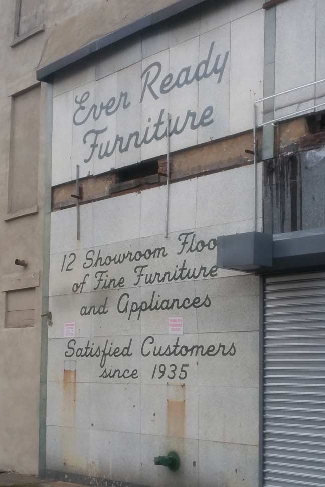
I admit, I learned cursive writing in grade school but I haven’t used it since, except to write my name (I am one of those people who try to make my signature readable). I had problems when I was learning it. I’ve always been a print guy and I’m very fond of my handprinting. I could even digitize my printing and make it a font. Cursive, though, I rebelled against because some of the letterforms bore no resemblance whatsoever to their printed counterparts. Look at that cap A. Cursive cap A’s are ridiculous: the printed versions look like inverted V’s with a crossbar, and that’s how I always envision them.
Cursive, like shorthand, arose as a way to write fluidly and quickly. It’s gradually lost traction over the decades; look at letters written in the 18th and 19th Centuries, and you’ll see some genuinely gorgeous handwriting. Today, bored kids raised on it usually follow my course and drop it as soon as they don’t have to use it anymore.
There are various typefonts that imitate cursive writing, like on this ad for a long-departed furniture store on Quincy Street and Broadway at the undefended border of Bedford-Stuyvesant and Bushwick. It probably has not been there since 1935, but it’s certainly been there since at least the mid-1950s. It was covered by a garish neon restaurant sign for a couple of years.
Photo: Gary Fonville
5/5/16