I admit it — I have been quite bullish about the subway lately in light of the three new 2nd avenue Subway stations that opened January 1, 2017, and the new Hudson Yards western terminus of the #7 train that opened in September 2015. Let me clarify by saying I’m bullish about subway station design. The service? As the late WABC radio host Bob Grant used to say, and current host Curtis Sliwa says, “oo-fah.” I was working on the east side in early 2017 and the 7 and E trains each had their problems. NYC was the first, and is still one of the few, subways in the world to offer express service, and when the express works, it’s the 8th Wonder. When there are mechanical problems, “sick passengers” and broken elevators, the system shows all of its 113 years as of 2017. Decisions on the part of management are also problematic. What Rhodes scholar at Court Square prefers to keep the escalators turned off in one of the steeper transfers in the whole subway?
In my wanderings around town, I have gotten into the habit of snapping the subway station where I get off to begin, and the station where I begin my journey home when I’m finished. Thus, there are a number of subway photos I’m not doing anything with, and thus, I decided to use them for “grab bag” pages in which I give my impressions of the design and hopefully, provide some information about the station that you didn’t know.
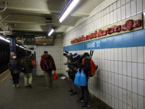
Grand Street (IND)
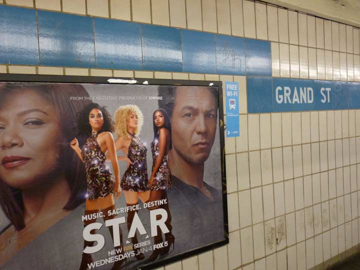


One of two Grand Street stations in the NYC subway (the other one is on the L line), this is the only new station opened on the Chrystie Street connection; another new station on 6th Avenue, the former northern terminal of the B, F, Q and KK trains at various times, was opened at 6th Avenue and 57th street next year. Today the F continues past it en route to Lex/63rd, Roosevelt Island, 21st/Queensbridge and the Queens Boulevard IND.
The Grand Street station is very plain, typical of 1960s decor sensibilities, with plain beige wall tiles and a blue color band with the station name. Concurrently, several IRT stations were having their platforms extended, and this same wall tile design was used for those extensions.
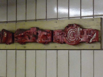
Grand Street does have a bit of subway art to break up its monotony, relief subway car friezes mounted on wood by artists Andrea Gardner and Sally Heller called “Trains of Thought.” The cars are stylized and a little hard to make out, and originally I thought there was a Chinese theme (there is in the BMT Canal Street station).
Canal Street (Lex IRT)
Canal Street is named for a 19th-century canal created to drain Collect Pond, which was in the present Foley Square area. The originally freshwater pond was used by early colonists as a refuse and offal dump, and by the early 1800s it had become a stinking miasma. Eventually the canal had served its purpose and Canal Street was built on its old route. It has become a main truck route and a mecca for discount stores.
There are no less than six NYC Canal Street subway stations: IRT 7th Avenue (#1) at Varick, IND 8th Avenue (A, C, E) at 6th Avenue, BMT Broadway express and local (J, M, Z), BMT Nassau Street line at Centre Street, and the very first, built here in 1904 at Canal and Centre Streets, served by the #6.
Though Canal Street has a couple of layers of renovations from various decades, a few original elements remain. The station sports a green scheme overall. As this picture shows, the original subway was built just below the street, allowing sun to pour in from skylights that were part of the station design. They were blocked up long ago, though at certain stations the sun streams in from breaks in the sidewalk.
The Canal Street station cartouche (right) like others in neighboring stations, was originally fired by the Atlantic Terra Cotta Company in Staten Island (in fact, a small stop on the Staten Island Railway is named Atlantic, since the factory was nearby). After 100 years the finish on these cartouches still shines. The “C” on the cartouche is accompanied by two poppy flowers.
The 1904 stations were quite short. At the beginning, trainsets were only a couple of cars long, so at present, original station artwork takes up only a small area in the modern-day station. Later subway architects who took up the mantle from original subway architects Heins and LaFarge such as Squire Vickers applied an Arts and Crafts sensibility, with mosaic plaques depicting area histories, to subway stations he designed. The extension at Canal Street, though, finds him exploring a more streamlined side that he would fully employ in the IND, built in the Machine Age, ushered in by the 1925 Paris Exposition.
Vernon-Jackson Avenue
U Thant Island
Finally, August Belmont, one of the founders of the IRT, built the tunnels between 1907 and 1909, with the excavated earth becoming Belmont Island, later U Thant Island in the East River. Once completed, the tunnels were promptly close as Belmont did not have a franchise for a new subway project. The city purchased the tunnels from him and developed them for subway use in the 1910s as part of the Dual Contracts project that opened several BMT and IRT lines in four boroughs.
The line was built east from Grand Central, the easternmost stop in Manhattan, starting in 1915 and by 1917 stations out to Corona Plaza (103rd Street) were complete. 111th, Willets Point, and Main Street Flushing (now the busiest “outer borough” station in the system) were completed between 1925 and 1928. The line also expanded west: 5th Avenue and Times Square, the western terminal for nearly 9 decades, appeared in 1926 and 1927. One more western addition was made in 2015 (see below).
The Flushing Line, much of which celebrates its centennial in 2017, has some odd quirks. It connects with no other IRT line but it does have a BMT connection, at Queensboro Plaza, where a spur from the old 2nd Avenue El also terminated. Though the Flushing was an IRT line, BMT elevated cars used it for several decades. In 1949, the BMT took over the Astoria Line while the IRT kept the Flushing. It’s also the only elevated with platforms long enough to take 11-car trainsets, and it was the last line to regularly use R-33 and R-36 “redbird” cars, until 2003.
The underground stations of the Flushing Line were built at the peak of the Arts and Crafts-style mosaic design period; they were created by chief subway architect and designer Squire Vickers. The style used multicolored mosaic tiles banded at tops of walls and in station ID plaques. Some of the stations created during this time were subdued, with earth tones and dark blues, but here, Vickers “let himself go” and used much of the spectrum with blues, golds, greens and brick reds. Station names were white against a field of blue mosaic tiles with multicolored borders.
Vickers (1872-1947) was handsome and mustachioed when he first began to work in the NYC subways at age 34 in 1906; he would remain in NYC employ as designer and architect until 1942. He was a Cornell University graduate and studied in their school of architecture, and was an accomplished painter and poet living in a cottage in Grand View-on-Hudson in Rockland County.
Vickers, quoted in Subway Style (NY Transit Museum 2004): “it is not enough that our stations should be sanitary, commodious and convenient — they must at the same time present a cheerful and attractive appearance to the public.”
The station name also preserves a former street name: until about 1920, Vernon Boulevard, which parallels the East River, was called “Vernon Avenue.” The origin of the name is unclear, though it may honor Mount Vernon, President George Washington’s mansion in Virginia.
South Ferry
The architects of subway stations that opened between 1904 and 1908, including the flagship City Hall station that is closed to the public except for sanctioned tours, were George Lewis Heins and Christopher Grant LaFarge, who also designed the massive Cathedral of St. John the Divine in Harlem and the original Astor Court buildings of the Central Park Zoo. Heins and LaFarge incorporated several design items they used at the Bronx Zoo into the City Hall station. These included such techniques as arches, vaulted ceilings, and polychrome tile.
In several stations, ceramic tiles and plaques were specially designed to be appropriate to the station name. For example, the Astor Place station incorporates beavers on the plaques, and namesake John Jacob Astor made his millions in the beaver pelt trade. Columbus Circle incorporates sailing ships in the station motif.
So too at South Ferry, where the plaque depicts not a ferry but a graceful sloop in what could be Upper New York Bay, with billowing clouds and a seagull for company. They’re also among the largest plaques created by H&L in their stations, at a good 14 x 23″, not a Fibonacci ratio but close.
There is also an inner track and platform at South Ferry built in 1918 no longer used for passenger service except on special occasions. It connects to the Bowling Green station serving the #4-5 trains and is used when construction or restoration precludes the use of trackage.
Like the now-closed H&L City Hall station, South Ferry is a semicircular station. To mitigate the large gap between car and platform and ensure passenger safety, mechanical gap fillers were installed several decades ago. These signs alert motormen on how to proceed when entering. The station was never extended, unlike many other IRT stations, and thus only the first five cars make the platform.
This station was actually replaced by a new one (with a somewhat boring all-white esthetic, somewhat relieved by mezzanine artwork) in 2009; however, it was destroyed by Hurricane Sandy in October 2012. The MTA prefers to retire the H&L South Ferry station because it desires a modern station where all cars platform, among other elements, and thus has been rebuilding the new South Ferry station, which is expected to reopen in 2017. Perhaps this classic can be reimagined as a Transit Museum outpost.
Another somewhat lesser-known relic is preserved at South Ferry. For a time in the 1980s, the MTA was using Helvetica Bold Condensed on some station signage, especially on supporting columns. It has since replaced most of those Condensed signs, but South Ferry still has several.
Morgan Avenue
These 1924-1928 Canarsie subway stations represent Squire Vickers’ mosaic tile work at its most assured, with bold colors and station ID tiles. Morgan Avenue features primarily browns and golds, though different colors appear at other stations.
9th Avenue
In fact the BMT designed over a dozen new station houses for open-cut lines like the West End Line (D train) is here, Brighton (Prospect Park and Parkside Avenue; Q) and on the Sea Brach (N train). For decades they languished; the 9th Avenue buildings front entrance was boarded up for years. Now they’re being refurbished and will soon take their place among Squire Vickers’ other great subway works.
A look from the south end of the Manhattan-bound platform toward the station house. As part of station renovations from 2012-2015, new lamp stanchions were added that came close in appearance to the originals, and new station ID signs that resemble fat versions of the lamp stanchions were installed as well. The center express track is unused at present.
There is an unused lower level, complete with mosaic tiled and enamel signs, that connected to the Culver El that when originally built, diverged from the 5th Avenue El , ran in a right-of-way along 37th Street and then down Gravesend (later McDonald Ave.) to Coney Island. When the 5th Avenue El was razed in 1940, the line became a shuttle originating here; it continued until 1975, with the unused structure remaining in place for the next 10 years.
Atlantic Avenue (IRT)
A contrast in station signage as a 1908 colorful mosaic plaque in maroon, blue and pink abuts a more prosaic black and white Unimark-style MTA sign.
96 Street (IND)
All local stations received brightly colored color mosaic “plaques,” most of which were bordered by a different color, and station names in black or white. At first it seems that the colors were arbitrarily selected. However, all the local stations between two express stations received the same color; a different color is used in subsequent local stations.
When the Brooklyn-Queens Crosstown Line, then the GG, now the G, was built beginning in 1933, no expresses were built except at Nostrand (where a shelved connection to a “second system” IND network of stations was supposed to have a transfer. Thus, all Crosstown Line stations are light green in color.
A few stations on the 8th avenue Line (A, C, E) have gotten new versions of the IND-style plaques as part of renovations. They come close, but can’t replicate that original IND font, which I’ve never seen anywhere else.
72nd Street (BMT)
Though I’m not crazy about the white-on-white design esthetics espoused by the MTA for its most recent stations I applaud the consistency of design of these stations: each has a separate set of art created by one singular artist, curtains on the railings that use the traincar colored ID bullet as a theme, even if these have been deemphasized on the cars over the past decade; and the reinvention of the sidewalk entrance kiosk.
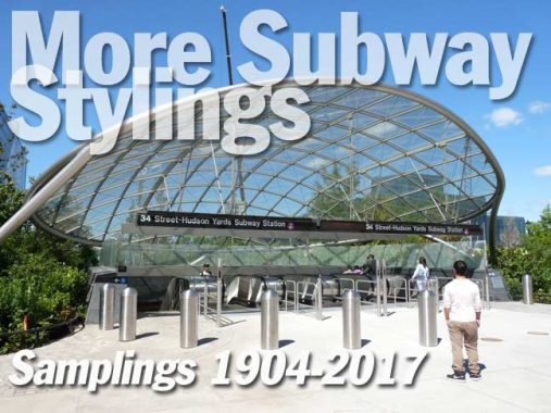
34th-Hudson Yards
Hudson Yards is the largest private real estate development in the history of the United States and the largest development in New York City since Rockefeller Center. When completed in 2025, 125,000 people a day will work in, visit, or call Hudson Yards their home. The site will include more than 18 million square feet of commercial and residential space, state-of-the-art office towers, more than 100 shops including New York’s first Neiman Marcus, and a collection of restaurants curated by Chef Thomas Keller. The urban development will include approximately 4,000 residences, The Shed, a new center for artistic invention, 14 acres of public open space, a 750-seat public school and an Equinox® branded luxury hotel with more than 200 rooms—all offering unparalleled amenities for residents, employees and guests.
The new 34th Street/Hudson Yards station has been planned since 2005 and took seven years to complete (given the additional tunneling, electric work, etc). By contrast, the Original 28 stations on the IRT took four years to build (1900-1904). A test run with NYC Mayor Michael Bloomberg and other city and transit officials took place in 2013, but it took two more years to complete the station. It’s the first new trackage built to IRT specifications since the #3 train was extended to Lenox Terminal at 148th Street in 1968. No stations were built between Times Square and Hudson Yards; transit advocates had pushed for a station at 10th Avenue and 41st Street, but the MTA demurred, citing budgetary restrictions. Nevertheless, allowances were made in the tunnel that added room for a station, if money is found in future years to place a station there.
As far as design goes the station is very much of the moment as far as 2015 subway design is concerned with plenty of chrome and white. There are some elements that set it apart from other subway stations, though.
Like the new 2nd Avenue stations, Hudson Yards station is built deep underground, with a large mezzanine area above the platforms. Station signage refers to the new Hudson Boulevard, Manhattan’s newest north-south avenue constructed between 34th and 36th Streets and divided into East and West sections, along with a new Hudson Park. Hudson Boulevard West forms the west side of the park between West 35th and 36th. Hudson Boulevard may extend south when the yards are decked over as part of the overall Yards project.
This is also the first reference to High Line Park on MTA signage; the linear park opened in stages between 2009 and 2012 along the structure of the former West Side Freight Elevated line that was opened to railroad traffic between 1934 and 1980. FNY has covered it extensively.
The mezzanine is on the blasé side, with none of the commissioned artwork that appears on the SAS.
However, there’s a futuristic arch that leads to the escalator and elevator banks.
The escalator is among the system’s longest and deepest.
Hudson Yards is unique among subway stations in that it is the only station that boasts inclined elevators.
An incline elevator, also known as an incline platform lift or hillside tram, is an elevator that runs in a direction diagonal to the ground. Unlike a standard elevator, incline elevators can go up tilted grades, and can be used for both residential and commercial purposes. They are sometimes colloquially referred to as, or confused with, funiculars. The purpose of incline elevators is to provide accessibility to steep hillsides and inclines at minimal effort to the user. wikipedia
The same principle is used in those small home elevators you see in commercials that are attached to staircase bannisters. When I visited Pittsburgh a few years ago, I rode the funicular railways (the Duquesne and Monongahela Inclines) that climb the city’s steep cliffs. Those are pulled by cables and run on different principles than inclined elevators.
Hudson Yards only has one major artwork of note, but it’s a doozy, as Xenobia Bailey’s “Funktional Vibrations” appears in a large “oculus” above the entrance turnstiles, as well as part of the entrance kiosks.
For the mezzanine of the new station, artist Xenobia Bailey was commissioned to create three mosaic designs, one being a 2,788 square-foot mosaic mural called Funktional Vibrations—one of the largest mosaic works in the subway system, according to the Metropolitan Transportation Authority.
Bailey is known for her elaborate crocheted designs evoking African and Native American patterns. The fiber artist says her signature aesthetic is “the aesthetic of funk,” in a video for Etsy. [Artnet]
Hudson Boulevard East in front of the 34th Street entrance.
New-style subway entrance indicator globe stanchion at the new corner of West 34th and Hudson Boulevard East.
After some more of the new park and Hudson Yards are completed I’ll find a Forgotten NY angle. I’ll never actually get into one of the towers!
Will also have some more posts on subway styles soon, as well.
“Comment as you see fit.” kevinjudewalsh@gmail.com
2/5/17
