


March 2019 marks Forgotten New York’s 20th anniversary. To mark the occasion, I’ve re-scanned about 150 key images from the early days of FNY from 35MM prints. In the early days, when people including me were accessing FNY with dial-up modems, I had to save photos really small — in some cases, just 4″ across. I couldn’t find all those early photos — I think I foolishly discarded some along the way — but all month, and into April, I’ll be picking out some and showing the newly scanned versions.
I’ve only been to Chicago once, for a week in late August and early September 2001. I hiked up and down, rode the famed El, went to Oak Park to see the Frank Lloyd Wrights. I had a friend in town and, with some fellow rail buffs, we took a commuter line to the southeast part of town to see another Wright. I was only able to get a superficial knowledge for so vast a city, and I may return some day. I wish I had the wherewithal to travel more but for now I settle for NYC and its satellites such as Jersey City and Hoboken.
As is well-known to readers of Forgotten NY, New York’s streets were marked between 1964 and 1984 with color-coded signs, yellow with black letters for Manhattan, black/white for Brooklyn, blue/white for the Bronx and off white/blue for Queens. For reasons known only to the Department of Transportation, Staten Island replicated Manhattan’s yellow/black scheme. All streets were shown in Highway Gothic all caps, or Highway Gothic Condensed for longer names. It was all very simple.
By the mid-1980s, a Federal regulation stipulated that green should be used for all highway and street signs, believing green the best color visible for motorists in moving cars. The Feds further ruled about 20 years later that upper and lower case is even more readable; that assertion is dubious given what NYC’s DOT did, creating upper and lower case signs in Clearview and Highway Gothic that are tough to make out even at 5 MPH.
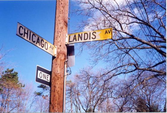
This is the best photo I’ve found in the Forgotten Collection form the early days of a pair of yellow Staten Island signs, at Chicago and Landis Avenues in Arrochar, Staten Island near St. John Villa girls’ high school. These are probably 1964 originals given that the paint has peeled, faded and chipped, but some of the brilliant yellow still shows up.
I ask you: why did the Feds consider this sign unreadable?
Check out the ForgottenBook, take a look at the gift shop, and as always, “comment…as you see fit.”
3/14/19