GRAND Central Madison, the new Long Island Rail Road terminal beneath the main terminal serving Metro-North rains, opened in early 2023 after about 20 years of construction. It’s truly vast, on three separate levels: the track level; the entrance concourse above it; and the main concourse above that–and that’s just the new construction. The main terminal in use since 1913 sprawls above that. After months of delay, I visited for the first time in October 2023 and, since I found wayfinding poorly marked, I took a truly lengthy route down innumerable corridors and staircases to the main concourse. It was only later that I found the escalator from the GCT food court to the main GCM concourse, and even later to locate elevators to the street.
Grand Central Terminal was saved from oblivion by preservationists after the demise of the original Penn Station, with celebs such as Jackie Kennedy Onassis leading the way. It underwent a top to bottom cleaning and restoration in the 1990s of which the most visible feature was the removal of the immense illuminated billboards from the center concourse with the clock, perhaps NYC’s greatest open gathering space. During those renovations, all the signage was replaced with perhaps my favorite serif font, Garamond…and they actually used the original Garamond, based on the font devised hundreds of years ago. I have been known to read books just because they were typeset in Garamond Old Style.
Over they years, though, various type designers have taken a crack at “reimagining” Garamond with results not exactly to my liking. (Don’t get me started on the inflated x-height ITC Garamond, produced by the company I was employed by, Photo-Lettering; those fonts seem dated today and are rarely employed anymore.)
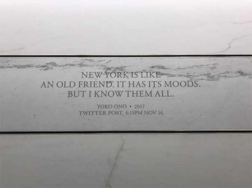
The entrance concourse of Grand Central Madison, with escalators to two levels of tracks, features quotations from famed New Yorkers, or in Yoko Ono’s case, transplants. Take a look at the quote by Yoko, shown above. The quotation itself is in one of the “New” Garamonds, but at least it’s Garamond. However, the caption beneath it is in a different font: Baskerville, itself a very old font, like Garamond.

Here’s another quotation by another transplant, painter Georgia O’Keeffe. Once again, it’s in Garamond. However, the attribution is also in Garamond, except for the date (1928) which is in Baskerville. If I were more OCD than I am already, this inconsistency would drive me nuts.

If you want to call this inconsistency sloppiness, you can, but I think it’s designed that way. Here’s some track level signage and most of it is in Garamond, Oldstyle this time, except for the numbers which are in Times Roman. I believe the numerals in Garamond Oldstyle are inconsistent in height because of ascenders and descenders (though I’ve seen signage elsewhere in GCT with Garamond numerals, perhaps some of the newer knockoffs have numbers of the same height).
OK, I’ll stop before all of you are asleep. I’ll do more photos from Grand Central Madison from time to time; I found fonts that look like Novarese, but aren’t…OK, I said I’d stop.
As always, “comment…as you see fit.” I earn a small payment when you click on any ad on the site. Take a look at the new JOBS link in the red toolbar at the top of the page on the desktop version, as I also get a small payment when you view a job via that link.
2/13/24
