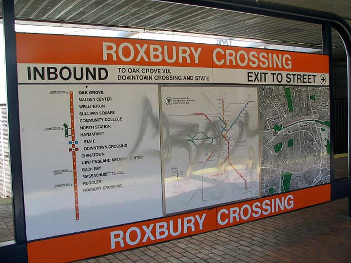
I’ve always preferred Boston’s “T” route maps to the MTA’s in New York (though apparently the locals disagree with my assessment). One one large surface, you have a line map, a system map, and a local street map. With some exceptions, you have to look in several different walls or surfaces for these maps in New York subway stations, and NYC doesn’t bother with line maps at all — likely because several lines can operate on one set of track. Boston’s subway predated New York’s, and on some lines, subway and light rail service is combined. At Park Street and other downtown stations, you can actually cross the tracks on Green Line stations as the light rail trains using the underground stations take power from overhead lines. This was a revelation when I first saw them in 1983!
Another bit of decor that Boston is able to do that New York cannot is assign an individual color to different subway lines. In New York, trunk lines carry colors based on what north-south avenue or street they travel under, but in the other boroughs different lines run on different sets of track on different roads; for example, the 2 (red) and 5 (green) share tracks in the Bronx.
In both cities, Helvetica is the font of choice.
12/21/15