The Swingin’ 60s were a fun time to grow up in Brooklyn, especially for kids like me, with a perplexing penchant for noticing changes in lampposts as well as subway signage. One day in 1962, the whole neighborhood’s 1920s-era Corvingtons had been hauled away and slot-shafted, curved neck Donald Deskey posts appeared.
Likewise, in 1969 or 1970 (the mind is hazy on that point) all of the BMT 4th Avenue and Broadway Line’s intricate mosaic signs and shiny tile bricks were buried underneath unending walls of white blocks, interspersed with Mondrian-esque rectangles of color accompanied by metal signs. Less than thirty years later, the MTA went to great expense to knock down the white blocks and expose the mosaics once again — with one exception, as we will see — but in Brooklyn, no such expense was warranted, and streamlined 1970 design still holds forth.
When you ride the subways, you’re riding in the world’s longest museum. From the Beaux Arts Heins and Lafarge stations of the early 1900s…to the Squire Vickers mosaic tiling that was in control from 1915 to 1928 … to the Machine Age IND stations of 1932-1948 — to the bland modern stuff seen at the end of the Jamaica Line extension from the 1980s — when you ride the trains you’re getting an American design primer, all for the ever-rising price of a MetroCard swipe.
You dig what you grow up with. I like the pop rock and soul music that sounds like what I heard from the Good Guys on WMCA and Daaaaaan Ingram on WABC. So, it’s no great stretch to think that I have a soft spot for these made-over BMT stations. More specifically I also like designs with bold colors. You get them with the 4th Avenue BMT.
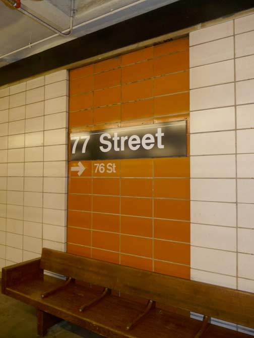
The color blocks on the BMT makeover were tomato red (or burnt orange, a favored color for subway station redesign in the 1960s — Bowling Green, 49th Street and Lexington Avenue on the F train Queens extension are awash in it); bright blue; golden yellow; and gray. What’s more, the Transit Authority redid the stations in rigid order of color.
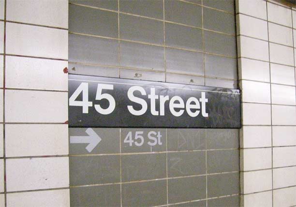
Originally, the metal signs indicating what stop it was were white with black lettering in the Standard font. In the 1980s, all stations changed the signs to black with a thin white stripe and lettering in Helvetica. However, the directional signs in Standard that were stenciled directly on the color tile were retained in the Standard font.
As you can see concrete peeks out from between the tiles. This was a design flaw because the concrete has become covered in soot over the decades.
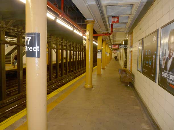
The stations on the BMT 4th Avenue were opened in 1915 and 1916, with the exception of 95th Street (1925). There are a few clues to the stations’ 1910s legacy still intact, such as the fluted filigree on the top and bottom of the columns …
…and the terra cotta “News Stand” sign in the station mezzanine. It was bricked up long ago and I don’t remember ever seeing it open.
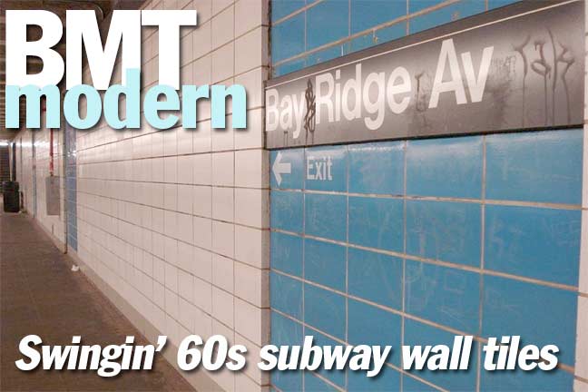
Some Bay Ridge Avenue bright blue.
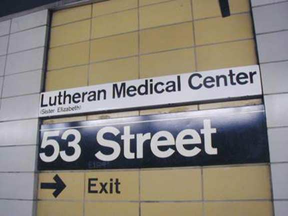
“Extra” signage is few and far between on the tiled signs but at 53rd Street is an indicator for nearby Lutheran Medical Center in the Standard font.
Some dull 45th Street gray. The Transit Authority should have chosen a cheerier color. Note the font difference between Standard (53rd) and Helvetica (45th)
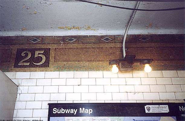
Sometimes, the TA left tantalizing reminders of the 1915-era design, especially oin the “token booth” areas, like the mosaic 25 and original light fixture.
Originally, the new tiling treatment was done all the way north to at least the 28th Street station (49th Street was given a special makeover — in burnt orange — by a group headed by architect Philip Johnson, and I’m not sure if 5th Avenue, which has local platforms, ever got the white blocks arrangement). In the 1990s, all Manhattan stations, except Rector Street, were returned to mosaic splendor.
Rector is a bit different — it was vouchsafed to keep one mosaic tablet. Also, the new black signs were done with Standard, not Helvetica, as you can see here.
Most photos from nycsubway.org
1/6/12




15 comments
5th Avenue definited used to have these white blocks, but I don’t remember the color (perhaps blue). Don’t know if 49th Street was redone before the 1979 Orange brick but it probably was.
One other change in the 1990s was that there is a station sign on every other section of color instead on every color portion. This was to reduce the sign clutter.
Union Street is a odd hybird, the Coney Island-bound side was re-redone in the 1990s with large square white tiles ut on top of these blocks, plus some odd artwork over each station sign. They never bothered with the city-bound side however, probably realizing it was a waste of time & money. Soon after they started taking down these walls in Manhattan. Union St. all has redone track-side wals in both directions was covered up in an unispired diagonal colored tile pattern on both sides.
Thanks for finding the good side of 1960s subway work that typically is forgettable.
I don’t like what they did with Union. Probably a long-lost German relation in me dislikes breaking the pattern.
49th Street was done up in burnt orange long before 1979. I remember it being that way from a trip into that station in 1974 when I was little.
And yes, 5th Avenue did have the ’70s work done as well, with blue as the color as I recall from the times I went through there in the 1980s.
Hi Kevin,
Check out the mezzanine at Bay Ridge’s 86th Street Station for a splendid example of a modern-day mosaic mural and yes there is an operational newstand right next to it.
Ted General
86th Street got tiled station walls for the first time in decades just recently ….
I grew up on Kings Highway, near E. 22nd, in the 60’s – My great aunt would come from Flatbush to pick me up, and then she’d have me duck under the red, painted, wood turnstiles at the Kings Highway station, to save the fare! Always let me stand up in the first train car to see everything as we rode along to Manhattan.
I’ve lived in Sunset Park since 1982 (46th St) and I agree with your assertion of the boring gray used for the 45th St station. I marvel at the beauty found in Manhattan, especially on the IRT lines…. just gorgeous mosaic and overall pleasant station ambiance. I have always felt the MTA has ignored this stretch of Brooklyn. I wonder why the 9th St station has yet to receive a worthy makeover, especially those long, dingy interchanges between the F and R trains. I doubt I will ever see anything different or inspiring given the negative financial climate the MTA is currently embroiled in.
It was a pleasure to read and learn more about this stretch of BMT stations that I have traveled for so many years.
As a 60’s kid, there is something comforting about the “Mad-Men” moderne Worlds Fair look that covered many of these stations. It was a brief period in time, and it brings back memories.
Man, those photos bring back memories! I also grew up near the 4th Avenue line in the 1960’s. Like all things, the times they were a changing. I still remember the old wooden turnstile at the 77th Street station (“tick….tick, tick, tick, tick”) a sound as familiar to me today as was any of the pop music from that era (circa 1968).
The old and the new were evident at those 4th Avenue stations: the old pillars near the edge of the platform and the new “mod” wall tilings.
I think the local stations along 4th avenue were rehabbed in late 60s/early 70s when the platfroms were extended to handle 10-car trains. I remember that the white on black Helvetica signs appeared c.1985 or so when the old RR line became known as the R.
I’ve wondered for some time now whether there are still any stations that have the huge metal revolving door turnstyles in operation. I seem to remember a few at stations without token booths- if memory serves they were quite prevalent in the lines that went through east new york.
I wonder how many of these long ago bricked-up newstand areas exist that could be reopened today to provide the MTA some extra funding. There are so many more people living in the 5 boros today that perhaps there will be enough demand to sustain them.
Just a thought.
Also, Kevin you have a great site. I’ve been following since at least 2005. Keep up the great work you do, subway posts are always a fave!
I lived in Bay Ridge from 1982 to 1987, and the color blocks and Helvetica white-on-black signage was all there in 1982. I believe the designer who chose the Helvetica was John Tauranac, who also designed the subway map that (with changes) is still in use. His genius was to color-code subway lines for the routes they followed through Manhattan. Thus all lines using the Broadway/7th Ave line are red, lines using the Nassau Street line are brown, etc.
I worked for the Transit Authority in downtown Brooklyn, and tended to alternate between taking the subway (crowded but fast) or the Third Ave. bus (got a seat, but slow). When I bought a (very small) house in 1984 on Madeline Court in Bay Ridge (check that out for “forgotten NY”), my boarding station became Bay Ridge Avenue, but the Third Avenue bus was a block closer.
KEVIN What ever happen to the plan to build the BMT across the narrows to Staten Island,I understand that there was a tunnel on the Brooklyn side started just before we entered the First War in 1917,wonder why it wasn’t re started after Nov 1918??????Any chance of a tour into that area or a book dealing with that subject(any do a book like that????)..
Thanks for Forgotten NY,live outside NYC(Wyoming)been gone since 1978….but Im still a former NY’er NEVER a X-NY’er!!!!!!!!!!!
If you go to the nycsubway.org website, you will note that the 5th Avenue/59th Street on the BMT Broadway line did in fact have a similar “refrigerator-tile” makeover.