The 28th Street station on the Lexington Avenue IRT (e.g., the #6 train) is one of what I call the Original 28 — the original 28 stations built by the Interborough Rapid Transit subway company that opened in 1904, running from City Hall up Elm (since renamed Lafayette), 4th Avenue, Park Avenue, 42nd Street and Broadway north to 145th Street. The original line has been divided since the late 1910s into the Lexington, Times Square Shuttle, and Broadway lines, or the #4/5/6, S and #1/2/3 lines.
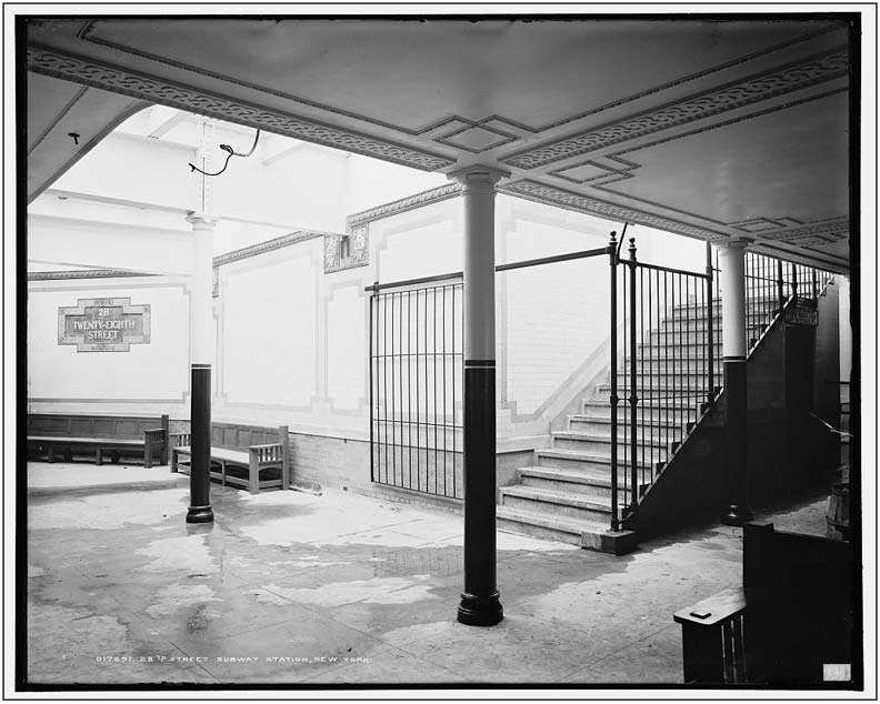
Courtesy nycsubway.org, I have a couple of views for you of the original platform layout in photos taken just before the line opened. You can tell from this picture that while the station did feature incandescent lighting, skylights allowed a generous amount of sunlight in. Of course this had to be augmented by artificial lighting on cloudy days and at night.
Several elements of the decor still remain. The large and small station ID plaques are still there. Many of the round columns with fluted tops and bottoms are still in place, and in the last decade or so, the paint scheme you see here has been restored, though it’s impossible to tell from a black and white photo if the same colors are employed. However the filigree on the ceiling has largely disappeared, as have the wood benches.

Here you get a greater sense of what part of the platform benefited the most from the skylighting. On the right is the ‘fare control’ area. In the days before tokens and turnstiles, collecting the fare was a two-man operation, one to sell a ticket from a booth, and the other to take the ticket at the entrance (between the two columns on the right, at the break in the fence) and drop it in a ticket chopper. Amazingly a couple of these survived in some stations into the 1970s. The approximate view today.
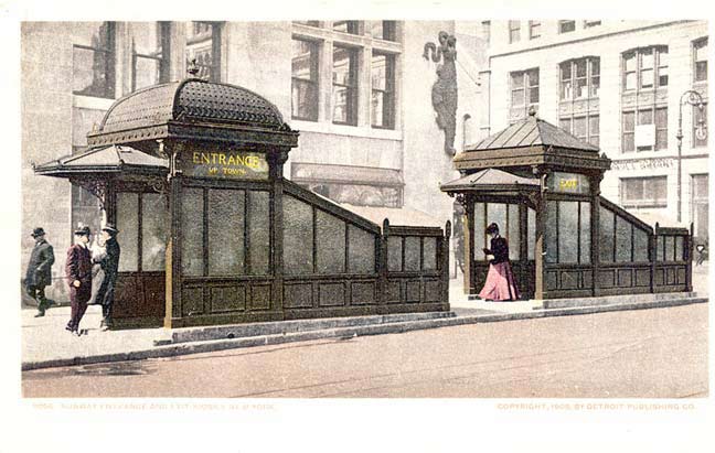
Original IRT stations built in 1904 featured entrance and exit kiosks (entrances had domed roofs, exits peaked roofs). As the century rolled on, motorists began to find these large structures an obstruction to viewing traffic signals and stoplights, so they were phased out, with the last ones surviving until the late 1960s. A new entrance kiosk was built for the uptown Astor Place platform in the traffic island formed at Astor Place and Cooper Square in the mid 1980s. THis pair could be found at the uptown 28th Street station.


I don’t know what formula Original 28 station designers George Lewis Heins and Christopher Grant LaFarge used to determine what stations got large, decorative identification plaques, but 28th Street was selected to receive some of them. You can see that they were made of several pieces that were adhered together. There are two each on the uptown and downtown platforms. They are composed of ceramics made by the Grueby Faience Company of Boston, which closed its doors in 1920.
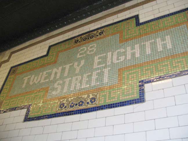

A new mosaic plaque, (poorly) imitative of the originals, was installed a couple of decades ago on the uptown platform. Accept no substitutes.
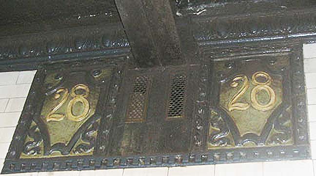
In addition to the large plaques, these terra cotta shields were installed at intervals at the ceiling line (see 1904 photo above). They were manufactured by the Atlantic Terra Cotta Company in Tottenville, Staten Island. These, too, are replicated by mosaics on the uptown platform.
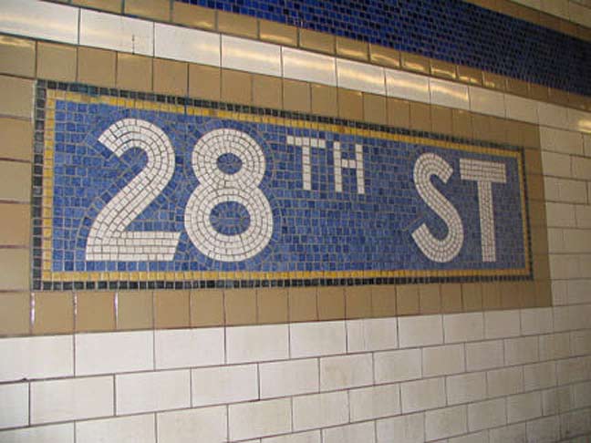
When stations along the line were extended in the 1950s to accommodate longer trainsets, the new walls received IND-style mosaics that were the de facto signage standard until the 1960s. The blue and gold color scheme contrasts somewhat with the green and gold plaques.
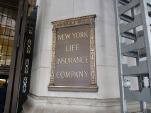
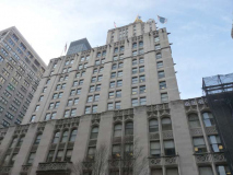
One of the downtown 28th Street entrances/exits is located beneath New York Life’s “Cathedral of Insurance” building, occupying a full block between Madison and Park Avenue South and East 26th-27th Streets, which celebrated its 85th anniversary in 2013. It was designed by famed architect Cass Gilbert (who also designed the Woolworth Building on lower Broadway) and was inspired by Britain’s 13th Century Salisbury Cathedral.
New York Life is 40 stories high and contains 2180 windows and 72 gargoyles. It stands on the site of the first Hippodrome and the first and second Madison Square Gardens, which really did overlook Madison Square. The famed gold leaf pinnacle (barely visible from this angle on Park Avenue South) was added in 1967 and was lit at night for the first time in 1985. New York Life Insurance has been the building’s sole tenant and has been made familiar across the country by a company ad campaign beginning in 1999.
But one aspect of the insurance palace I’d not suspected was its subway entrance at 27th and Park Avenue South.
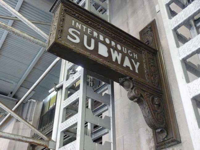
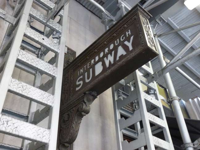
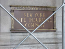
Yeah, I had noticed these huge, ornate iron signs out in front, backlit with the words “Interborough Subway.” This is a hark back to the name of the original subway, Interborough Rapid Transit, the IRT. These signs very likely go back to 1928, when the building opened. Of course, whenever I need to photograph a building, the Walsh Rules state that the outside sidewalk must be covered in scaffolding, because FNY.
I had thought that the signs pointed out a run of the mill staircase leading down. That’s not the case.

The wood and brass front doors of NY Life have a stenciled window sign indicating a subway entrance/exit, but only from 7AM to 7PM. Open the door and walk in…

.. and you’re not in Planet Subway anymore. It’s a sea of polished brass everywhere in the anteroom to one of NYC’s great feats of architecture.

There’s a door leading into the restaurant on the ground floor of the building at East 27th.
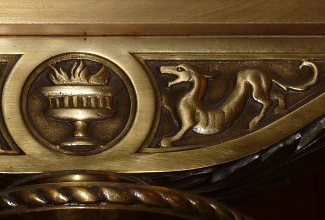
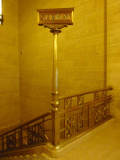
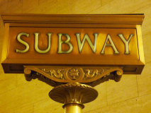
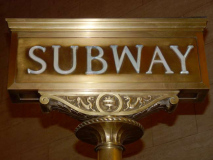
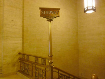
I think the big discovery for me was the presence of two “SUBWAY” stanchions that appear at both staircases leading down to the station. Note the detail on the sign of what appear to be two barking dogs on either side of a flaming brazier. I tried without success to find out if this has anything to do with a former New York Life Insurance logo or symbol.
NYLI symbol or not, these are among the handsomest station indicators in the entire system, even though they’re outside the purview of the MTA.
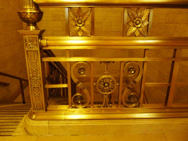
Polished brass railing overlooking the staircase.
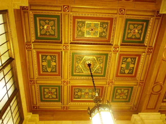
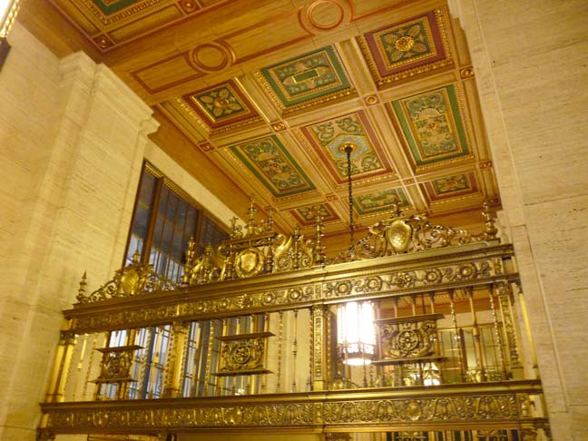
The ceiling treatment is nothing short of breathtaking, with nine colored reliefs in red, gold and green. A chandelier hangs from the central tile. This treatment appears in front of each down staircase. Cass Gilbert, you done good.

Another original element, the ‘push’ sign on the door leading out.

Google Street View from 2009. Without the scaffolding this is how this subway entrance appears from Park Avenue South.
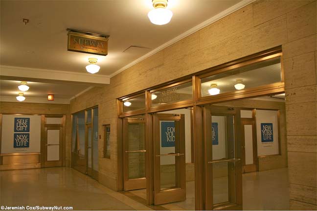
Once underground you are in a maze of corridors, one of which leads to the subway entrance. Note the brass “SUBWAY” sign on the ceiling. From Jeremiah Cox’ Subway Nut site.
“Hat tip” to David Pirmann of nycsubway.org.
1/19/13


20 comments
The subway entrance at 42nd st and Lex (Graybar building?) is also pretty neat.
So elegant and beautiful. Why can’t they still make them like that??
Because ugly and utilitarian is more cost effective.
They don;t build ’em like this anymore because now, only poorer people ride the subways. Back in the day, more or less everyone used the trains, even if it was only from Grand Central to the Met Life office.
I am just a few years older than Kevin and remember being lead by the hand down a kiosk subway entrance. The opaque wired glass surround had been smashed by vandals. Some sections were replaced by steel plates. This must have been the very early ’60’s. The social fabric was beginning to unravel i.e. respect for public property.
Too many historically beautiful features removed for the sake of improvement or modern convenience, like the Entrance and Exit kiosks. I love all the old time style, the brass, the glass, the vintage tile, and wall trim. I was definitely born in the wrong era.
haven’t had some good in depth subway from fny in some time, this is refreshing . used to love the full spread pages on the hidden subway nooks, also the 59th street tram. seems odd but it appears that the old days transit options were vast not like today.
why don’t we have a light rail tramway from QB plaza over the bridge to 59th subway? seems the old days they had a much more practical approach to transit options.
Love the opulence commercial and the baby giraffe. :~)
It appears that even the subway stations (atleast some of them) got caught up in the glitter and glamour of the 1920s (pre-depression years) when artistic impression was at its zenith. Very interesting tour, Kevin.
I lived at 49 W. 135th Street in the late 1950s. I clearly remember the kiosks at the 135th Street/Lenox Avenue station.
Kevin, you done good too. Not a stop I use but I shall have to have a boo. Cass Gilbert is one of my favorite architects.
I hate being snippy but the link is off. Your link leads to a different Hippodrome, one that is near Times Square not 28th Street.
The one that was torn down and replaced by the New York Life Building was P.T. Barnum’s Great Roman Hippodrome, seen here:
http://digitalgallery.nypl.org/nypldigital/dgkeysearchdetail.cfm?trg=1&strucID=1846113&imageID=1691042&total=5&num=0&word=barnum%20hippodrome&s=1¬word=&d=&c=&f=&k=1&lWord=&lField=&sScope=&sLevel=&sLabel=&imgs=20&pos=4&e=r
Thanks, fixed with that link.
A small addition – the mosaic replacement that you call a poor imitation is actually quite old, I’ve read from the 1920s. When they extended the station (the first time), the original mosic was damaged and this version was created. I think it’s really jazzy, like a silent movie card, and should be apprciated, esp. the rare light blue background. To me, it is a transition to the IND style and is unique in the subway system.
Thank you for highlighting this wonderful station entrance. When you have a chance, see the southern end of the IRT 34th St. Penn Station entrance with some remains of the old grand entrance way (you probably did write this up already)
I’m not sure. The type font looks like the fonts used on desktop printing in the 1980s and 1990s.
Beautiful photos. Thanks! I believe the “barking dogs” mentioned in the post are actually dragons.
This is cool. I look forward to checking it out. I’m also interested in finding a station around 165th street on one of the numbered trains a few years ago. It had an art deco bridge passing over the tracks.
Also, I really wanted to comment on one of the Crown Heights Articles but WordPress was not allowing the option to me. I’m very curious if anyone knows the story behind the facades at the tops many of the red brick apartment buildings which appear sprinkled all around Prospect Lefferts on Flatbush ave, and in the areas just south of Empire Ave. East of Nostrand. I see them sprinkled all around but there are concentrations of them there. Also lot’s of them on and around Ocean Ave. Particularly south of Parkside Avenue. To me they seem to be signatures of the developers or perhaps the architects. I also found a single standing house that looks as if it were cut from the corner of one of those buildings an set on the ground. Very curious!
I have NEVER viewed any railway or subway quite like this. An incredible work of art. Amazing.
[…] https://forgotten-ny.com/2014/01/nycs-most-opulent-subway-entrance/ […]
There was a ticket chopper on display at 71 Avenue in Forest Hills by the main metrocard window. It might still be there.