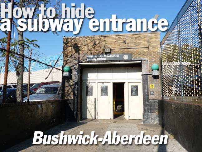
I had never known where the entrance was for the Bushwick Avenue-Aberdeen Street station on the Canarsie Line, popularly known as the L train. I was always looking around for it on Google Street View on Aberdeen Street, where the map says it is, and I had never seen the traditional railed staircase that subway lines use for entrances and exits on either street.
The station is actually a short brick building on the north side of Bushwick Avenue between Aberdeen Street and DeSales Place, just west of the expansive Evergreens Cemetery. The entrance is protected by barbed wire and cyclone fences from surrounding used car lots. It’s about as hidden and camouflaged a NYC subway entrance gets (compare it to the recently opened Fulton Transit Center, or “Oculus” on lower Broadway for visibility!) A similar entrance can also be found at the Jefferson Street station a couple of miles away.
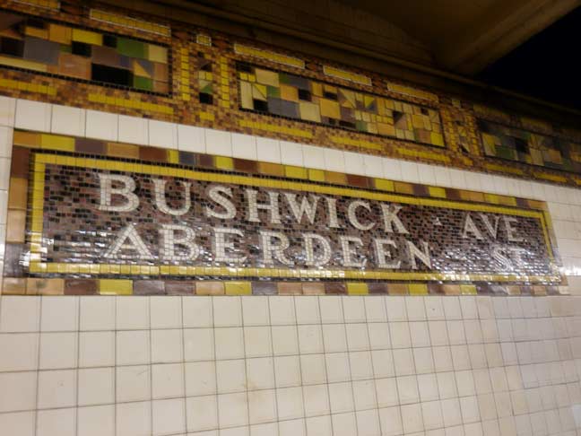
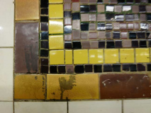
Though the entrance is nothing to write home to Mother about, if she’s a transit design buff you should definitely let her know about the Canarsie Line mosaics, installed from 1924 to 1928 as the line was extended from Midtown to Broadway Junction. Perhaps sensing that the mosaics’ days were numbered, subway design honcho Squire Vickers, who worked for the IRT, BMT and IND when they were separate companies from about 1915 to 1040) oversaw the mosaics’ most ambitious designs on the Canarsie Line subway station, most of them under Wyckoff Avenue.
Why were the mosaics’ days numbered? After 1928, except for extensions here and there, the IND and BMT were complete and the new Independent (IND) subway would employ a much more streamlined, Machine Age look.
Shapes range from squares to triangles to hexagons and most of the colors of the visual spectrum were employed. See NYC Subway’s Canarsie Line page under the header The Canarsie Line Mosaics for an overview if you don’t have time to inspect every station on your own.
At Bushwick-Aberdeen gold and brown are the dominant hues, but earth tones like dark green make their way in as well.
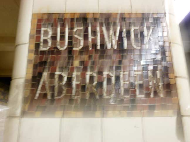
As a rule, though not always, the presence of a building directly above a platform will necessitate the columns to be shored up with concrete, on which tiles are placed. The Canarsie Line is unusual in that the station names on the columns are tiled instead of typeset.
All these mosaics ate tiles can be grouped under an architectural style called Arts and Crafts that was popular in the latter 19th and early 20th Century.
Forgive the blurry images, as the flash on my camera isn’t working, likely needing a trip to the shop.
11/12/14

6 comments
Not around anymore, the 95th street station in Brooklyn on the BMT line was pretty cool. I think it was located next to the pizzeria? As seen on Forgotten Tour 20. The Canarsie Line station names…now that’s what I call hand typesetting. No California Job Case for this job!
The full Canarsie line opened in four parts:
Broadway Junction (ENY – Eastern Parkway) to Rockaway Parkway opened in 1906. The line actually went all the way to the shore in a private right of way parallel to Rockaway Parkway.
The section between Montrose Ave and 6th Ave opened in 1924. The cars were dragged on the LIRR and temporary tracks to a ramp down to the subway.
The intermediate section from Montrose to ENY opened in 1928.
The one stop at 8th Ave was added in 1931.
While the 8th Ave. extention occurred in 1931, the signs outside the L train stations still listed a 6th Ave. termination into – I think – the 1970’s. I guess no one noticed.
While NYC did not take over the BMT until 1939 or 40, the 8th Ave. station was decorated in the same streamlined tile format as was the City owned IND system. Any reason for this? Could it be that the BMT was running low on cash and to do this on the cheap? Or had styles just changed?
When this station was modernized, the MTA did a great job of combining both the BMT and IND tile designs.
It wasn’t just the 8th Avenue station on the Canarsie line – when the Fulton Street and Broad Street stations of the Nassau Street line opened in 1931, they too initially employed the “streamlined” IND station design style. (And likewise, when modernized, redesigned with 1920’s BMT-style designs.) Had any new IRT stations been built and opened past 1928, I suspect they too would have had “streamlined” IND style stations.
These mosaics were really works of art. Its a shame that many of them were later covered over or removed. I would love for the MTA to restore the closed platforms at 18th and 91st Streets on the original IRT lines, as I am sure the mosaics there were quite special.
When talking about hidden subway entrances, I guess the Clark Street Station would win the prize accessible only from inside the former St. George Hotel.