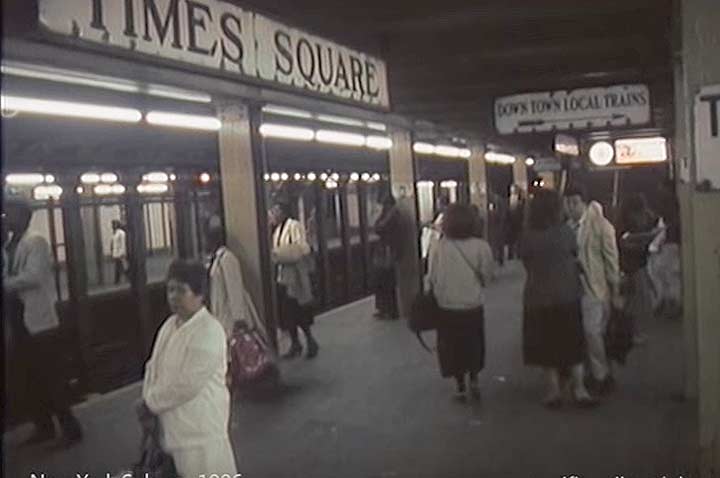
Here is a screen capture from a video made in the Seventh Avenue Line IRT Times Square subway station by a visiting Danish filmmaker. The film is labeled 1986, and things look pretty much as I’d expect in 1986; the IRT lines at the time were still plagued with graffiti and this was at a time when older cars were breaking down frequently and track fires were a regular occurrence. I was working nights at Photo-Lettering on East 45th between 2nd and 3rd Avenues.
My common practice was to catch an R train from Bay Ridge or an N train from 8th Avenue, take it to 14th Street, and change for a 4, 5 or 6 to Grand Central, depending on which came first. My hours varied but mostly I reported between 5 and 7 PM and left for home from 1 to 3 AM. Most of the time, though, there was overtime and I sometimes found myself battling the morning rush hour to get home. I would typically wait on a near deserted GCT platform for up to 20 minutes for a train after 3 AM. I never got into any fights or was mugged. I suppose I had perfected a “don’t f@#$ with me” appearance many New Yorkers are able to adopt.
My point in showing the platform here, though, was that I was surprised at the amount of 1910s-1920s enamel signage still remained in stations. In the 1960s, the then-Transit Authority tired of the complicated and sometimes overly prolix and wordy signage, and hired a firm called Unimark International, which featured designers Massimo Vignelli and Bob Noorda, to come up with a standard for subway signage. What happened was that the designers wanted to use Helvetica but it was unavailable for license at that time, so they settled on a similar font called Standard (in Germany, Akzidenz).
However, as we see here the rollout wasn’t as immediate as you might think. In Brooklyn, the entire 4th Avenue line and in Manhattan the Broadway line was tricked out with Mondrian-esque subway tiling and signs in Standard, but other divisions, like the IRT, lagged behind for about a decade! It wasn’t till the 1990s that standardized signs truly took over. Today, when an older or nonstandard sign is revealed, the MTA descends on it like a pack of jackals on a gnu corpse.
A very few of these beautiful pre-Unimark signs are preserved in the NYC Transit Museum, but most of them were apparently scrapped.
1/27/16

3 comments
I remember parts of the 8th and 6th Avenue lines in Manhattan having the original black text on white background Unimark signs by 1970. I remember the route signs at platform edge, exit and transfer signs, column signs at 59th St and 47-50th Sts as Unimark signs though I don’t remember if the big station name signs had been changed over yet. To see the “NYCTA Graphics Standards Manual” from 1970, see http://standardsmanual.com/
Scrapped. Tragic. Lovely to see and read about them though.
My favorite old subway signs were on the elevated lines in Queens. The stairways from the sidewalk to the mezzanine level provided room between the handrails and the stair base for a flat area in the shape of a parallelogram. The wonderful hand-painted signs indicated the route (BMT or IRT) and the direction (Astoria or Manhattan or Flushing) and were aligned so that the lettering was level with the ground but had to fit into the parallelogram. I always marveled at how the signs appeared to inspire motion as the letters leaned forward. They were beauties!