

The West Side, the East Side and the Shuttle
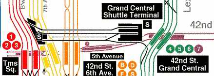
In its original 1904 configuration, seen at left, the IRT subway had two stations at 42nd Street, at Grand Central and at then-newly renamed Times Square (formerly Longacre Square). By 1905 the subway was expanding into the Bronx; by 1908 it had reached Brooklyn, and expansion continued apace with the Seventh Avenue and Lexington Avenue lines as we know them today completed in 1918. The stretch of track beneath 42nd Street was relegated to shuttle duty. In special cases though, trains can still be switched, with some special maneuvers, between the Seventh and the Lex by using the shuttle tracks. Above is a Peter Dougherty map showing the track configurations that allow trains to do this.

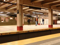
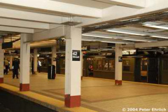
photo left: Richard Panse; photo right: Peter Ehrlich
While this is the original 1904 42nd Street-Grand Central station, it reveals little of its original pedigree, since the station, now the eastern end of the Times Square-Grand Central shuttle, has been renovated repeatedly over the years. The lengthy passageway between this station and the main concourse at Lexington Avenue where there is a transfer to the #4, 5 and 6 was originally going to be a platform further east, but the plan was scrapped soon after construction. Until recently, columns could still be seen along the passageway, and the planned platform edges can still be seen in the present-day walkway. A 1964 fire claimed all of the station’s original signage.

When the New York Times moved here and built a massive tower, the area increased in importance and the station gained a new platform and signage. The platforms contained entrances to both the Times Tower and the Knickerbocker Hotel, each of which can still be detected today.
photo left: Jesse Chan-Norris; photo right: Dave Emanuel
It’s hard to fathom it now but there was no free transfer from the Shuttle to the BMT Broadway Line here until 1948 (this was a full 8 years after subway unification). The concourse that allows riders to transfer between the Shuttle, BMT Broadway, IRT Flushing, and IRT 7th Avenue lines has recently completed a lengthy reconfiguration, but the rest of this massive, labyrinthine station is apparently under perpetual construction. In 2001 and 2002, new art was commissioned for the station, including Roy Lichtenstein‘s Times Square Mural (seen in the distance at left).
Liliana Porter’s 1994 Lewis carroll-themed Alice: The Way Out is the station’s art piece.
50th Street uses the same typefont and amphora (two-handled jug used in ancient Greece and Rome) theme first seen at Astor Place (see Original 28 Part One).
The original Arts and Crafts Grueby Faience ID plaques remind me of a game board, with bold colors and geometric shapes. When the station was renovated in 1993-1994 tile versions of the faience sign were installed that imitate the colors, but not the style. Notice the error on the tile version: The four squares surrounding the triangles should be green, not red.
As these 1964 views show, 50th Street was among the last stations to lose its distinctive entrance and exit cast-iron kiosks.Photo left: nycsubway.org; photo right: Evelyn Hofer from New York Proclaimed
Built on a gentle curve, and full of all kinds of convex and concave walls, Columbus Circle is one of the more interesting “Contract One” stations. It’s the only one that features Grueby Faience plaques placed on corners. The plaque depicts “the great navigator’s caravel” according to The New York Subway: Its Construction and Equipment, the book published by the IRT in 1904 when the subways opened. It is likely not the Santa Maria, which was larger than a caravel and had a topsail. The plaques are surrounded by rosetts and, as we have seen at Astor Place and 50th Streets, the amphora motif. There are also simple versions of wall tapestries; more elaborate ones, as we will see, can be found a couple of stops later.
As we’ll see, the Columbus Circle station has undergone a number of changes over the years, among them being some loss of its original terra cotta and faience ornamentation. One answer has been to put back some of the old art, but in mosaic form. One of the caravels has a mosaic replacement — compare the two and see how the mosaic version stacks up to its older model.
Much of Columbus Circle was compromised when the IND subway was built intersecting it along 8th Avenue in the 1930s. Much of the station was lost so a connection to the newer subway could be made, but ample room was also left because there was a plan to make Columbus Circle an express station and convert 72nd Street to local. The platforms flange out very wide in spots as space was left for this now-scrapped objective. At photo right, we see cylindrical columns with decorative plastering at the top and bottom. This was a hallmark of IRT and BMT stations built prior to 1920.
When first built, Columbus Circle had a number of faience name tablets using the same Goudy-esque type we have seen at Astor Place and 50th Street. The semicircular faience was not duplicated elsewhere on this Contract One route, and this was a bad loss.
Some mosaic tablets do remain though, as we see at right.
A 1950s station extension has eliminated the older tile and mosaic, employing a bland sea-green scheme that is also used on uptown stations.
Original stations used intricate and elaborate moldings on ceilings. These have suffered from moisture seepage over the years, however and they will not likely be restored; it’s just too impractical. Subsequent IRT, BMT and IND stations did not get this treatment.
When subway engineers ran the line up Broadway to what became the Lincoln Square neighborhood in 1904, it was inconceivable that there would be a grand entertainment mecca this far north. Block after block of tenements lined the streets, which could be mean ones by the time West Side Story, set in the neighborhood, was written. Robert Moses was to raze a total of 18 square blocks to create Lincoln Center and public housing at the site, displacing 7,000 low-income apartments and replacing them with only 4400, according to Robert A. Caro’s The Power Broker.
You’d be forgiven for thinking it’s the original signage, but the LC — for Lincoln Center (also spelled out on the plaque) give it away. This is, though, the best rebuilt station on the Original 28.
The shimmery, golden station mosaic is Nancy Speros’ Artemis, Acrobats, Divas and Dancers. It was placed here after the main renovations, in 2001.
The station itself is most remarkable not for what is below ground, but on the surface in the two triangle-shaped plots created by Broadway, Amsterdam Avenue and West 72nd Street.
Not much in the way of ceramic signage here, just the ceramic cross with the street number. Some very nice wrought iron work above the doors at each end. I didn’t take photos in the fare control area–cops swarm around at this very busy station.
At the tracks, 72nd Street preserves the best-kept example of wall mosaic tapestries. Others, not in this kind of condition, can also be seen at 110th Street. The ones at Bowling Green have been removed in favor of an orange glazed brick covering installed in the early 1970s.
A weakness of the 72nd street station in the 1990s was that even though it was constructed as an express station, no free transfer was possible from uptown to downtown. This was done because space in the control house was at a premium and the MTA was concerned about crowd control. The staircases are also quite narrow for an express station.
The condition has been alleviated by the construction, in 2002, of a second control house and a realignment of the uptown local track. Finally, uptown-downtown transfers were permitted; this is helpful in cases where local service is cancelled for trackwork. Previously you had to travel to 96th Street to cross from uptown to downtown service in cases like that.
The new control house, considered a glass, brick and metal update of the original 1904 building, was executed by Gruzen Samton and Richard Dattner and Partners. As you can see it allows a great deal of natural light to stream in, and especially on sunny days, it’s a very pleasant place to board a train. The staircases remain too narrow, however.
Most of 79th Street (and the following station, 86th) has been redone in a quintessentially 50s bland, monotonous tile scheme, but there are still flashes of greatness here and there. Modest wall tapestries like those at 23rd Street are the rule here. Above right: 1904 meets 1960, and 1904 always wins with that sort of matchup.
At 86th and Broadway we find the twin-towered Montana Apartments, built in 1986 and named as a counterpoint to the Dakota, 14 blocks to the southeast.
Most of 86th Street has been redesigned with bland tile (punctuated, however, with charming art pieces) but some 1904 elements are still here. The wall tapestry has been crudely tampered with; its number is gone. The number tablet is in better shape than the one at 79th.
The mosaic name tablet and other original elements that remain can be found at the southern end of the downtown station.
Surprisingly 86th preserves a good deal of its original 1904 roof plaster ornamentation.
Skipping 91st Street ( I have never been able to obtain photos of this station, closed in 1959 when 96th Street was expanded; its station art resembles that of its cohorts, 79th and 86th Streets, as nycsubway.org will show you.)
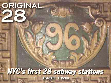
As with Brooklyn Bridge and 14th Street further down the line, side platforms originally served local trains. Unlike those two stations though, the platforms are revealed for all to see here, and a good thing too, because the side platforms preserve the mosaic station name tablets as well as the Grueby Faience “96” cartouches. These resemble the ones at Canal, Worth, Bleecker and Spring Streets in that the station letter or number is flanked by a pair of posies, tulips, in this case. Note how the 9 and 6 are simple reverses of the other. Also, note the swastika design in the plaque surrounding the number. It was an innocent symbol of good fortune in 1904.
Skylights from the platform shine through to the crossunder passage. They are reminiscent of early Contract One stations, which all has skylights to allow natural light into stations. This principle is again a part of new station construction proposed for the Fulton Center downtown on Broadway and at the new PATH station presently underway at Church and Dey Streets.
A tale of two mosaic name tablets, one modest, one florid.
Tulips and swastikas return here on the ID cartouches.
Since the Cathedral of St. John the Divine on Amsterdam and110th was begun in 1892, and the station opened in 1904, we may assume the street was granted the moniker sometime in the intervening years.
This station features two separate ID cartouches, one with the station number and another featuring the seal of Columbia University. Each is flanked by a faience torch. Is that a snake entwining it?
Also note the baby blue station tile. The blue color is official to Columbia.
In a truly loving bit of detail, you can find an open book and an Aladdin-style lamp adjoining the “Columbia University” station name.
With and without the windscreen.
Broadway here is nothing special, just a few storage lofts. You can spot an old Studebaker studio, recognizable by its wheel logo, on West 126th between Broadway and 12th Avenue.
The view to the west is impressive as it contains the Riverside viaduct, and on clearer days than this, views across the mighty Hudson to New Jersey.
Station lighting harks back to its original 1904 versions. It uses the same shafts, topped by a new gooseneck mercury luminaire, replacing the dim incandescents. photo bottom: Matt Weber
Sheesh…in the early 1980s, the 137th Street station was remodeled in a contemporary scheme that makes you glad it isn’t the 80s anymore. Actually this should be preserved as a paean to Everlovin’ Eighties bad taste. Later, in 1988, the station got a further treatment with Steve Wood’s Fossils bas reliefs.
Fortunately a couple of station ID mosaic panels were preserved, though they seem totally out of place in the Jetsons-like rest of the station. The tablet is rendered in the City College lavender color; the cartouche is the three-faced City College emblem “Respice”, “Adspice”, and “Prospice.” Forgotten Fan Joe Schlesinger: “The original Spice Girls.”
SOURCES:
The New York Subway, Its Construction and Equipment,Interborough Rapid Transit 1904, 2004 reissue
BUY this book at Amazon.COM
The Power Broker: Robert Moses and the Fall of New York ,Robert Caro, Vintage paperback 1975
BUY this book at Amazon.COM

