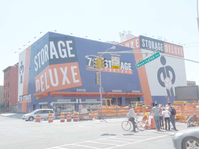
This incredible painted sign at Washington and Atlantic Avenues in Brooklyn (across from my old high school) has been now been tamed and homogenized:

Because we need logos, don’t we?
5/24/12
This incredible painted sign at Washington and Atlantic Avenues in Brooklyn (across from my old high school) has been now been tamed and homogenized:

Because we need logos, don’t we?
5/24/12

9 comments
When I first moved to NYC, in 1999, my roommate and I moved into a building on Pacific Street that sat directly behind the big yellow storage building.
I spent the first few years, (as well as 9/11) in that neighborhood, and it will always be near and dear to me. It was a little rougher then, but still a good place for a stupid white kid from the midwest to move to without ruffling any feathers.
Our building is now gone, replaced by a higher-end development. There is a giant arena a block away in the old rail yard… and now this old yellow landmark is gone as well.
I guess, just like everything else in New York, Prospect Heights is changing. It’s not a bad thing, it’s just what it is.
Looks like a new skin was stretched over the whole thing, since the old windows and facade elements aren’t apparent anymore… so hopefully they left the old signs underneath and they will be uncovered several decades from now.
It’s too bad that they had to change that. I did like how unique it was. Unfortunately, everything these days is becoming the same. I did remember just seeing something like the top picture over in Newark when I was driving on the I-78 to the NJ Turnpike after going to a Liberty that night.
Reminds me of the old SNL bit “dick in a box”!
I pass the building everyday to go to work. The neighboorhood is changing very fast. Now with the new stadium coming in just a few blocks away will make it even more crowded.
Does anyone know when this building was originally built and/or its original purpose?
I liked the old comic book or pop art look of the old building facade…but then I like old stuff…the new one is ugly. I don’t care for block color areas of blue and orange.
Somehow, Walmart comes to mind.
And it’s about to change again! The even-tamer-styled CubeSmart bought Storage Deluxe and is starting to rebrand all of the orange-and-blue buildings. I’ve seen it here in the Bronx.