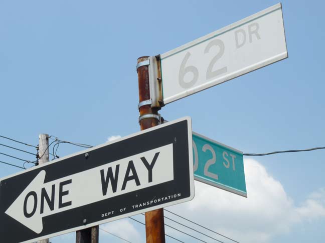
As the city wastes millions by changing street signs that are ALL CAPS to Upper & Lower Case — including, ridiculously, numbered signs that, at most, have a tiny “AV” or a “ST” on them, it occurs to me that the millions would be better spent on replacing the signs that actually need replacing. A federal mandate — since rescinded — called for signs in all caps to become caps and lower case, for greater readability.
Many of the city’s green and white street signs were installed in the mid-1980s, when an earlier federal mandate called for highway signs to be rendered in those colors for optimum visibility. Previously, signs were color-coded by borough, with Queens getting blue on white, Bronx white on blue, Brooklyn white on black, Manhattan black on yellow, and for some reason (likely that its previous signs were black on yellow), Staten Island copying the Manhattan colors.
Of course, some of these green and white signs are almost 30 years old and are sun-bleached to the point of unreadability, like this one on 62nd Drive in fab Forest Hills.
Those, however, don’t seem to be the signs the Department of Transportation is targeting for replacement.
That would make altogether too much sense.
7/12/12


7 comments
The federal mandate was not rescinded. The new upper/lower design is still the new standard but states and localities do not have to replace all the signs at once. Ridiculous. The ALL-CAPS signs are much easier to read.
Aint it wonderful how the federal government not only wastes mountains of money on their own but can force other levels of government to waste it too?
I was doing a rotation at Coney Island Hospital in the mid-90’s and parked on a side street where the alternate-side parking sign was bleached white and totally unreadable. The next morning my car was gone! What an expensive ordeal to get it back! I had to take a bus to central Staten Island just to pay the fine! I bet faded signs make a lot of money for the city…
Mayor Koch who had a way with words called these laws “mandate millstones”.
Two years ago I saw turn arrows on the pavement being erased and replaced with thinner shafted arrows. They also repaced the bike lane icons with a slightly different icon. Why can’t they just wait until they wear out?
Because they have to spend so much money in a period of time. You don’t want them to be sensible, now do you???
According to DOT they are replacing the all-cap signs as needed with the new signs and since they normally replace old signs anyway they say there is no extra cost. Feds claim the upper and lower case signs are easier to read. The new signs also meet a new Fed standard for light reflectivity, which also make them easier to read. Or so they say.