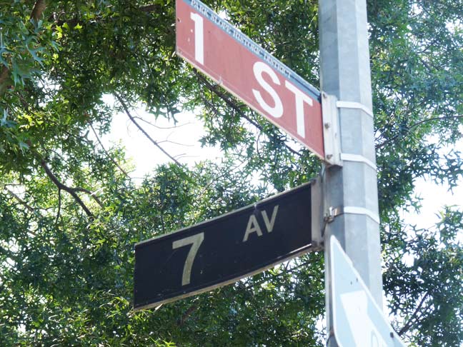
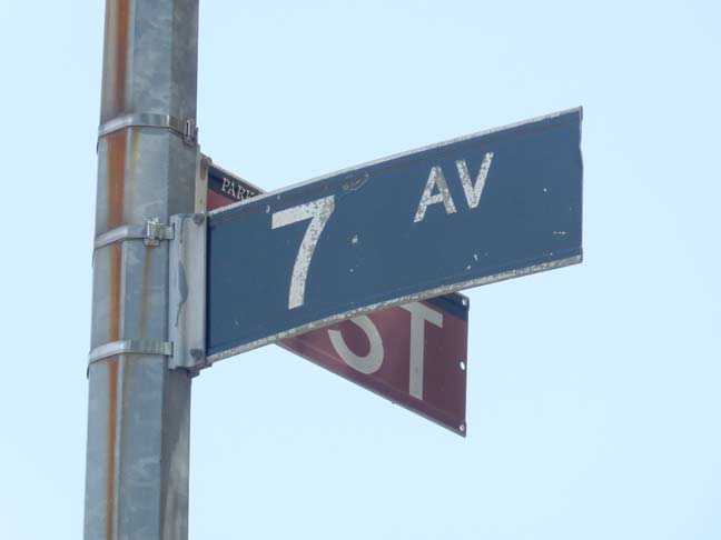
One of Brooklyn’s oldest street signs is hiding in plain sight in Brooklyn’s premier residential neighborhood (or so the papers and magazines would have you believe). At the corner of 7th Avenue and 1st street on the edge of a landmarked section of Park Slope — indicated by the maroon 1st Street sign — is a black and white 7th Avenue sign, battered and bruised but otherwise intact.
Street signs in NYC from 1964-1984 or so identified boroughs by street sign color — Brooklyn’s was white on black. There was some informal color coding going on before that, but new signs installed in 1964 standardized the color ID. All that went out the window in the 1980s when NYC’s streets signs went to green and white, and you no longer knew what borough you were in by street sign color.

Signs like this, made of vinyl with a metallic holder, were introduced in NYC in 1964, so that’s the date this one was likely installed. The very first one I ever saw, in 1964, was on a new section of 7th Avenue serving as a Gowanus Expressway service road at 82nd Street in that same year.
Of course, posting it here insures its doom. The Department of Transportation is renowned for its obsession with standardization. And this sign, in 2012, is clearly out of uniform… it’ll either receive a green and white sign or a maroon Landmarks sign.
8/7/12


22 comments
There’s an even older one, the type that’s thin and thicker which predates the one in the pic, @ Coney Island Avenue and Homecrest Court.
I know about that one. Those are porcelain and metal signs dating from the late 40s or early 50s (I wasn’t born yet, so I’m hazy on the date)
I assume that one is being preserved on purpose…I hope…?
I am dreading the conversion of NYC’s current typeface on street signs to the new typeface cropping up all over the place. Hate the new signs — represent one other unique part of NY that is withering away. Can we start a photography project to photograph the old street signs before they are removed?
The new font is called Clearface, or something similar. The old one is Highway Gothic. Governments love to tinker to validate their collection of taxes.
Clearview, or Clearview Highway.
WIkipedia: “The standard FHWA typefaces, developed in the 1940s, were designed to work with a system of highway signs in which almost all words are capitalized. The designers of Clearview sought to create a typeface adapted for mixed-case signage, initially expecting it would be based on an existing European sans-serif typeface.[2] Instead, using a similar weight to the FHWA fonts, a new font was created from scratch. Two key differences are much larger counter spaces, the enclosed spaces in letters like the lower case “e” or “a,” and a higher x-height, the relative height of the lower case “x” to the upper case “X.” Smaller counter spaces in the FHWA fonts reduced legibility, particularly when the letters glowed from headlight illumination at night.”
Is it older than the Willoughby/Hudson sign?
No. Willoughby-Hudson goes back to the 1910s or 1920s. Perhaps, I should have specified that this is one of the oldest signs of its TYPE still in use.
Gee, I grew up in NY and remember the really old signs – there is a round one with a pointed top for bridges and tunnels you occasionally spot. These must go back to the 60’s or even earlier
Try the 10s or 20s!
[…] Barclays Street Art [Hypoallergic] Thieves Targeting Ghost Bikes For Parts [PH Patch] One of Brooklyn’s Oldest Street Signs in Park Slope [Forgotten NY] The Early Word on Lake Trout in Williamsburg [Eater] Why the MTA Needs to Close the […]
The Clearview font is a money maker. I could tolerate the clearview if they go back to yhe color coded signs, perhaps we could start a movement to get the boroughs that border to be color coded.
Born and raised in ny I grew up with the c.c and therefore a big fan. Those signs made nyc a distintive place, with these green signs nyc is becoming small town America. Do you know where I could a old c.c thanks
Nice find, Kevin. Definitely, without no doubt, a forgotten gem. “Color coded” street signs are extremely difficult to find nowadays. I own a “FOSTER AV” street sign that came from Brooklyn, and its condition is good.
As far as I know, I know only one “color coded” street sign that I have seen in person in the past. I don’t know if it is still in existence, but it is definitely barely visible to read. It’s quite old (maybe late 1960s). The sign is from Staten Island, and it’s located in the Woodrow section of Staten Island. The next time I am there, I’ll have to see if it is still there (the street sign, that is).
Where is it?
The street sign is located at the corner of Von Braun Avenue and Woehrle Avenue. I grew up not too far away from there.
On Google Map (namely street view), the sign could is noticeable. Like I mentioned in my previous comment, the sign is barely visible, not to mention faded (in regards to its color) as well.
Some neighborhoods in that particular area of Woodrow in Staten Island were constructed in the early 1970s. So, it is safe to say that the sign most likely dates back to that particular time period.
I see it on Street View. Think you can get a shot of it and send it along? I rarely get out that way.
Since I haven’t been to Staten Island for a while, I am not exactly sure if the street sign still exists there in that neighborhood. On Google Map, the pictures of that neighborhood have not been updated since 2007.
Although I will visit Staten Island this Monday. I will make sure to see it (if it still exists) in person. If it’s still there, then I’ll indeed take a picture of it.
It would be definitely a real treat to see that sign still in service.
The street sign still exists…
http://www.flickr.com/photos/30862834@N02/7777239822/
What are they (NYC DOT) doing with the old signs?
D.O.T. typically recycles everything removed from useful service.
The ‘7 AV’ sign likely dates to 1969 or ’70, as the same layout as colored yellow with black type showed up in Manhattan south of 23rd Street and north of Central Park during ’69 (prior to the latter section’s signs being replaced with those of ADAM CLAYTON POWELL JR. BLVD in 1974). The other clue is the use of Highway Gothic D (a.k.a. FHWA Series D) for both ‘7’ (6 inches high) and ‘AV’ (3 inches high). Circa 1965 signs (in both Manhattan and Brooklyn color coding) would have said ‘7 AVE’, set in 6″ high and 3″ high (respectively) FHWA Series (Highway Gothic) C.
Because virtually all of Manhattan between 24th and 60th Streets had the new type signage installed between 1964 and 1968, very few sections of Midtown had the 1969 set of signs; if one saw pics of Brooklyn from the ’70’s around numbered avenues and streets with ‘E’ and ‘W’ designations, you could get a window as to what such signs would have looked like with Manhattan color-coding – especially Brooklyn’s Sixth Avenue (‘6 AVE’ in 1965 era signs, ‘6 AV’ in 1969-70), given how the then-Department of Traffic in those days was gung-ho about the exclusive use of the Avenue of the Americas nomenclature for what most New Yorkers recognized as Sixth Avenue in Manhattan.
There is another! I may have found one at Cadman Plaza near the U.S. District Court. It’s located on Cadman Plaza East between Tillary Street & Red Cross Place. Is it legit or just an dirty old green sign?
Check it out: https://flic.kr/p/tQRs4V