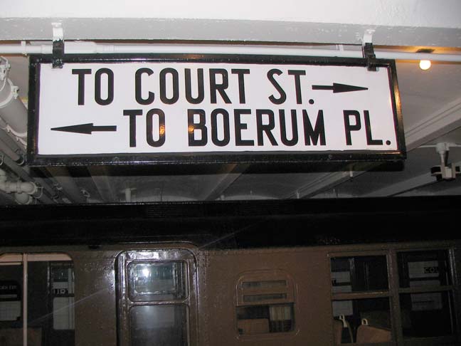
When the IND Subway was built beginning in the late 1920s, designer/architect Squire Vickers decided to move away from the Beaux Arts terra cotta and multicolored mosaics that had characterized the IRT and BMT, then run by private contractors, and streamline the whole design, with stations outfitted in one color with black and/or white trim. A new typeface, seen nowhere else before or since, was also devised for station signage and ID.
It was a no-nonsense type font, with easy to read letterforms that somehow lacked the sunniness that latter-day Helvetica, or even its contemporary, Futura, possessed. (I don’t even know its name — if it had one).
Of course beginning about 1970 the Transit Authority scuttled most of these free-standing enamel signs featuring this font — the only place to see the font now is in IND station wall mosaics. The Unimark system demanded the Standard font be used for all signage, which later was changed to Helvetica. The only place to see a good collection of them is at the Transit Museum in Brooklyn.
4/10/13


7 comments
I grew up with it, was heavily influenced by it, yet never realized that the font had no name.
A near match typeface is Copperhead. Not exactly the same but close.
Would Paul Shaw, who wrote the book about how all the subway signage got standardized to Helvetica, be able to help you on the question of whether IND signage had a name for its font?
Actually, I’m enough of a contrary sort that I find the ubiquity of Helvetica disturbing in its “sunniness,” and wish the TA had kept the font of the old IND signs, and made IT the standard systemwide. Somehow, the idea that the Subway would have its own lettering would, to me anyway, suggest the perhaps subliminal effect on others of saying, “We actually go to the trouble of coming up with what WE think our facilities should look like, and if an all-uppercase fairly-unadorned lettering on the signage can convey that we care about such things, that’s what we’re after. Not for us the fancy-schmancy– signs are to be read and processed quickly without taking time and admiring the lettering, yeah?”
I HIGHLY recommend the MTA Transit Museum and their guided Tours of various subway facilities!! I recently took the centennial tour of Grand Central Terminal, it was quite interesting!
I never went 2 the transit museum be4, but I went 2 the TM store in bkln. and I’ll go there this summer
Before the opening of the IND in 1932, this new style of signage – plus the accompanying semi-serif fonts on the tiles that were hung on the walls spelling out the station name or number, and the color-coded station ID tiling – was tried out on three BMT Eastern Division stations: the Eighth Avenue terminus of the 14th Street – Canarsie line (today’s L); and the Fulton Street (with ‘FULTN’ all over the walls) and Broad Street stations of the Nassau Street line (where the J and Z run). Alas, all three have since been remodeled with a “modern” take on 1920’s BMT station design (with ITC Bookman for Fulton Street, for example)
I didn’t know those came in advance of the IND lines’ signage