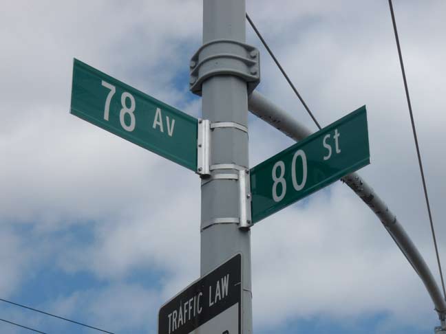
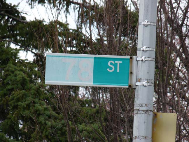
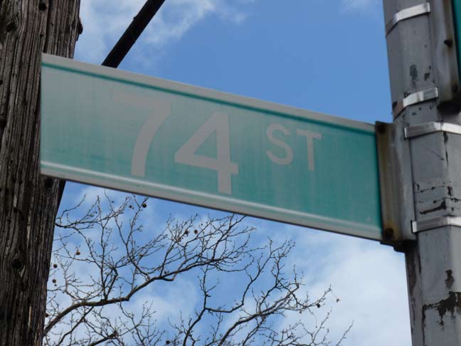
For the past five years, the Department of Transportation has slowly been replacing street signs with new ones that feature the Clearview typefont in upper and lower case, following a federal ukase that is not immediately mandatorily applicable, according to the NYTimes. The DOT has made a number of errors with the new signs, as some of the new ones are all caps instead of upper and lower.
My problem with the replacement is not that it’s being done — many signs were installed thirty years ago and are in need of a refresh. It’s that the ones that are worn out are being left in place.
As a look at the title card photo shows, sun bleaching is the signs’ worst enemy. Any sign that gets full sun for a good part of the day will eventually wind up looking like this. Since 1964, all newly installed NYC street signs have been made of colored vinyl; a color code system by borough was followed until the early 1980s. Since then, new signs have been green and white, except in certain designated areas such as midtown (blue and white) and neighborhoods designated by the Landmarks Preservation Commission, which are reddish-brown and white.

In many, many cases, the new signs seen above featuring Clearview in place of Highway Gothic have replaced perfectly legible old signs. Meanwhile, sun-bleached signs that are barely legible are allowed to remain in place! The implementation of the new signs makes no sense whatsoever.
I’d also question the replacement of the numbered signs at all except the illegible sun-bleached ones. After all numbers are not in uppercase or lowercase.

Now, this condition of sun bleaching is unexplainable, unless the right sign originally said “AVE” and “ST” was pasted over it. I see no sign of that, though; it’s ingeniously done, at least. The DOT should make it a priority to replace all sun bleached signs instead of the helter skelter replacement system in use right now.
4/9/14


13 comments
As Koch would say, “Another mandate millstone from Washington”.
Why does Avenue have to be abbreviated Av instead of Ave? I guess if there’s thousands of streets, a lot of vinyl Es are saved. 74 Av would be 74th Ave in most other cities. We are wildly inconsistent around here, despite the new rules attempting to standardize. Sometimes it’s just 5th Ave when it should be W 5th Ave. Sometimes it’s all caps and sometimes not, sometimes the house numbering on the nearest corner is included and sometimes not.
In certain places the signs are huge!
There’s a street called DeBarr. The correct name is DeBarr Rd. But have seen it as St instead of Rd and no less than four variations on its spelling: Debarr, DeBarr, DEBARR, DE BARR.
It’s as if the people making the signs just don’t give a shit anymore!!
Another one – up here in the BTV, I see “North” abbreviated on signs in various ways. “N.”, “No”, (smaller-prefix) “N”. I never understood “No” and “So” for north and south. I mean, “Ea” and “We” are NOT east and west. Also, signs here are frequently missing/stolen because it’s a college city, you’d think they’d get better at mounting them – in my town, just north of Burlington, some signs are CHAINED to the posts.
Also, shouldn’t the signs have reflective (top/bottom) edges? [I’m not so sure that this a MUTCD requirement]
“No” and “So” for north and south are probably to distinguish them from abbreviated words like “New” or “Saint” whereas east and west aren’t likely to be mistaken for something else.
From what I could tell, the ‘AV’ abbreviation was first used in the post-1964 era around 1968 for Manhattan’s Park Avenue (as well as a few made up for Second and Fifth Avenues), and was used all through the sign installations of 1969-71 (in Manhattan, south of 23rd Street and north of 61st Street) that replaced the remainder of the humpback signs in Manhattan and the Bronx; the 1950’s black-on-yellow Manhattan signs; the 1950’s porcelain Brooklyn signs; the old metal signs in Queens; and the black-on-yellow porcelain signs of Staten Island. The signs with the ‘AVE’ abbreviation were made between 1964 and 1967, except with 1969-era one-line ‘AVE OF THE AMERICAS’ signs (set in 4″ Highway Gothic B) as seen from its southernmost starting point at Franklin Street up to West 23rd Street (and possibly, on its southwest corner with West 49th and a few others here and there). Over the years, the 1969-71 layout for signs (with the abbreviations in Highway Gothic D) would be used frequently for white-on-green signage, dating back to the 1981 set in Midtown from the FDR Drive to Eighth Avenue between 34th and 59th Streets which had a picture of Lady Liberty on the left side. The bleached ’74 ST’ sign would have dated to 1987, as would the sign with a clear green ‘ST’ next to a faded ’78’.
Oh, and who remembers Lane being abbreviated ‘LA’?
The last one was caused by an eclipse. 🙂
Per Wikipedia, a majority of the states still use the Highway Gothic font on their interstate highways, and only a few have made a complete or partial switchover to the Clearview font. New York State is still using the Highway Gothic font on it’s highways, so it appears New York City is still ahead of the state, when it comes to the changeover to the Clearview font on it’s street signs.
That said, it is strange that New York City does not place a priority of changing it’s worn out, sun bleached street signs featuring the old Highway Gothic to the new Clearview font, instead doing an apparent random changeover to the new Clearview font street signs, on street signs that were probably still in perfectly good shape.
But that’s not that surprising to me given New York City’s habit of having so many different series of street lights as well as traffic signals, sometimes for no inexplicable reason. When it comes to standardization, New York City does not seem to be at the forefront of the game.
I got ticketed near Coney Island Hospital some years ago because the alternate-side-of-the-street parking sign was unreadable due to sun bleaching. The traffic court had no compassion…
Maybe the City doesn’t have a comprehensive inventory of every sign’s condition, and is simply doing the replacement in geographic blocks.
They say the upper/lower case letters are easier to read….I cant see how this is being the font is smaller as well.
I can’t tell you how many times I’ve driven around lately and couldn’t tell what street I was on because the signs are completely faded or not there at all.
If you think it’s bad in NYC – and it was when I left in 1989 let alone now – come to Florida! I swear sometimes that they’re doing vision tests on us from some remote site … and laughing heartily at every bypass and blunder.
The same general comment applies to the replacement of the new, larger, overhead street signs mounted on traffic signal gantries. Perfectly good, very legible highway gothic was scrapped in favor of clearview, which actually appears to be a bit smaller and thus tougher to read, at least through my 60+ year old eyes.
The overhead signs were borrowed from other states and are a great improvement, especially for drivers who don’t have to look sideways to see the street names. Unfortunately, here in Nassau County such signs have not been installed. But red light cameras are all over the place.