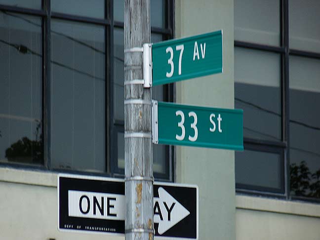
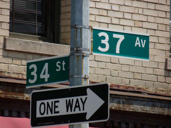
There’s a right way and a wrong way to do everything, and the recent installation of Clearview street signs in Long Island City illustrates the point perfectly.
The signs at 37th Avenue and 34th Street use the boldface version with the normal width, with white racing stripes at the top and bottom of the sign to contrast the green background of the sign. This style has been in place since about 1985, and there’s no reason to change it now.

Or is there? The pair at 33rd Street use the condensed version of the font in regular weight, with no racing stripes. The overall impression is indifferent, if not just a bit nonassertive and wimpy. Nevertheless, this seems to be the version that is appearing on most streets, not the boldface, take-charge vision.
This has probably come up because the signs are likely being produced in more than one shop. If I were involved, I’d try to cajole the foreman/forewoman into producing the correct version, which, of course, is the one on 34th Street.
7/30/14


7 comments
I believe that the NHTSA has jurisdiction over all highway and street signs. A number of years ago they tried to mandate that all municipalities change to the new signage immediately, but local cities, counties, etc. squawked enough about the cost to allow them to wait until the signs needed to be changed because of age or damage.
Another change are the lower case fonts that is now a federal mandate which is now replacing older signs as needed that currently use all upper case fonts.
I definitely agree that the signs look better with the white stripes. The boldface numbers, I’m not so sure about.
NHTSA be d***ed, bring back the humpback signs!
Another worthwhile use of our tax money by our beneficent goobermint! (Other truisms; The check is in the mail; and you can keep your current health insurance plan!)
The top signs look better for sure but based on my informal observations they’re a rarity in New York. In my own neighborhood of Crown Heights the city has installed what appear to be anomalous versions of the white-on-brown historic district sign using an elongated version of Clearview. The old all-caps FHWA historic-district signs were a little hard to read, but these new ones are just ugly because of the nonstandard letter width.
I’m pleased, though, to see that the city has not done away with two-line signs for longer street names. The Washington Avenue sign across from the Brooklyn Museum at Eastern Parkway has a nice look to it, with its neat lowercase “g” descending into the line occupied by a left-justified “Avenue” in a smaller font. Very classy, very Québécois or Italian if it weren’t for the federally-mandated green color.
I noticed a few years ago when the mixed case signs began to appear that certain signs just looked off, but I couldn’t place what it was. Then it hit me that the problem was with names that had descenders (lowercase y, p, etc.). In those cases they were shrinking the name so that there was room for the descender, and it was messing up the whole symmetry of the sign. The most recent signs have done away with the racing stripes, and now if there are descenders in the street name, they simply extend to the bottom (where the racing stripes would have been), which alleviates that weirdness. I would assume they chose to do away with the racing stripes for that reason, and they likely removed them even from the signs where that isn’t an issue, because it would be strange to have signs that don’t match.
I always liked the racing stripes — they were uniquely NYC. But if they are going to have mixed case signs, it creates a problem. The numerical sign above looks great, but that “Perry Av” sign that was plastered all over the newspapers a few years ago was a mess.
Having said that, I don’t understand why they are using condensed type for numbered streets. Numbers were always wider/bolder and they popped. The first time I saw a numbered street sign with condensed type, I assumed it was a goof. Then they started popping up everywhere, so I guess that’s the standard they settled on. I do like Clearview, but the one thing I prefer about the old font are the numbers. The numbers looked fantastic in the old font, especially the numbers 2, 5, 6, and 9.
I don’t know when the top sign was installed, but it looks similar to the ones on the north side of Queens Boulevard and 43rd Street in Sunnyside, and those were one of the earlier sets of Clearview signs from a few years ago, before they settled on the bottom style.
On a related note, the city keeps replacing signs that don’t need to be replaced, while ignoring requests to replace missing/worn signs. I submitted a request two months ago to replace a missing 59th Place sign on the north side of Laurel Hill Boulevard in Woodside, and they indicated they would respond within 30 days. It’s been almost 60, and the status is still “Past Due”. Talk about Forgotten NY!