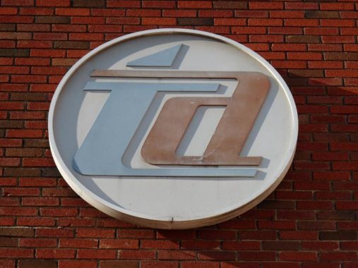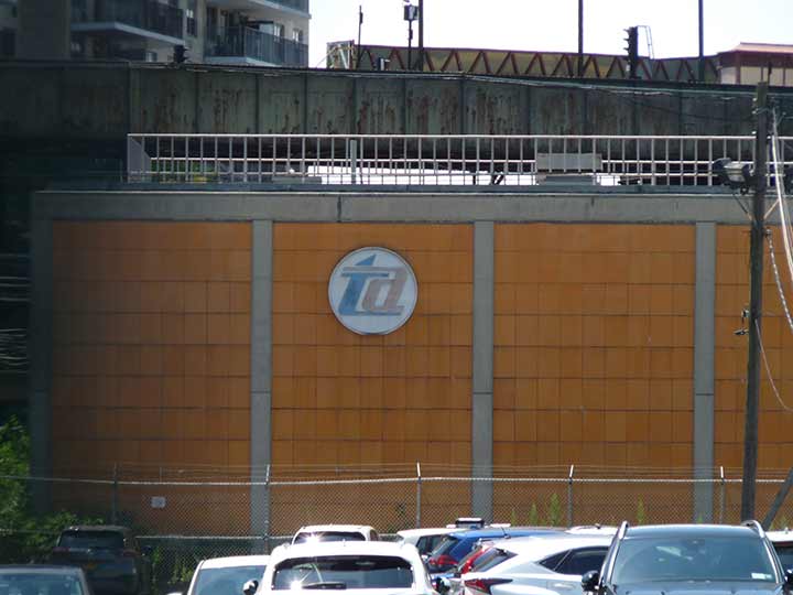
So there I was, idling on a wicker seat on a 1910s BMT B-Type “Standard” subway car making its way down the Q line from 96th Street to Coney Island on a Transit Museum nostalgia train run, when I spotted the best Transit Authority logo ever designed as the train was passing a substation located at the south end of West 6th Street, where the F train joins the interlocking group of subway elevated tracks. After debarking the traincar, I staggered over to see if I could get a picture. The substation is well fenced off, but I was able to use the zoom and shoot through the chain link fence to get a photo of the medallion on the north side of the substation.
The Transit Authority only employed the interlocking TA logo from 1962 to 1968. After that, the agency was called the Metropolitan Transit Authority and the two-toned “M” (see the logos on this page) ruled from 1968 to 1994, replaced by the “Doppler” logo with MTA letters getting smaller as they recede, as train noise gets fainter when it passes at high speeds.

I don’t know the designer, but it’s certainly Glaser-worthy. The blue and orange in the logo are the official colors of New York State (which is why the Knicks were blue and orange, but not why the Mets wear the colors; in baseball, blue and orange were the colors of the Dodgers and Giants.
I have seen the interlocking TA elsewhere around town, most recently on Fulton street under the el in East New York; but they have to be in out of the way, unnoticed places, lest the control freaks at the MTA take notice of them.
As always, “comment…as you see fit.” I earn a small payment when you click on any ad on the site.
7/13/22


6 comments
The control freaks don’t care. That is why there are still old entrance globes all over the place.
There are plenty of the two-tone ‘M’ globes (square globes) still in place. I even saw a couple of solid green globes (vs the newer green top, white bottom ones). At 49th St/7thAv, one entrance has the solid green globes, across the street are the two-tone ‘M’ ones, and on the other side of 7th Av, there is the green over white one.
You were on the nostalgia train last Sunday as well? My besty got me a ticket. I took it in both directions. It was fabulous!
I remember that logo from the Worlds Fair train livery.
I encountered some cars that had rattan seats on the IND in the early 70s.Felt
I was in a time warp.
Thanks for the memory. BTW the Doppler shift is a change in the pitch of the sound not a change in its intensity. True, the sound of a train or horn grows louder as it approaches and gets softer as it pulls away, but a Doppler shift alters the pitch: higher as it approaches and lower as it recedes.
George, Kevin was talking about the current MTA logo, not the Doppler sound. I have never heard the logo design called that. When I look at it is l think of the old PacMan game.
Thanks – makes me very nostalgic. My dad worked for the TA’s engineering dept. for well over 30 years, beginning in the 60s at the old Jay Street HQ. He always called it “the TA,” not the “MTA” or any other nickname. As a kid, he passed on a love of the different buses, train cars, etc., and would always point out logo and font changes those times we’d ride together from our apt in the Bronx down to Brooklyn. I too, love the pre-’68 logo, and vividly remember it in full (now faded) color.
I am in real estate law, and follow your page for its wealth of knowledge on neighborhood traits, but it’s serendipity (for me) when the topics go over to mass transit.