

I recently walked much of East and West 45th, which will eventually turn up in an FNY Crosstown page. On the street, I worked for 6 straight years at what was the city’s biggest type shop when type shops were a thing, Photo Lettering, so I do feel a bit of nostalgia when I pass these realms again. Here’s a place I passed every late afternoon or evening on the way to work, though I never went in, preferring the nearby Blarney Stone on 3rd Avenue.
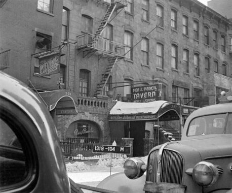
East 45th came to be known as Steak Row in its heyday beginning in the 1920s. One of the more famed of the restaurants of “Steak Row” was the Pen & Pencil, where Hunsecker/Winchell-esque columnist (though nicer and more journalistic) Earl Wilson once held forth from there. His NY Post columns were punctuated by a daily photo of a busty film diva and his tagline, “That’s Earl, brother.”
[John] Bruno’s Pen & Pencil expanded from 203 E. 45th St. to a larger location at 205, on the premises of a former soda fountain. John redecorated the new place to include watercolor paintings by Milton Marx of famous writers, from Lord Byron down, and at least two great newspaper publishers—Joseph Medill Patterson and William Randolph Hearst. [Lost City]
The Pen & Pencil closed in the 1990s and the premises was home to The Perfect Pint by 2006. Note the typefont the signs were set in. It is known as Benguiat (pronounced “BENG-gat”) and it was invented by Ed Benguiat, a jazz percussionist turned type designer who worked at Photo-Lettering, where I worked, and I would see him on the premises occasionally.
So, on the same block where “ink stained wretches” gathered were printing plants and type shops. I am glad to have had my feet in both worlds.
As always, “comment…as you see fit.” I earn a small payment when you click on any ad on the site. Take a look at the new JOBS link in the red toolbar at the top of the page on the desktop version, as I also get a small payment when you view a job via that link.
8/29/24
10 comments
That place looks about as authentic as a Steak and Ale.
”Where hearty eating abounds….”
Chris: I think you mean Steak & Brew
No,I’m afraid I meant Steak and Ale.Through the years there have been a lot of ”Steaks”.Steak and Ale,
Steak and Brew,Steak and Shake,you name it.The one I’m talking about was a chain that replicated the
Ye Olde English Tavern theme at all their locations.Where good fellowship and camraderie abounded
complete with fake fireplaces.Sometimes methinks that if they had hired some buxom serving wenches
for their restaurants they might still be in business.
The defunct (though recently revived) Steak and Ale chain had an alternative name for its restaurants, Jolly Ox, for use in jurisdictions which prohibited the mention of alcohol in trade names.
Chris: Oh, good to know (even if it’s just so much trivia now).
I’m amazed we never ran into each other back then. I worked at Conover-Mast, later Cahners Publishing, at 205 East 42nd Street, from 1967-74, doing magazine production. During that time, I started in letterpress, eventually the magazines got into cold type. There was a dedicated room at Cahners with a proof press and a guy whose sole job was to pull proofs off letterpress ad plates received. C-M and Cahners used Photo Lettering, and numerous other type houses. I still have some letterpress plates here, and a letterpress paperweight, “Dixie Delivers!” from Dixie Electrotype Company, Nashville—along with a bunch of other stuff from those days. I like to say that everything I learned doing magazine production back then is now, and has been for many years, obsolete.
I didn’t arrive at Photo Lettering till March 1982.
Ah! By then I’d left Cahners, gotten a job as Production Manager on three trade magazines at 40th & Lex, then went to work for Fawcett Publications on Rudder Magazine—and left to start publishing my own magazines, in 1975.
That building housing the Perfect Pint is very curious. It’s slightly under the much larger new building next door and doesn’t resemble the original building that housed the Pen and Pencil much aside from the same number of floors. Perhaps a tale of purchased air rights and massive renovations enabled by the sale. A similar possible tale of air rights seems to hover around Katz’s Deli on Houston St. enabling it’s continued existence without worry for a long time, although the developers next door didn’t take advantage of it…yet. I wonder how many air rights tales are around the city. There’s another oddball construction on 1st Ave and 5th street over the Rite-Aid store.
Since 1972 I have worked as a graphic artist, designer, production artist and illustrator mainly in print publications.
A client requested Benguiat to be the font in their project. I has been included in my top ten list of fonts since. The magazine U&Lc (Upper & Lowercase) was an inspiring publication. It demonstrated how fonts play an integral role in the best graphic designs. They featured Benguiat in one issue.