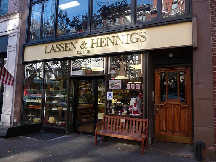
DELICATESSEN Lassen and Hennig has been in business in Brooklyn in various locations since 1949, as the sign indicates. Currently, it is located on Montague Street in Brooklyn Heights (this photo) and on Water Street in DUMBO. My attention, though, was drawn to the signage, which is in a font much underutilized in that role, Baskerville.
Many of the serifed (the fonts with the little lines or teardrops at the end of strokes) typefaces we read today go back many years, even centuries, though the two most common, Times Roman, was created in the 20th Century, as was the nonserif Helvetica. John Baskerville (1707-1775) was a paper manufacturer who dabbled in typefont design, and his signature font, first cut in 1757, based on previous designs like Caslon, caught on, especially as a book font. It’s sparingly used in signage, which is why I note it here. There are numerous knockoffs and variants, such as a thick-shafted version used in Reader’s Digest magazine for many years. As a Photo-Letterer in the 1980s, I worked with its own variant, Baskervale.
As an added attraction, the lettering on the right side of the front window is in Bernhard, a font perhaps best recognizable from its use on the intro and outro titles of The Twilight Zone in the 1950s-60s and again in its Jordan Peele revival in 2019.
Check out the ForgottenBook, take a look at the gift shop. As always, “comment…as you see fit.” I earn a small payment when you click on any ad on the site.
3/29/25


6 comments
Good sandwiches at L&H. I used to live a few blocks away in the ’90s.
My favorite font when I was a kid was Old West Wanted poster.I used to
sit in class and draw the ”w” over and over in my notebook.Lettering is hard!
Baskerville works well for this sign and the colors look good. As a graphic designer for the past 53 years I also have a keen interest in font design. A great resource for other type aficionados are the free back issues of Upper&Lower Case Magazine link below:
https://archive.org/details/ulc-magazine/Volume%201-1/
I admit I still have lots of Letraset—all now more than 50 years old—in an original Letraset drawer system. Had lots of typefaces that never existed anywhere else. Keep it for sentimental reasons (likely all dried up by now). Baskerville never a favorite of mine. Now, Bodoni, Cut-In Medium, Cooper Black, Egyptian, Memphis, Eurostyle: THOSE are Typefaces! (And I walk by/go into L&H every few days, btw.)
Good delicatessens are hard to find.
Years ago, i frequented a deli called “Conrad’s” on East 41st Street between Madison and Park in midtown.
Middle aged German ladies worked the counter. Most came from Ridgewood.
One of them kept trying to set me up with her niece, I refused. The woman turned me onto a great sandwich, egg salad with bacon on a Kaiser roll with lettuce, tomato and…mustard.
Kevin, I have always been amazed at your encyclopedic knowledge of type faces. It is a very odd colncidence that there is a Baskerville typeface. It was in “The Hound Of the Baskerville’s” that Sherlock Holmes displays his encyclopedic knowledge of type faces. Sir Henry Baskerville, on his arrival in London, has received a mysterious note composed of words cut from a newspaper:” As you value your life and your reason stay away from the moor”. Holmes is able not only to say what newspaper it has come from, but also the column in that paper. When Dr. Mortimer expresses his astonishment at how he could do it, Holmes explains that “it his special hobby,and that to his eyes he can see the difference between the leaded bourgeois type of a Times article and the slovenly print of an evening half penny paper”. “ The detection of types is one of the most elementary branches of knowledge to the special expert in crime, though I confess that when I was very young I confused the Leeds Mercury with the Western Morning News”.