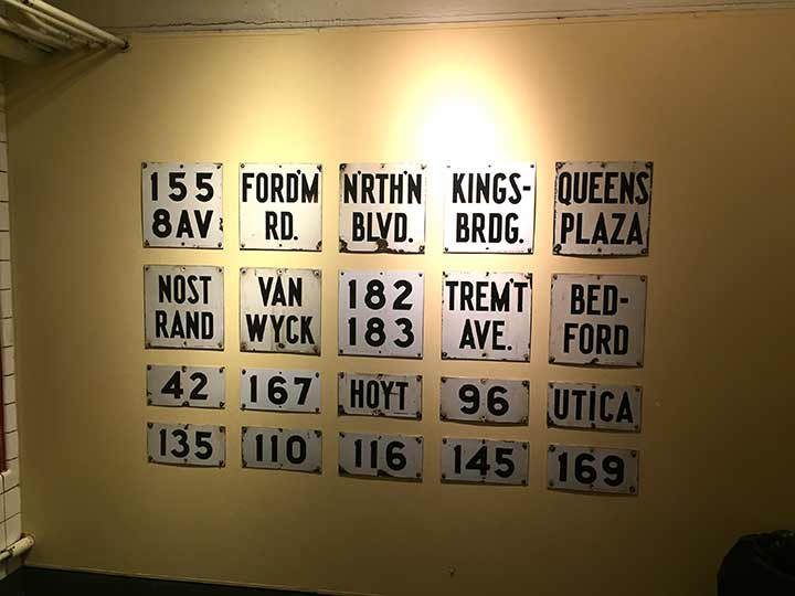
ALTHOUGH I am a loyal (dues-paying) member of the NYC Transit Museum on Schermerhorn Street, I have not been able to visit since January 2020, just before the pandemic. The museum has exhibited a fairly comprehensive selection of subway signage throughout the years. I’m fascinated by the square signs that were employed on subway columns. Most of these, before the 1980s, were white enamel signs with black lettering in a font designed specifically for the Transit Authority (I have not seen it elsewhere).
Most of these signs were replaced by black signs with white lettering, first in the Standard font, then in Helvetica. The most prominent feature of these signs was that speace considerations required abbreviation, sometimes with apostrophes or hyphens, sometimes not. In this batch, notice that Nostrand is divided into two lines without punctuation, while Kingsbridge has a hyphen and period, and Fordham and Tremont get apostrophes.
If you look carefully, on the lower right in very small lettering, too small for my zoom lens to make clear, is the manufacturer and its address. Many of these signs were made by the Baltimore Enamel and Novelty Company, in business from 1898 to 1943, which produced products like municipal signs and license plates. Occasionally signs like these pop up for sale online. I do not know if the company produced Manhattan’s distinctive navy and white humpback street signs.
The last enamel signs of this type in service were on the BMT Times Square station which remained in place into the 1990s. In some stations, you’ll find them in columns located between uptown and downtown tracks, such as at the West 4th Street IND station. They’re pretty dust and crud-encased by now, though.
Check out the ForgottenBook, take a look at the gift shop. As always, “comment…as you see fit.” I earn a small payment when you click on any ad on the site.
1/23/26


10 comments
What was wrong with them that they had to be replaced?
Just more NY bullshit is the answer
Someone (with a relative in the sign business) decided that white lettering on a black background was easier to read than black lettering on a white background.
I well remember those station signs, as many of them shared the poles with the penny gum machines. If you actually purchased a piece of gum from them, you had to keep it in your mouth for quite a while for it to soften up enough to chew. More than a few teeth, or fillings, were cracked if you were too impatient to wait until the gum was ready to enjoy.
The signs in the photo are all from the various IND routes that opened between 1932 and 1940. BMT subways used similar white enameled signs on platform columns, but the fonts used were a bit different. IRT stations had varied column signs; the oldest stations had painted signs on round columns. When IRT platforms were extended beginning in the 1940s, I-beam columns and enameled signs were used as well.
Ken – your memory of the gum is hilarious, I recall doing the same thing
I clearly remember the column signs at Union Turnpike on the F when I was a kid. “UNION T’P’KE” I believe some of these signs are still hanging on the curtain walls separating the express and local tracks in local stations on the IND QB line.
I too remember the penny gum machines.You had the choice of
3 Wrigley flavors.The gum was old because the vending company
was too cheap to rotate their stock..We always called old gum
”subway gum”.I rhink the last time I saw a gum machine was 1969.
Waiting for what felt like hours on the High Street station drove me to take a closer look at the signs, and the manufacturer even shortened their own name to Balto. Enamel. I became obsessed with looking for the manufacturer name on these signs, and wish I could recall the competitor company who also produced them. I believe it began with a “D”
I really started somethin’
Found it! Name was Nelke https://www.nyctransitforums.com/topic/48340-making-of-original-enamel-signs/