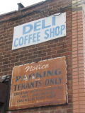
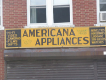
JUST like pretty much everything else, the art of signage has suffered over the past few decades. That’s getting to be a frequent trope in Forgotten NY, and I’m going to have to wean myself off of it, but the city sometimes makes it so darn hard for me to stop. Just as the city, especially in the local neighborhoods of the 5 boroughs, is being filled with ugly, brick architecture, the great, hand-lettered, stenciled and neon signs of yore are succumbing to vinyl awnings with misspelled words, most of them in eye-ease Helvetica. Here in Forgotten NY, though, we still exist in a New York of carefully crafted mini-masterpieces that never failed to draw in myriads of customers. And we’re going to show you as many of them as possible.
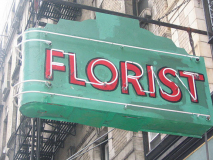
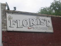
8th Avenue between 21st and 22nd Street, Chelsea. Doubling your pleasure here with a hand-lettered ‘florist’ in red with a black outline, echoed by neon lettering on a solid green marquee. What color is this at night when lit? When I passed by in August 2005 the florist had closed; hopefully the next tenant will preserve the sign. It’s incredibly well-crafted by people that give a s!@# about signs. The black outline was rendered with either a blunt brush, or an unsteady hand, but who cares? A sign doesn’t have to be done perfectly.
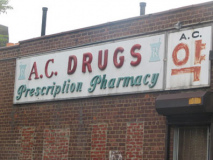
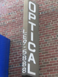
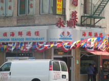
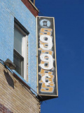
This is all signage you’ll find scattered around fab Flushing, my adopted home for over a decade. Downtown Flushing is mostly Asian; most of the signs on Main Street are in Chinese, while Union Street seems to be a Korean stronghold. Yet as little as 20 years ago Flushing was a Jewish stronghold. These signs are among the few mainly in English left, and as you can see they’re rusting away. A.C. Drugs and the optician are still there, but are owned by Chinese proprietors now. The ones with the lettered phone numbers predate the swingin’ Sixties. “LE” stood for LEnnox; “FL” was “FLushing.”
photo from bridgeandtunnelclub.com
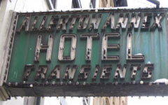
Both of these turn up on 8th Avenuebetween 21st and 22nd Street in Chelsea, a stronghold for 1940s-style neon. The Allerton Annex sign has just been there all these years, because it’s too much trouble to remove. I like the use of the term ‘transients’ in the sense of people were there for short stays. These days the word has a more negative connotation, as in “bums.”
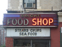
Bright Food Shop had this neon sign all these years too, but sometimes these signs attain a sort of hip glamor to them. I won’t say ‘ironic’ because there’s never a flippant or arrogant component to the businesses that maintain old signs. But sometimes, if you just stay in the same place and never change, you sort of obtain a nobility. I wish my ex-employers had that notion.
RIP: August 2007
These hand-lettered beauties, on 61st Street, Woodside , Queens (left) and Metropolitan Avenue, Queens, have done the job since the late 1970s, but probably no earlier. “Video” didn’t enter into the public consciousness in a mass-market sense till the 1980s.
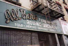
LEFT: I’ve already featured this ad on Grand Street in Williamsburg on a previous ad page, but it really should be here. I love the green linoleum or plastic background, the neon “All-Boro”, and the block lettering which also had been neon’ed. Likely from late in the fab Forties.
I still have a typewriter, just in case; but technology is moving at lightning speed now. In a few years people will no longer have to write at all, with bluetooth letting people talk to their machines and allowing people to be untethered by cords.
What a nightmare world it’ll be.
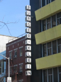
ABOVE: Burger-Klein, former furniture outlet, Avenue A between 2nd and 3rd Streets. This represents what I dolike about 1950s-era design: the clean lines on the monochrome pale yellow panels. But the 50s led design down a sorry path.
RIGHT: former Oldsmobile dealer, Flatbush Avenue and Avenue D, Brooklyn. Dig the tiny clock at the bottom, and the ugly modern sign under it in eye-ease Helvetica. The Oldsmobile imprint was ended in 2004 after a 107-year run, after its founding by Ransom Eli Olds in 1897. General Motors phased out the brand in 2004; the last Olds produced was an Alero, in Lansing MI, where Olds started the company.
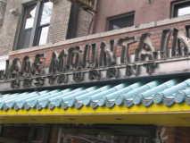
Above two, Second Avenue near East 10th Street, East Village; left, Pitkin Avenue, Brownsville, Brooklyn.
I’ve always found the practice of mangling Roman characters to look Chinese in signage rather patronizing; it’s done to a lesser degree with Hebrew, Arabic and Indian lettering, quite possibly by Asian, Indian, Arabic, etc. proprietors, so who am I to judge? What do you think?
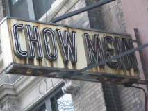
You’ll find quite a few ancient neon “chow mein” signs around town. I’ve never had it but I think from the 1920s through the 50s, Asian restaurants would advertise the mildest and most ‘familiar’ fare in the States, in an era when Chinese food was still considered somewhat exotic. I am by no means an expert on the cuisine though.
In the Light, Briefly
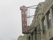
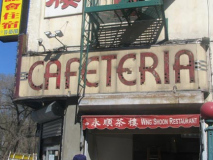
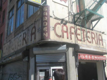
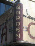
I received a frantic … well, I won’t call it frantic,I’d call it urgent, phone call from Vinny in May 2005. I had to haul it to the corner of East Broadway and Rutgers in the Lower East Side, and do it quick, or I’d be missing out on something good. He was right.
Awesome, don’t you think? The exuberant craftsmanship emblematic of a country either still deep in a depression or engaged in a world war but yet confident everything would be all right. And why wouldn’t it be, when you produce a wonderful sign like this, destined to last deacdes? Ah, well. It lasted till probably the 1960s, when styles changed and something in Helvetica probably replaced it. (In homage to this sign, my iTunes player shuffled to Benny Goodman’s ‘Sing, Sing, Sing’ just as I’m writing this.)
Unfortunately, from the looks of the new sign (which I snapped about a month later) the old one has been ripped down and is probably in a landfill someplace now. But it sung, sung, sung for a few more days in the 2005 sunlight.
Forgotten Fan Marc Berger writes that the Garden Cafeteria was a favorite of writer Isaac Bashevis Singer. Photographer Bruce Davidson mounted an exhibit of Singer’s life and times, including his experiences at the Garden Cafeteria, in 2004.
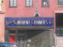
A pair from Lafayette Avenue in rapidly gentrifying Fort Greene, Brooklyn. I see from brownstoner that the locals are up in arms about a Blimpie moving into the area. We don’t have enough of them in Flushing; I wish I had their problems. The ‘French garment cleaners’ have a natural hook, being on Lafayette Avenue, and have added a Tour Eiffel rendering above the ad. Plenty of NYC dry cleaners label themselves “French cleaners” but what exactly is French cleaning technique, anyway? And, “garment” is a word being phased out in common parlance. In fact most multisyllabic words for generic clothing have been. Nobody says “raiment” anymore, either.
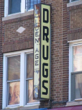
LEFT: Golden Age Drugs can no longer be found on Myrtle Avenue in Ridgewood, but the sign, and its subtle “Rx” are still there. The Rx symbol is an ancient one and has a variety of possible origins, as the ever-reliable Cecil Adams explains for you in The Straight Dope.
RIGHT: You often find palimpsests, or overprints, on old painted ads when the ad on top, produced with cheaper paint, fades away and allows the underlying ad to show up again. But on this sign, the painter apparently thought, f!@# it, I’m not bothering to paint out the sneaker ad, I’ll just superimpose 99¢!
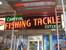
It’s not just any old rod and reel shop; for one thing, Capitol Fishing Tackle, in business since 1897, is located on the ground floor of the Chelsea Hotel at 218 West 23rd Street. As Field and Streamputs it…
At any given time, at Capitol Fishing Tackle and Cutlery in Manhattan, a dominatrix might strut in to purchase some nautical rope for a bondage session, a downtown barmaid might bounce in for some monofilament to thread through the hole of her belly button piercing, a theatrical monster makeup artist might browse tackle boxes for something in which to keep his brushes, and an Upper East Side matron might brusquely demand a spool of 6-pound-test FireLine—and nothing else, thank you—for use in her latest beading project.
The fact that the hotel that played hostel and recovery ward for some of the world’s great literary and creative nabobs is also the home to NYC’s pre-eminent fishing supplies shops, or so some of its patrons believe, bends the mind somewhat. But I’m here for the fab red and green neon, likely from the 40s, that still advertises cutlery, which Capitol hasn’t sold since the 70s.
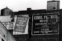
For decades, Carl Fischer, the music publisher, has had a gi-normous building ad facing Astor Place, its HQ from 1923-1999, where it meets Cooper Square. (Fittingly, it’s an eighth note; East 8th Street meets Astor here as well.) Fischer is now located on Bleecker Street and the big sign’s future may be in doubt, with the nearby construction of “Sculpture For Living.”
A much older sign advertising Fischer when it sold musical instruments can be found nearby, at 103 East 16th Street; according to ad maven Walter Grutchfield the store was there from 1950 to 1970.
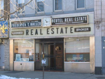
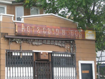
Haller Real Estate, Myrtle Avenue in Ridgewood, Queens, and Hot & Cold Heros, Leavitt Street, Flushing. Both employ a sort of semi-condensed block lettering used most often beginning in the 1950s on cafeteria-type restaurants; those signs are most often in green with gold letters. These ads are a kind of variation on the theme. Note the “Pepsi” sign on the right…quite a few logos ago.
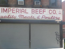
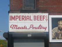
Imperial Beef Company, Myrtle Avenue a little east of Bedford, Bedford-Stuyvesant. Wonderfully hand lettered sign combining block print and script in bold red and white.
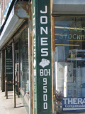
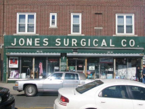
I was waiting for Christina one day at Metropolitan and 71st Avenues in Forest Hills, and showed up an hour early. That just gave me a chance to inspect the awesome storefront of Jones Surgical Supplies, with its righteous forest green tiling and bold white lettering. The phone number, BO1-9500 (BOulevard) is the old school version of 261-9500 (gander at the old-school rotary phone depicted above the area code…when the signs were produced, the artists naturally assumed that rotary phones would be used for a good long time to come, and they were).
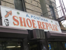
The juxtaposition of the image of Honest Abe with a stacked heel 1970s disco shoe at Fontana Shoe Repair in the East Village was too strange to pass up. What’s Abe doing here, anyway? A stealthy street artist likely stenciled him in, but why?
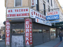
We’re on Myrtle Avenue yet again, in Ridgewood, where we find similar lettering to the Heller Real Estate and Hot and Cold Heros above. I had no idea Singer made vacuums.
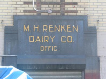
Back in Bedford-Stuyvesant we find a Machine Age-type sign for the Renken dairy office Howard Roark would have been proud of. I recall the Renken brand as a kid; we don’t really buy milk by brand name, even though there are quite a few. Milk is milk and there’s no difference between brands, after all.
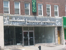
LEFT: Another ad briefly uncovered.One of the ugly modern vinyl awnings was removed on Grand Avenue in Maspeth, and voila, a 40s tiled ad for Long Island Lineoleum & Rug Company was revealed. Earlier in the century, it was a bit more acceptable to call establishments in Brooklyn or Queens as being from Long Island, but of late, city residents have gotten snobbier about it. When I temped at the NY Post, I overheard a good-natured argument about whether Brooklyn and Queens were on Long Island. Physically, yes; temperamentally, no.
RIGHT: Yet another Ridgewood classic on Myrtle Avenue
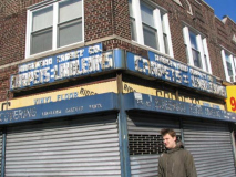
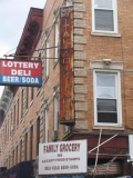
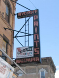
Both on Jamaica Avenue in Woodhaven.
Most, if not all, of the signs on this page deserve a place in the National Sign Museum in Cincinnati. Shortsighted building owners, however, will likely send them all (except the Capitol Fishing Tackle and Bright Foods) to the scrap heap sooner than later. What a shame. At least, they’re here on this page.
Most photos taken between January and August 2005; page written August 18, 2005.
Related:


