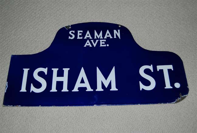
Here’s another one of those marvelous navy blue and white street signs used in Manhattan and the Bronx between about 1913 and 1964. Seaman Avenue and Isham Street are way up north in Inwood.
It’s an incredible font. There was a real flair in the rendering. Look at those cap M’s. I’ve never before seen a cap M without serifs at the top. And, look at that incredibly sharp angle at the bottom of the N, which plunges below the baseline. Incredible stuff.
10/10/12


2 comments
Hey, Just saw this on Facebook. I love these blue humpacks too. Thankfully, many of them were saved. I have a really nice one from Greenwich Village. Here is a link to the image in Flickr. Note, the “W” plunges below the baseline, in the same fashion as the “N”. That detail stands out very nicely. Come to think of it, the “M” in the smaller type of the cross streets does the same thing.
However, some blue humpbacks continued to appear on several Manhattan streets well into 1970, six years after the then-Department of Traffic instituted the “color-coding” system (among them East 14th Street and Union Square East, and the southwest corner of Fulton and South Streets). New signs of this type would apparently be made as late as about 1950, given how some with this style mentioned United Nations Plaza.