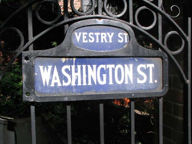
I had been unaware of it, but NYC’s Department of Transportation officially refers to these type of street signs as “camelback” signs, instead of my own appellation, “humpback” signs. I suppose it’s classier that way.
This sign adorns a gate at Washington and West 10th; when in use in the early to mid-20th Century, it was fastened on a pole several dozen blocks further downtown.
11/23/12


4 comments
Those signs, white letters/numbers on a blue background, were found in Manhattan and The Bronx till the mid 1960s when the black-on-yellow (Manhattan) and white-on blue (Bronx) retangular signs without the humps were installed. In Manhattan, a few of the major N-S Avenues (3rd, 5th, 9th, and Broadway) were given a unique group of large rectangular signs with black-on-yellow large lettering, including a smaller rectangle with the instersecting street name below. These too, although very effective, gave way to the mid-60s rectangles.
Does anyone know if the font used for these signs was named? Was an electronic version ever produced?
I wish it had been.
Besides being classy tis also more logical. Say ‘camelback’ and one knows the shape instantly, camel with a hump. Say ‘humpback’ and one thinks whale. Haven’t seen too many whales with a hump.