In Boston, subway and surface lines are identified by color: red, blue, green and orange. Recently, an express bus system was implemented, known as the silver line. Lines can be identified by color there because trains/streetcars are assigned to specific trackage. In NYC, the system is so large and complicated that trains can be rerouted from one line to another, so even though different bullet colors are assigned to specific routes, trains can often use two separately built lines on their routes. Out of towners often make the mistake of asking for the “green line” if they mean the 4, 5, 6 or the “yellow line” if they mean the N or the R.
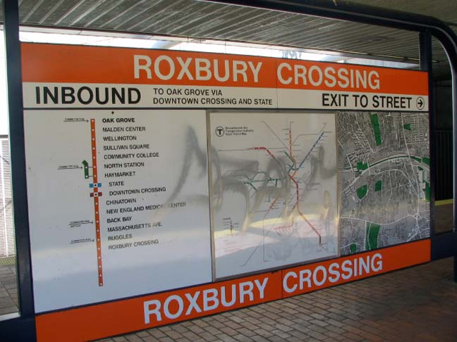
In the 1970s, the MBTA — or the T as it’s known — developed a system signage scheme that incorporated line colors, a line strip map, a systemwide map and a street/topographical map, as well as words in the easily readable Helvetica Bold font. This combination appears in most stations.
3/18/13


5 comments
This is a second version colored line strip map, the old ones featured black dots instead of white dots for station stops…The early 1980s when the Red Line was extended north and south the T switched to these new maps as they were easier to read.
The neighborhood maps were put in place in the 1960s, with the ones at Bowdoin, State, and Government Center showing buildings and overpasses that were planned but never built. They also feature buildings that were torn down or renamed long ago.
Within the past five years the MBTA has started to bring back the neighborhood maps zoomed in to show a half mile radius around the stations. These maps are also paper- making them able to be updated rather than left for 50 years to give false information.
The strip maps are even earlier than thought- they date to the earliest days of color adapting in 1965 as there are several that survived at Copley and Hynes Convention Center that showed the A Line(service “suspended’ 1969)
http://upload.wikimedia.org/wikipedia/commons/6/6c/Green_Line_branches.jpg
FYI, the commuter rail lines are known as the purple lines and they are shown in the more detailed map. I understand that the track gauge of the blue, red and orange are all different so cars could not be used on other color designated lines.
Track gauge is the same on all four lines. Differences are the lengths and widths of the cars, platform types, and the different types of electric power distribution used, making each line’s rolling stock incompatible with the other three.
Orange Line: High platforms, cars with 3 doors per side, approx 60′ long, third rail power
Blue Line: High Platforms, cars with 2 doors per side approx 50′ long, third rail power in tunnels, overhead power outdoors
Red Line: High Platforms, cars with 4 doors per side, approx 70′ long, third rail power
Green Line: Low Platforms, articulated light rail cars, overhead power. This is sometimes called a trolley subway for obvious reasons. It was the first of Boston’s subways.
Often, someone else comes up with a good idea that, because one didn’t think of it oneself, is immediately dismissed. The differentiation by color of the nomenclature of the Boston rapid transit lines was resisted for well over thirty years by another system where through-routed train lines, maintaining the same color designation on a map line-wide, existed– Chicago’s “L’s”. Whereas it might not be practical in NYC to refer to lines by their color designation– “Take the Red line to West 125th St” (which one? All three of them go to two different stops) or “Take either the Blue or the Orange Lines to go to W 125th and St Nicholas Av” as opposed to “…’A’ or ‘D’ to 125th…” or ” …’B’ or ‘C’…” (depending on express or local station of origin)– in either case it resolves doubt, or adds no burden, simply to refer to the number or letter itself and not by its color. This is why the practice never came in, in NYC, of the Transit Authority using color designation once it had rationalized the mapping circa 1980. In addition, owing to rerouting, it’s easier for the passengers to figure that if it’s a “D” they’re boarding at Penn Station on the 8th Av line, it probably will pick up its regular route after Columbus Circle or W 4th (depending on direction of travel) than for station announcements to say that the arriving train is an Orange line train (which one? “B”, “D”, an already-rerouted “F”, or “M”?) By contrast, Chicago has only one line going to one terminal (except for the Green line, south of the Loop) and it makes sense there. They were just too stubborn to adopt it because they didn’t think of it first.