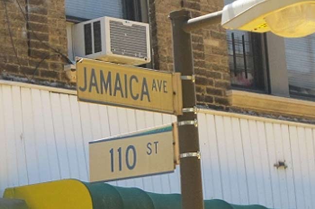
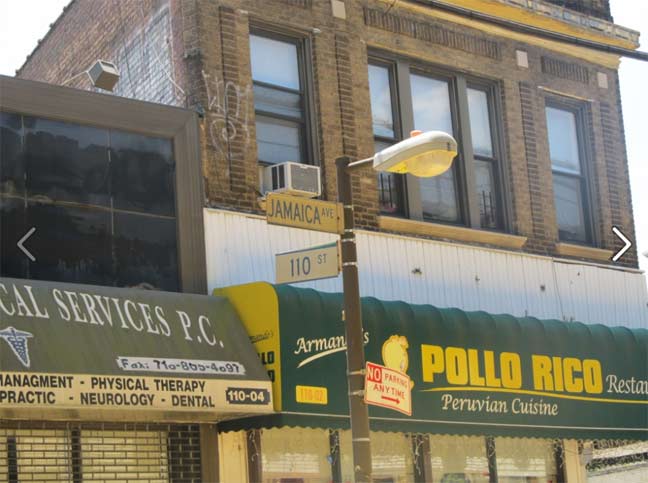
ForgottenFan Ed Wendell alerted me that there were some classic white-and-blue Queens signs turning up in Richmond Hill, relics of the on-location shooting for Men In Black 3, part of which was situated in 1969. Ed sent along some photos of the signs, one of which is shown here.

As you can see they’re decals placed on top of the regulation green and white signs. It’s surprising the Department of Transportation hasn’t removed them, and I’m likely dooming them by showing them here. There’s nothing NYCDOT likes more than uniformity — you can go to other towns and see decades-old street signage, but not here.
I applaud the MIB3 set designers — they got the Pantone colors right, as the signs are actually off-white, not pure white, and the blue stripes on the top and bottom were there too. They used the Highway Gothic font of the original signs — most set dressers can’t be bothered to get the fonts right. I would say the type on the 110th Street sign is a bit small but otherwise, good job.
However, these lampposts were introduced in the 1980s and in 1969, Jamaica Avenue had ‘dwarf’ versions of regulation octagonal poles there. Would have been a lot of $$$ to recreate that, though.
7/8/13


2 comments
a nit: weren’t the digits (110) left justified on the originals?
As of 1969, there were two lengths of signs in New York City: 24″ and 36″. The latter would have been used for Jamaica Avenue (‘AVE’ if 1965-67, ‘AV’ after 1969). 30″ long signs (as apparently on the JAMAICA AVE mockup) didn’t come into the picture until after the first set of white-on-green replacement signs in 1984.
Also, 5″ high Highway Gothic C (as well, in some cases, as 5″ Highway Gothic B) would have only been used on street signs in 1965-66. ‘110’ should have been 6″ high – but how it was justified depends on what year the sign was first put up. Signs where Highway Gothic C was the only font used, would have had the ‘110’ closer to the center, and ‘ST’ either closer to the number or nearer to the right.
Another nit: The old signs of the ’60’s had 2 mounting holes for installing the signs on the mounting brackets, spaced 8″ apart. It was in the 1980’s that it went to 3 holes, 4″ apart from one another.