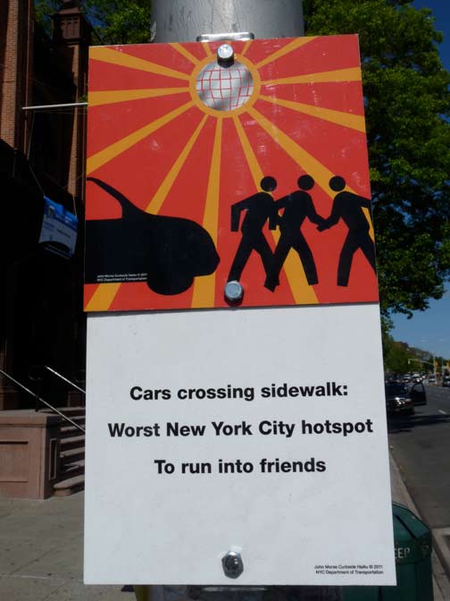
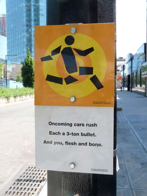
With pedestrian fatalities and injuries more common that usual in NYC in early 2014, I thought I’d root around for some photos I took of a program cooked up by the Department of Transportation in 2011 to alert the public that walking into traffic isn’t a smart move. It’s called “Curbside Haiku” and features twelve designs by artist John Morse. The signs are attached to lampposts an utility poles in areas where traffic is especially heavy and pedestrians and bicyclists have run into trouble. Each sign employs a haiku, a centuries-old style of poetry developed in Japan that consists of three lines and exactly seventeen syllables. Most of the signs spell out the haiku, but some have QR codes readable by smartphone apps. (Since I still live in 1985, that’s a world apart from my own.)
The one on the title card can be found on Jackson Avenue in front of the old Queens Borough Hall and reminds bicyclists that autos are in the habit of opening doors into the bike lane.

Here’s one on Jamaica Avenue across the street from King Park in Queens. The haiku says:
8 million swimming
The traffic rolling like waves
Watch for undertow

Northern Boulevard and Linden Place at the old Flushing Town Hall.

This one also appears on Jackson Avenue near 23rd Street.
These are pleasant designs, but is anyone paying attention? The NYPD has been cracking down on jaywalking, which is a ticketable offense, and the best deterrent might be a lighter wallet or a smaller bank account.
Here’s a list of every location in town where you can find Curbside Haiku.
1/22/14


8 comments
Honestly, I didn’t see how this helped with safe streets, and it probably cost taxpayers a lot to put them up.
I think they need to bring back the 1960’s “Don’t cross the street in the middle, in the middle, in the middle of the block” ad campaign. 50 years later and that song still pops into my head every so often and gets stuck there – just like “it’s a small world after all” at Disney World. I couldn’t find a video of the original commercial, but here is a link to an audio version http://www.youtube.com/watch?v=qWGEPZlbtX4
1985? Really? MC Hammer pants, big hair, mostly crappy music, NYC becomes Crackland and all sorts of other equally miserable stuff. But, if it was a good year for you, so be it.
I was listening to the Clash and the Ramones in 1985. However, I still use an answering machine, VCR, boxy television (2 of them) just like 1985. I have a flip phone for emergencies, just like 2004.
Gotcha, your clock runs slow. There’s a flip-phone or 2 in the old phone drawer at my house – I used my 2004 Samsung a670 until July 2010 and replaced it with an almost as ancient Motorola Flip until Feb 2012 – I answered a call with it at a Mickey D’s and when I was done, the guy at the next table asked me how old the phone was since he hadn’t seen a pullout antenna in years.
BTW, is the VCR remote connected to the VCR with that annoying twisted wire that everyone trips on?
Since you’re stuck in the ’80s here’s some affordable transportation for you (Re-elect Koch sticker available separately):
http://www.hemmings.com/classifieds/carsforsale/renault/alliance/1622999.html?refer=news
As well meaning and attractive as the signs may be, I’m afraid they are not going to be interpreted clearly by all. It seems uniform signs with black letters on a yellow background (standard warning sign colors) with simpler graphics (eg. a bicycle, and or pedestrian) with accompanying simple English explanations (such as x-ing) work the best. These are signs are found throughout the US, and would not confuse tourists (with New York being the number one tourist destination) and residents alike, and be understood by all.
If you asked me, I feel that these signs were more about having a legacy than safety, but that’s probably just me saying that.
I’m with Kevin. For decades now I refer to myself as living on the trailing edge of technology.