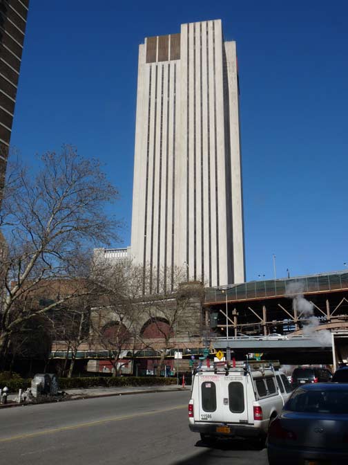
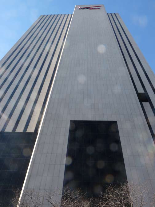
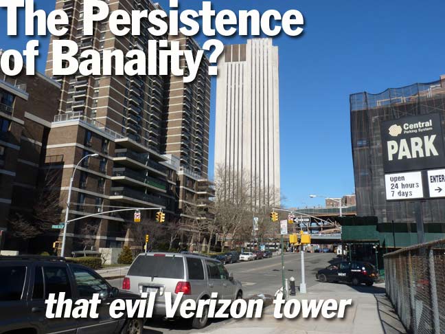
Despite what some daily NYC websites and their commentators have been saying over the years, and what the NY Times architecture critic said when it opened in 1975, the large Verizon tower adjacent to the Brooklyn Bridge approach on Pearl Street is neat-o by me. I mean, I’ve seen worse. I’m not an architectural critic myself, but I know what I don’t mind.

Officially called 375 Pearl Street, it was built for New York Telephone, but has served NYNEX, Bell Atlantic and Verizon over the years, and when Verizon is sold or merges with the next telecom company, it’ll serve whatever it’s renamed; in 2007, Verizon sold the building to Taconic Partners and now leases three floors. In turn, in 2011 Taconic sold it to Sabey Data Center Properties, which intends to develop it as a technology hub.
The building is a stark white tower with vertical-slit-shaped windows. When it opened in 1975 NY Times critic Paul Goldberger said it “overwhelms the Brooklyn Bridge towers, thrusts a residential neighborhood into shadow and sets a tone of utter banality.” The UK Telegraph ranked it #20 on their list of “ugliest buildings in the world.”

Am I really missing something here, or do I have no taste whatsoever? Brick for brick, is this as ugly as some of the piles of crap on that UK Telegraph list?
I like the white color, the clean lines, the slit windows. It projects orderliness and stability which are two things I tend to prefer. No question, the architects wanted to communicate the same thing.
There’s really nothing wrong with this structure. It’s no landmark, but it’s not evil personified, either.
3/10/14


25 comments
It’s amazing to consider the building was built in ’75, when vast floor spaces were needed for bulky switching units and such. Within a 15, 20 year period, computerization made these vast floor spaces obsolete
It’s is nicer that anything in the foreground or background of your picture.
The design of the building is not bad (and I am not an enthusiast of modern architecture at all) but it where it is located that is the main factor of it being unloved and not liked. With all the wonderful older architecture so close by what the critic at the NY Times said rings true for me. .
its disgusting , and has an overwhelming air of some form of Orwellian oppression. don’t believe me ? Google the Verizon building in downtown white plains.
Even if this building does get a face lift or gets remade, it will just be as banal, but only as an overrated glass building, so let it stay with its concrete exterior.
In the context of the times which was worse 375 Pearl Street or the World Trade Center? At least 375 Pearl didn’t destroy an entire neighborhood to make it’s banal statement.
It does have a severe look, granted; it was a building designed and built to house machines, not for the convenience and aesthetics of humans.
But I like it! The architect obviously took into consideration that the structure would be dominating the area and gave it some character, rather than just extrude a windowless concrete slab on site and call it a day.
On the scale of Taj Mahal to Ministry of Love, this definitely scores closer to the latter… but I don’t think that you’re off base on it, Kevin.
The building has a certain stern, imposing charm.
This building is an example of the “Brutalist” style of modern architecture. Brutalism is known for it’s simple unadorned lines, and repeated use of modular elements. This building may not be amongst the most beautiful ever built, but I certainly don’t think it deserves the extremely negative architectural criticism it received, and apparenty still receives, such as it’s ranking of number 20 on the UK Telegraph’s list of “ugliest buildings of the world.”
If you want to see Brutalist buildings check out the FBI HQ Building in D.C. or the Civic Center in Boston. Those things are brutal. Context is all. If 375 Pearl had been built in midtown we would not be having this discussion. Check out the Bush Terminal Building on 42nd street. They could be cousins. Dude at the Telegraph has issues of his own. Obviously does not like modern design. Perhaps he is happiest with his cuppa in some Victorian monstrosity. Some of those are hideous.
Old Skool, are you speaking of Boston City Hall as “Civic Center”?
Yeah, I guess I misspoke about that. It sorta sucks the life out of the middle of the city, in my humble opinion.
If I’m not mistaken, they aren’t really windows. I seem to recall that after another telephone building went up w/o windows (because it was mostly filled with equipment and not people), the City got them to build it so it looked like it had windows. Or is that just apocryphal?
Yes they are windows, small as they are.
For those who have read the Book of Revelation, it does have a distinct “666” look to it. Ditto Empire State Plaza in Albany, which reminds me of the four ministries mentioned at the beginning of the novel “1984”.
Book of Revealtions? Secretary of State Kerry intends to “impose” an agreement ( i.e. pre-1967 borders) between Israel & the Palestinian Authority on 4/29/14 if they don’t reach an accord by themselves (and they won’t). Pope Francis will visit Israel in May. If he visits the Temple Mount & makes certain statements, it’s time to confess & repent. Stay tuned to DayStar.
Interesting… Now that I look more closely at the preceding comments, I see that the “Orwellian” aspect has already been mentioned.
Personally, I was even against changing the exterior of 2 Columbus Circle when it was being discussed, and I thought even that looked good the way it was before.
Morlocks live within.
The building has a curious background. The building was built in the 1970s when NYC was in bad shape. NYC needed a new high school and AT&T needed a new building in the area. There was a deal arranged that the City would give AT&T the land and they would put their building and the high school next to it. They built Murry Bergtraum next door which is a much smaller, triangular building.
That building is now being coveted by the NYPD which is across the street and wants the building in order to expand.
Really, the whole area, from Chatham Square to Franklin Square and between Park Row and St. James Place/Pearl Street, was wiped out starting 1960 (and the Smith Houses had wiped the south side of Pearl even before the Third Avenue El came down). If there’s an ugliness to the area, it’s more just a lack of any unifying theme of any of the architecture (i.e. — the Verizon building doesn’t match down there, but neither does anything else)
It’s only a matter of time before these go away. These windowless AT&T-era buildings (of which there are several in Manhattan) exist to support hardline home and office phone systems, correct? The kind you can still plug a ROTARY phone into. How many of these phone systems disappear every year? Let me guess– thousands and thousands. 5 years from now, this valuable real estate will be bought up and condo’d.
If memory serves (and it may not), I seem to recall that the phone company went through a period of constructing their switching centers so that they could survive a nuclear attack. No, really. The idea was that making them windowless would prevent the gamma (?) radiation from hitting the switches and knocking them out. I seem to think there are other windowless telephone buildings located around the city, all built around the same time.
Wow, what a rush from the past! I worked in that fortress for several years for NY Tel. It was originally designed to house modern (for the time) switching equipmet for lower Manhattan. However it was decided to move the stuff to the World Trade center. Now stuck with a white elephant, NYT moved computers into some of the space. They pulled us out of the old Sperry Building on Park South and 23rd and stuffed us in there. What a nightmare! Lousey subway connections, few local restaurants, sketchy neighborhood. We would have to hike downtown to the Sea Port / Fulton Market or uptown to Chinatown / Little Italy for lunch. Not doable in an hour! As the computers became remotely accessable, NYT moved the non operational staff out to midtown. What a relief. Yes those are windows, but they were more like gun slits. The managers built their offices in front of them, cutting off the view for the peasants. Most professional photos of that section of Manhattan cut off south of the building. It is so out of place and not likely to see new neighbors. Just the decaying lower East Side.
obey!
https://www.google.com/maps/@41.032099,-73.769938,3a,75y,322.55h,106.44t/data=!3m4!1e1!3m2!1srct2kFjDv9adZ9NGNfuRaQ!2e0
https://www.google.com/maps/@41.032604,-73.769983,3a,75y,257.13h,120.23t/data=!3m4!1e1!3m2!1slwDKxYyJZljwUiMW6mg8NQ!2e0
UH-GLEE! And now an eyesore from another era…
http://nycma.lunaimaging.com/luna/servlet/detail/RECORDSPHOTOUNITARC~17~17~542731~109822:deg_42?sort=Identifier%2CFormat%2CType%2CCurators_Choice&qvq=w4s:/what/Buildings;sort:Identifier%2CFormat%2CType%2CCurators_Choice;lc:RECORDSPHOTOUNITARC~17~17&mi=9&trs=14