I have been an infrastructure buff almost from the cradle. In my earliest years, cast-iron, ornate lampposts, mainly Corvingtons and Bishop Crooks, still ruled the streets, interspersed with newer octagonal-shafted, aluminum, silver or grey lamps with a streamlined, no-nonsense design. When all of the castirons on 6th Avenue in Bay Ridge were replaced in 1962, seemingly overnight, with Donald Deskey poles, that was reflected in the reams of drawing tablets I used as a kid to sketch “street furniture.” Needless to say when the trench leading to the Verrazano Bridge was dug beginning that year, my wonder on the new fixtures I saw went into overdrive. I was never imaginative as a kid. Rather, I was reflective. When I would walk around Bay Ridge, or ride buses and trains with parents or later, on my own, I would always be inspired with wonder and delight at the various designs, styles, and even type fonts I was seeing.
I rode the B-63 bus on 5th Avenue “downtown” frequently and also the RR subway (as it was called then) under 4th Avenue. I didn’t like the subway as much as the bus, though, since looking out the window to see things like signs and lampposts was futile. Whatever enjoyment I got came from the stations themselves, which until 1970 were still bedecked in the same mosaic signs they had received when the line opened in 1915.
In 1970, the Transit Authority, as it was then known, changed things on the RR 4th Avenue (Brooklyn) and Broadway (Manhattan) lines. Mosaic tiling was considered passé, and unadorned, streamlined signage prescribed by Massimo Vignelli and the Unimark International design corporation was adopted. Subway maps and signage were updated around the city on a gradual basis. However, that year, the 4th Avenue and Broadway local stations between 77th Street in Bay Ridge and 5th Avenue in Manhattan were updated all at once with the exception of 49th Street, which received a special design from architect Philip Johnson featuring terrazzo flooring and shiny, burnt orange (a “hot” color in the 70s) bricks on the walls. That design remains to the present day.
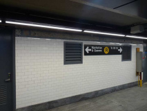
The 4th Ave/Broadway line was redesigned with plain white, or off-white, rectangular bricks, interspersed with wide color panels that held the station signage and rarely, other signs. The station signs were originally white with black letters, but in the 1980s, were changed to black signs with white letters. In addition, there were smaller signs in black letters on the color panels pointing to the nearest exits. Signs were in the sanserif Standard font, later replaced by Helvetica when that font became available.
The 1970s had a major influence on some subway station design — see this FNY page for details.
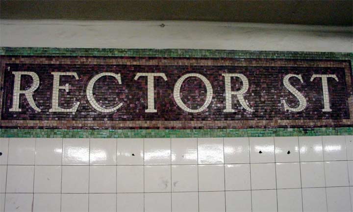
Taking careful note as always, I was aware of the strict color rotation, beginning with 77th (burnt orange or tomato red); Bay Ridge Avenue (blue); 53rd Street (yellow or gold) and 45th Street (gray). The color pattern would be repeated with other local stations with side platforms on 4th Avenue and Broadway, but in the 1990s, in the Broadway stations the MTA tore down the white and color blocks and restoring the old mosaics, adding whimsical artistic touches (I concentrate on those stations on this FNY page). The only Manhattan station whose mosaics weren’t re-revealed was and is Rector Street, but the TA did leave one mosaic uncovered (above). photo: nycsubway.org
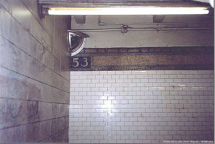
After the 1970 renovation the only mosaic “53” ceiling band could still be found at one of the 52nd street exits. Photo: Wayne Whitehorne in nycsubway.org. These, too, have now been renovated out.
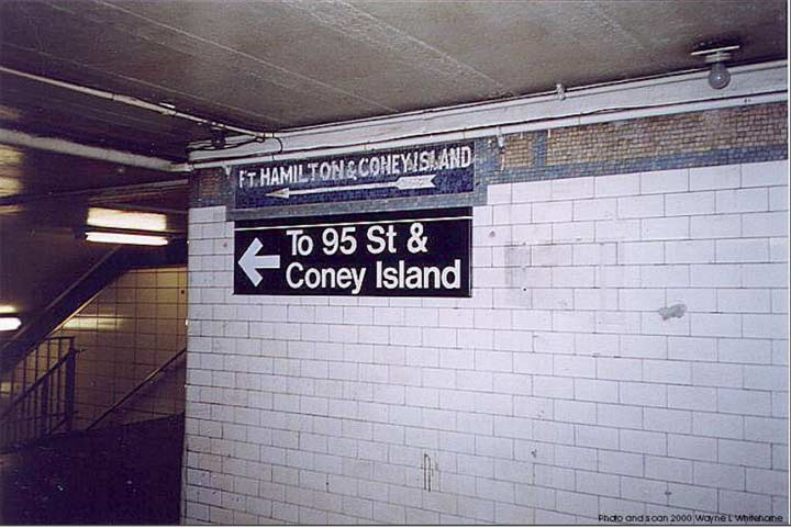
53rd Street had two mosaic bands on each side indicating train destinations; the Bay Ridge bound side featured this one, and I’ll show the surviving downtown side a little later. To get to Coney Island, passengers change to the Sea Beach line, presently the N train, at 59th Street, one stop away. Photo: Wayne Whitehorne in nycsubway.org.
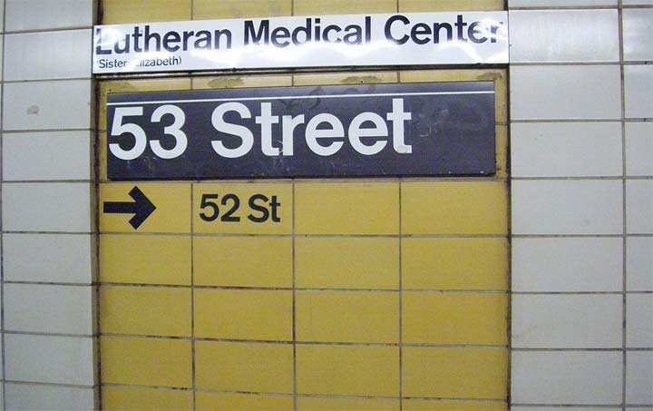
This panel gives you a good idea of what most of the stations on the R line still look like. In this case, there’s some special signage indicating the presence of Lutheran Medical Center, 2 blocks away on 2nd Avenue.
A footnote on the Lutheran Medical Center sign mentions a “Sister Elizabeth.”
Lutheran Medical Center was founded in 1883 by a Norwegian Lutheran Deaconess-Nurse, Sister Elizabeth Fedde, to serve the Norwegian immigrant community. The institution has provided care for the southwest Brooklyn communities and for 80 years grew and declined with other neighborhood institutions on the Brooklyn waterfront. In recent decades Lutheran Medical Center aggressively volunteered to be the corporate stimulus for community renewal, the catalyst for constructive change, and the advocate for the health and well-being of this entire urban area. Volunteer NYC
This indicator hasn’t survived the 53rd Street station renovation (see below).
You can also see that the wall blocks weren’t well planned out because the spaces in between, by the 2010s, are in need of a good power washing. As it turns out the MTA has in mind a complete renovation of all the stops on this line. 53rd Street has been completed, and Prospect and Bay Ridge Avenues are under way.
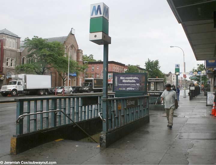
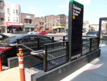
Till recently the entrances to the 53rd Street station here and on 52nd Street looked like this. Originally there were vertical neon signs indicating “SUBWAY” (they are still there, but damaged, at 45th Street). In the 1970s or 1980s, boxy signs with the old MTA logo, the two-toned M, were installed; the current logo is the “Doppler effect” bullet. The green box indicates the station is open 24/7. Photo: Jeremiah Cox, Subway Nut
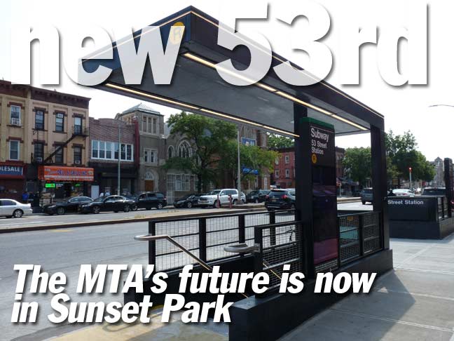
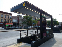
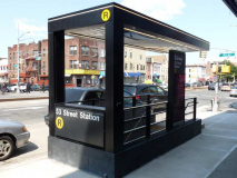
New entrance/exits to the 53rd Street station come in two varieties: covered and uncovered, and you can have whatever color you want as long as it’s black. Both versions of the new entrance/exits have animated video that can display maps, times until the next train, and advertisements. There also seems to be video on the roof of the covered version, though that seems impractical to me.
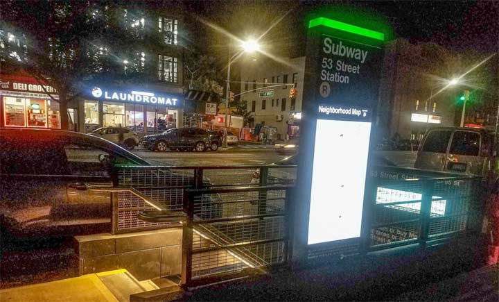
One thing that doesn’t seem immediately apparent is the “Doppler” MTA bullet. I had also thought the green lamp indicating the 24/7 opening was gone too, but this night view shows it as a panel above the sidewalk message board. Here’s what the canopied station entrance looks like fully illuminated. Photo: nycsubway.org

Compare these entrances to new ones found along the new Second Avenue Line opened 1/1/17. Now, these new entrances were created from scratch and open onto a mezzanine one level above the station platform, and there was a bigger canvas to work with. These station exit/entrances, taken together, represent the latest trends in industrial design in transportation services.
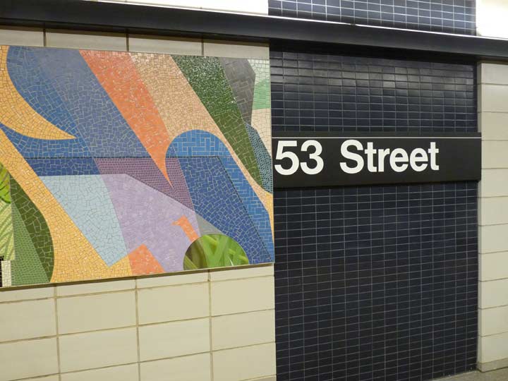
The MTA has dispensed with the gold tile bands and installed much smaller tiles in navy blue throughout the station; it has also painted the pillars on the platforms the same color. I believe there was an attempt to power wash the spaces between the white blocks, but it wasn’t entirely successful.
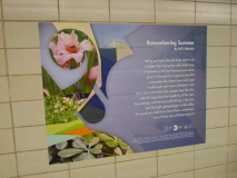
Renovated elevated stations in the past two decades have included commissioned artwork in glass panels. That couldn’t be done here, obviously, but a new mural, Title Unknown, by local artist Mickalene Thomas, has been affixed to the blocks.
One thing I noticed right off the bat here is that advertisements and notices, instead of being framed, are pasted straightaway on the white wall blocks. I imagine this is because there was no “purchase” for the frames to attach to, but I can’t help but think the neighborhood youth will make quick work of these ads, either peeling them off or tagging them.
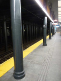
There is one decorative element from 1915 that has now survived two station overhauls: the fluted bottoms of the cylindrical platform pillars. In 1915, BMT stations were being overseen by designer/architect Squire Vickers, who discontinued the Beaux-Arts stylings of Original 28 stations architects Heins and Lafarge, imparting an Arts and Crafts motif with plenty of mosaics. That didn’t mean that extra ornamentation would be completely absent, though, and you had stuff like these pillar ornamentations.
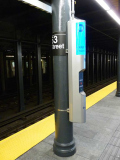
Some of the pillars have been tricked out with the MTA’s newest iterations of emergency call boxes.
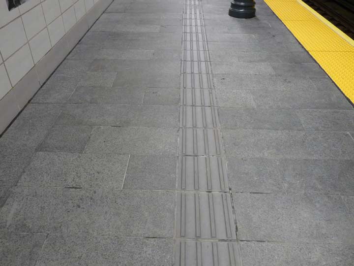
The platforms themselves have been resurfaced. Frankly I’m mystified by the grooved channel down the middle, which may surprise unwary passengers expecting a flat walking surface. My guess is that they are supposed to drain water efficiently in case of a flood, but enlighten me in Comments if I’m wrong.
ForgottenFan Richard Morris: “In the UK ridges in the pavement are used to indicate to unsighted people, typically using a stick, that they are approaching a hazard.”
In this case the ridges may be indicating the center of the platform, i.e., a safe place to walk.
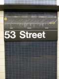
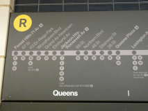
Strip maps have been placed periodically by the station nameplates. They are in a gray color that fits in with the new station decor scheme, but may be inconspicuous. “Stations yet to come” on the line are displayed in yellow, which is the color associated with the 4th Avenue/Broadway Line. The R is one of the most interconnected lines in the system, with transfers available at most stations depending on the time and whether it’s weekdays or weekends. The airplane bullet at 63rd Drive actually symbolizes a bus that goes to LaGuardia Airport.
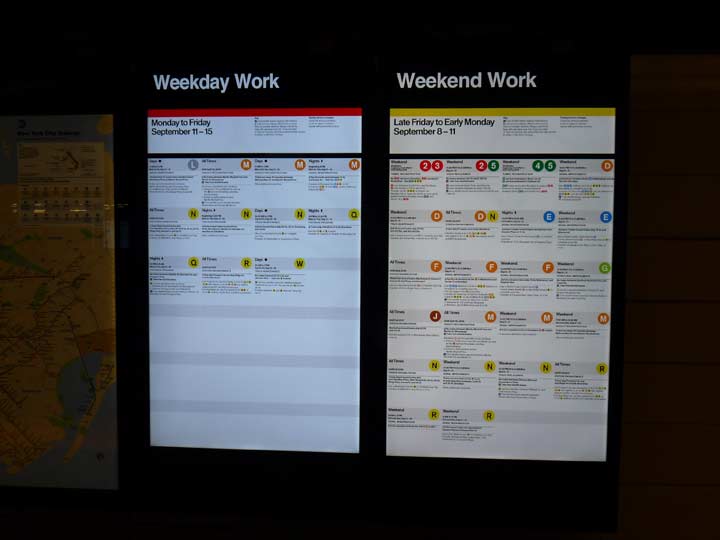
Construction and repair work is now so frequent in the subways that the MTA has now incorporated scheduled work into electronic signs instead of using temporary paper posters.
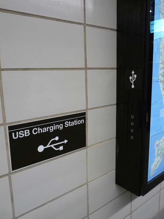
When Governor Andrew Cuomo announced that three stations on the 4th Avenue Line would close for renovations for much of 2017, one of the main upgrades, the crown jewel, as it were, to make the stations 21st-Century worthy was the installation of USB chargers for mobile phones. Mobile phone manufacturers remain adamant in not manufacturing phone batteries that don’t drain quickly.
There are four slots available — one more than I have on my desktop Mac G4 (where the magic happens)!
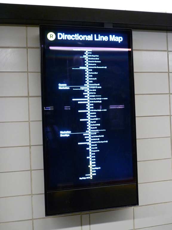
As if the strip maps weren’t enough the MTA also provides an electronic illuminated line map. No one need be lost, ever again. Well, maybe some people.

New 53rd Street platform. Time clocks indicating the next two trains to arrive at the station have also been installed here as well as other stations on the 4th Ave/Broadway line.

Here I am exiting at the 52nd Street end. The wall blocks also conform to the new dark blue color scheme.

A favorite of many train buffs I know are the neighborhood street maps that first began to appear in the 1970s. They also show area highlights such as bus lines, churches, schools and historic sites. The MTA has redrawn the maps so they more closely resemble Google Maps and now have them in electronic form in renovated stations, the better to update quickly if need be.
The MTA has put most of the neighborhood maps seen in subway stations online, if you didn’t know. Here they are.

I strolled over to the 53rd Street, or “main” entrance/exit, where the “token booth” is located. There are new additions to be found here, too. You would think that the main subway map, based on a design by John Tauranac way back in 1979 (replacing the previous Vignelli map) would be a prime candidate for “electronization” since trackwork forces subway lines to change tracks so very often and an electronic map could be changed easily, but a paper map still suffices here. Next to it, we see the week’s planned work on the R train. Metrocard vending machines are next, though they can still be purchased by a human employee in the booth.

A new design for “fare control” barriers can be found here. I didn’t take a picture of the turnstiles, but sometime in the next 5-10 years the MTA is planning to install an EZ Pass subway admittance procedure in which the electronic eye would sense a phone or specialized chip somewhere on passengers, and then duly charge a credit card, bank or other entity for payment. This would eliminate Metrocards and indeed, turnstiles and make the fare charge automatic and eliminate the risk of turnstile jumpers. Many cities use this system already for transit.
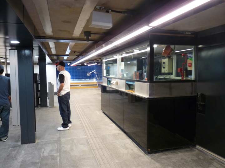
A look at the new mezzanine. The “token booth” now has dark-colored panels to fit in with the overall color scheme. There are also new floors and “flood channels.”
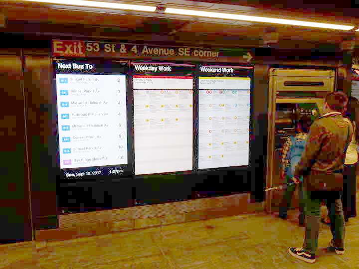
More planned subway construction work. There is also a panel devoted to wait times for the nearest bus lines: in this case, the B11, which runs past the station on 4th Avenue. It runs from Lutheran Medical on 2nd Avenue to Brooklyn College on Flatbush Avenue.
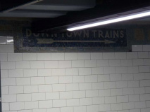
A small bit of the old 1915 tiling and mosaics can be seen in the mezzanine between the turnstiles and the staircases down to the platforms. A “down town” sign is still in place; it indicates Manhattan-bound trains. At 45th Street, one stop away, an “up town” sign indicates Bay Ridge-bound trains, rather inexplicably, in my opinion.
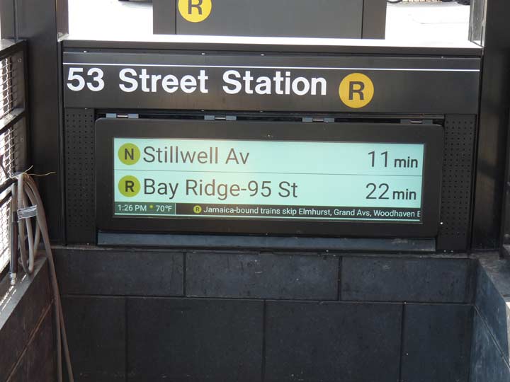
The MTA has completed the new 53rd Street station, and within a few months the Prospect Avenue and Bay Ridge Avenue stations will also be finished in a comparable manner. This is a pilot program, and there are no plans at present to reconstruct other stations on the 4th Avenue-Broadway Line. However, the MTA does plan to similarly renovate six other Brooklyn stations:
- The Flushing Avenue station on the border of Bed-Stuy and Williamsburg (G Train)
- The Classon Avenue station on the border of Bed-Stuy and Clinton Hill (G train)
- The Clinton-Washington Avenue station in Clinton Hill (G Train)
- The Kingston-Throop Avenue station on the border of Bed-Stuy and Crown Heights (C Train)
- The Van Siclen Avenue station on the border of East New York and Cypress Hills (C Train)
In addition the MTA will be closing the 30th Avenue and 36th Avenue stations on the elevated Astoria Line for similar renovations. It’ll be interesting to see what the MTA does with the elevated stations, and the other Brooklyn stations, which are all Independent Subway stations constructed in the 1930s.
There is one thing the MTA currently cannot do: increase capacity and run trains more frequently because of breakdowns and trackwork. This is reflected in the new countdown clocks, as on this day (a Sunday) there were 25 minute headways between R trains.
The recently installed clocks use the existing wireless network, rather than the previous system on the numbered lines, which used the signal network. Bluetooth receivers are installed in stations and on the front and back car of each train, which act “almost like little GPS devices,” Ms. [Veronique] Hakim {MTA Managing Director] said. The transportation authority monitors when trains enter and leave the station, and uses that information to display their estimated arrival times at the next station. [NY Times]
While some buffs vehemently dislike the 1970 renovation template on the 4th Ave/Broadway line, and call for the restoration of the mosaics, I’ve never minded it and I do like the new modernization. I do question where the MTA moo-la-dee is going, since I’d like them to go all-in on running trains more frequently and cutting down on the trackwork and repairs. That would likely mean shutting down the line completely (as will be done in 2019 on the Canarsie Line to repair damage meted out by Hurricane Sandy).
Check out the ForgottenBook, take a look at the gift shop, and as always, “comment…as you see fit.”
9/17/17

11 comments
I’m taking bets on how soon every one of the USB charging slots will be jammed up with chewing gum and inoperable. What a waste of money! By the way, they’ll always be the Fourth Avenue, West End, Sea Beach, Culver, and Brighton Beach lines to me…
Those “Flood Channels” are called tactile paving. Those tactile paving provides a directional guide to visually impaired people to the nearest exits. It similar to the yellow tile found on the subway platform edges and street corners.
The grooved tiles are meant for the blind to find the way. At least here in good old germany.
Hi, the grooved lines on the platforms are for the sight-impaired. Sometimes, the grooved lines lead to a section with raised circles; these sections are commonly used at crosswalks. The combination of raised circles and chirping pedestrian signals assure the sight-impaired of a safe crossing. I’ve also seen the raised circles at elevators and information desks’ I guess these mean “stop.”
I will miss the 1970 renovations, as it’s the only way I remember these stations looking.
In the UK ridges in the pavement are used to indicate to unsighted people, typically using a stick, that they are approaching a hazard.
The 30th and 36th Avenue stations have gotten what looks like plywood forms, possibly to widen the platforms? A new staircase has appeared on the Broadway station ,Ditmars bound platform south of Broadway, in front of the Municipal Parking lot. And it looks like excavations have been made for the support beams of a new staircase at the 30th Avenue station Ditmars bound platform north of 30th Avenue.
Having grown up on 54th between 3rd and 4th I was very familiar with that station. My, things have changed since 1965. I did a street view and saw St. Jacobi Church has turned Korean from the German church I attended.
I work in Sunset Park, 45th is my stop, nevertheless, I’m familiar like everyone else along this line. I’m a little dissapointed that the white blocks are still there, I would have like the mozaic tiles back.
Since Im a D train rider, I don’t get to go past 53rd street, as I have to go the other way….
I do like the way the stationd look like from the street. the nightime illumination looks really cool.
It would have been nice it they broke down the 70’s tiles in favour of the 1916 mosaics…I have yet to see a pic of those stations before the 70’s reno…
The 1960’s “modern look” should be removed to reveal the style of the 1910’s. Actually, I think those blocks were a complete waste in the first place !