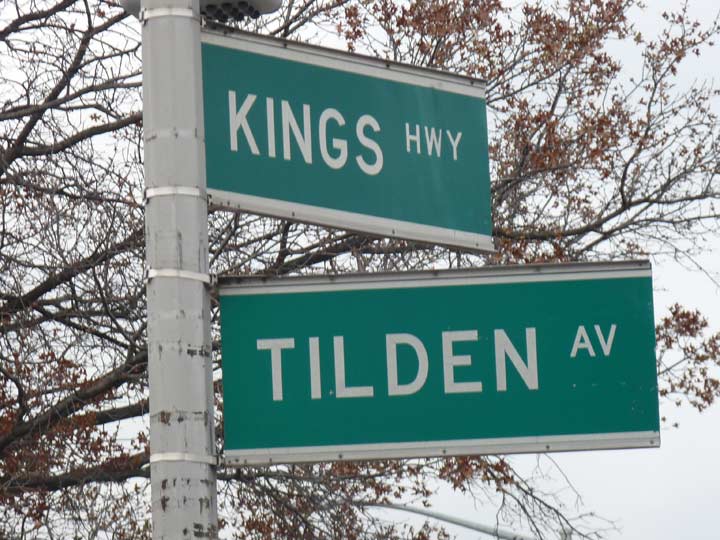
I am planning a feature on a walk I undertook from Parkville to Brownsville, Brooklyn soon enough, but here is a curiosity I couldn’t keep to myself for too long: the presence of extremely large streets signs on a stretch of Kings Highway in East Flatbush, from Beverl(e)y Road to Tilden Avenue. These signs have been up for 25 or 30 years in a few spots. All will be sacrificed sooner or later to the edict for caps-lower case street signs, which will likely be regulation-sized.
Larger street signs have been hung from guy-wired stoplights (a practice apparently copied from the West Coast especially Los Angeles) but the size of these lamppost-borne signs is surprising, if you’re not used to them.
The reason for them can only be surmised but at one time, the Department of Transportation may have been doing a pilot program with larger signs on busy roads such as Kings Highway that have synchronized stoplights.
In any case, I like them, so I wish their reach could have been expanded.
Check out the ForgottenBook, take a look at the gift shop, and as always, “comment…as you see fit.”
12/5/17

7 comments
I have never seen synchronized stoplights on Kings Highway. I would like to know why DOT and even the MTA have opted for signs wth narrow font even when there is ample room for a regular font. They are more difficult to read. (You can compare the two at the Avenue U station of the Brighton line.)
Hm, if they’re not synchronized that knocks out my guess why there are those extra large signs.
I believe the lights are synchronized in rush hour.
I realize that federal law mandates the white on green signs. However, I always felt that the large signs installed on some Manhattan avenues in the late 1950s were the best design – large rectangles, all upper case letters (to my mind preferable to upper-lower case), and large black letters/numerals on a bright yellow background. These signs were on Broadway, Third Avenue, Fifth Avenue, Ninth Avenue, and a few other north-south arteries, but were never used out of Manhattan, unfortunately
Why is the federal government telling what type of street sign design to use? This is another example of BIG GOVERNMENT dictating everything. Also if white on green is the mandated format, then why are there so many different designs of street signs, especially in Manhattan. I also spotted white on blue signs in Suffolk County, similar to the old Bronx design. I miss the color coded signs that I remember from the 1970’s. I do not like lower case font. Is this to impress the damn millenials?
There are fewer accidents if the signs convey info in a familiar way wherever you are driving. (Do you know what to do when you see an Octagonal sign.)
Jesus, dude. Put the meth down and get out of your mom’s basement for once. The only people out to get you are your fellow boomers, the ones with money.